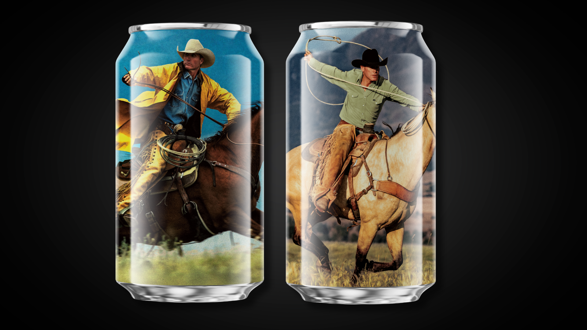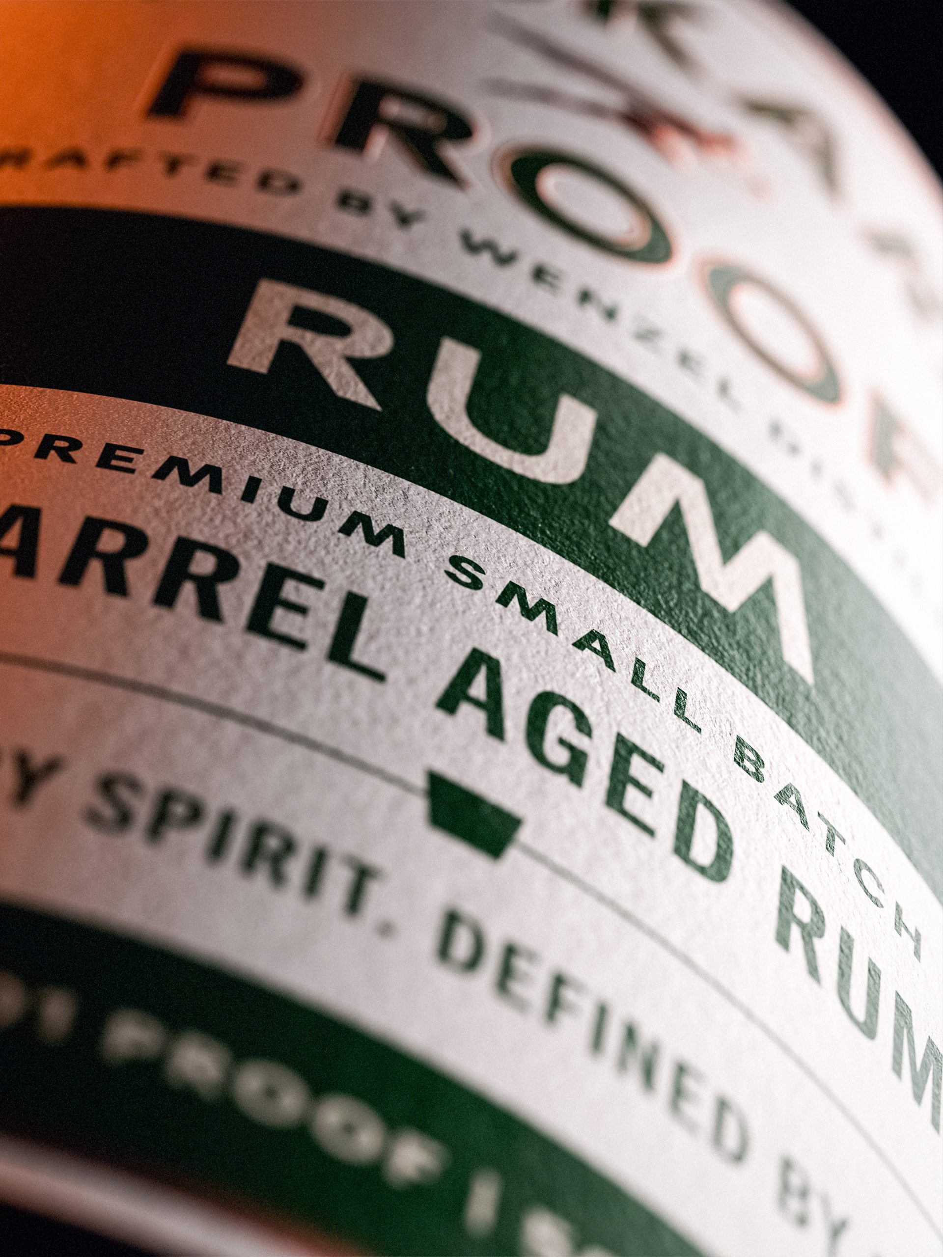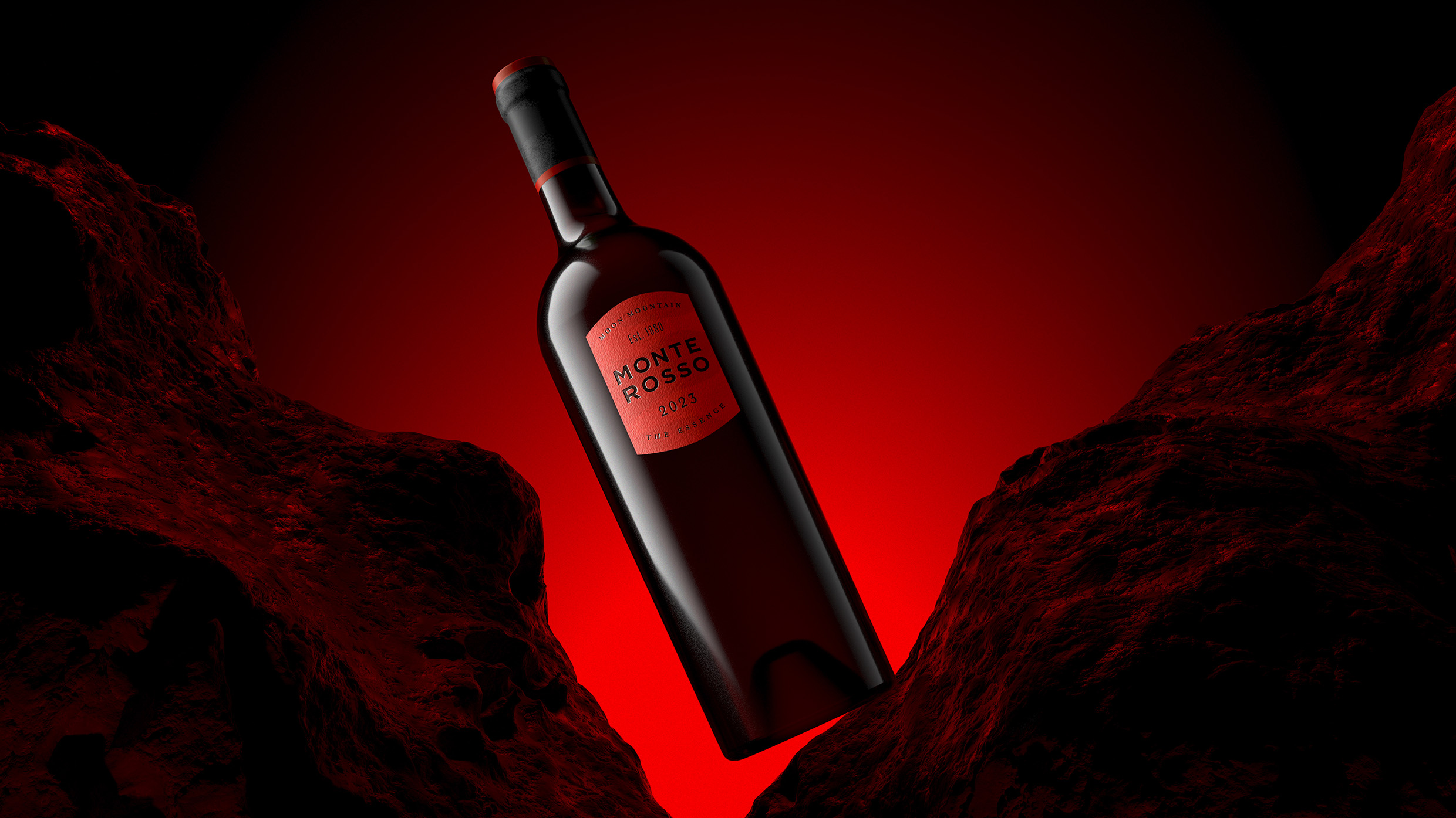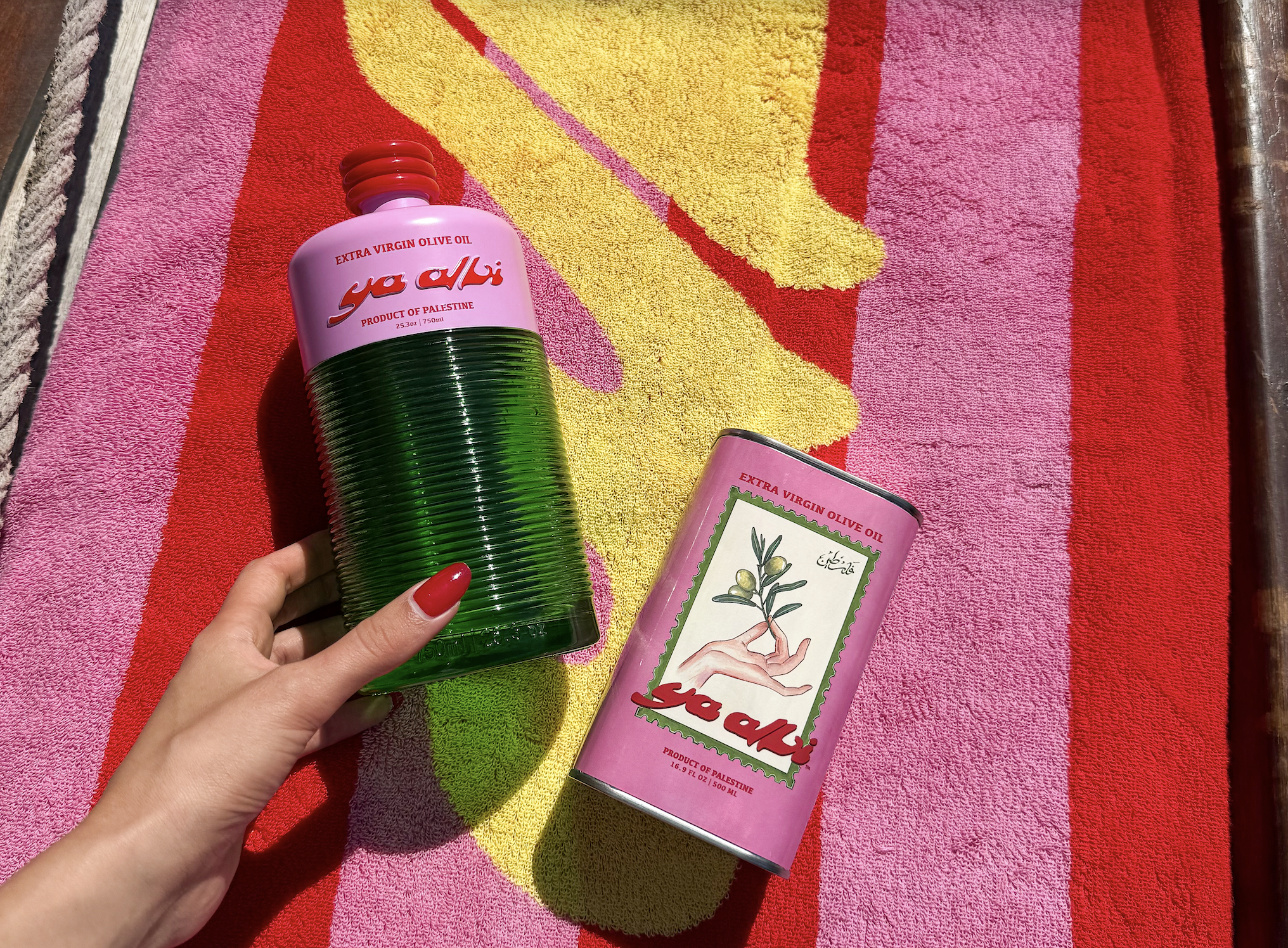
The Winners of The Dieline Awards 2015 were announced at HOW Design Live, the largest annual gathering of creative professionals, anywhere.
For the 6th year, The Dieline is proud and honored to be able to give the art of consumer package design the platform and the recognition it truly deserves. The Dieline Awards 2015 Winners truly represent the peak of package design, the most creative work designed over the past year from all across the globe.
In front of an audience of over 1000 creatives, 42 winners across 13 different categories were awarded a 1st, 2nd, or 3rd place Award.
BEST OF SHOW
Gin Rawal
DORIAN

The design not only gives image to the product it also makes it much more memorable, thanks to the visual game obtained as the bottle empties. We had to create the image for a gin produced by a small place called “Pesca Salada” located in Barcelona. We were requested to work on a different image from those we usually find in supermarkets, and that it had something in common with the place.
EDITOR’S CHOICE
The Adventurous Blends of William Whistle
Horse

Scope to create the name, brand identity and packaging for a well travelled and eccentric English tea and coffee merchant. The concept had to champion exotic flavours from around the world, blending the very best discoveries of the past with the very best expertise of today.
SUSTAINABLE
Naturally Clicquot II
PaperFoam BV

In close cooperation with Veuve Clicquot we were able to design Naturally Clicquot II PaperFoam packaging. This packaging will keep the chilled bottle cool for 2 hours and the packaging is afterwards recyclable with paper. PapeFoam is made with industrial starch is Bio-based and Compostable.
STUDIO OF THE YEAR
Mousegraphics

Design is an endless exercise in communication. mousegraphics is a creative office that realizes this basic principle since 1984, and in a way that concerns each one of its partners / clients separately. With a creative team consisting today of ten designers, an illustrator, a photographer, a creative strategist and an office manager.
Neenah Paper Award
PRADO STUDIO

The most powerful and identifiable trademark of any retail product is a well-designed package that entices and delights desired customers. By incorporating intricate details and the luxurious
FRESH & PREPARED FOODS
1st Place: Louis Charden
Backbone Branding

What comes to your mind when you think of a bakery? Home, family, a fest, childhood or may be a tempting aroma of your mother’s cakes? The concept of scent-driven memories led the entire branding process.
French origin insinuation was first of all solved through the naming. We developed a brand character – Louis Charden, the founder of the bakery and created a brand story.
2nd Place: Dorset Cereals
Big Fish

We’ve been Dorset Cereals’ brand, design and marketing team since we rebranded their business ten years ago. Our original redesign helped grow its brand value from £4m to £45 million in just three and a half years. Our challenge from the new owners was to do it all over again and build on the success.
3rd Place: BOUTARY
CARRE BASSET

he Maison Boutary entrusted Carré Basset with the rebirth of its brand through the creation of a new French caviar, subtle balance between traditional heritage and modernity, know-how and innovation.
The agency signed the visual identity and the packaging design of Boutary Premier Cru, prestigious caviar presented in a large tin with custom-made format rewriting the caviar rulebook, while meeting all the conservation and hermeticism constraints related to this exceptional product.
DAIRY, SPICES, OILS, SAUCES, CONDIMENTS
1st Place: Foodscross
Mousegraphics

The market for honey is a rising one and as such already filled with a variety of packaging designs. We needed to realize a brand identity able to convey this product’s specific advantage: it’s pure synthesis. This is Greek honey distinguished for its extremely high concentration of thyme pollen grains (80%). A rare, natural product of an eco-conscious process, meant to be offered in numbered and signed vases.
2nd Place: Tesco Finest Grocery Redesign
Pemberton & Whitefoord LLP

As part of the recent overall rebranding project, P&W was tasked to take guardianship of the grocery category.
This latest phase of Finest* differed from previous evolutions in that each individual pack was handcrafted, with meticulous attention to detail, while striking a careful balance between individuality and continuity, resulting in a truly bespoke / artisan range.
3rd Place: The Family Beez
Mousegraphics

We proceeded with this packaging design based on the simple truth expressed by the producer himself: “The beehives are on my island, Serifos, within an area full of thyme, protected by Unesco…I learned beekeeping from my father when I was a kid and visited the beehives… Bees live between 2 and 4 months…not even 2 during Summer due to the heat…They work morning to night until they run out of strength…
CONFECTIONARY, SNACKS, DESSERTS
1st Place: Foodstuff Own Brands-Pams Confectionary
Brother Design

The Pams Confectionery Range features an eclectic mix of quirky characters, bursting with fun and whimsical charm! Sure to capture the imagination and bring smiles to young and old.
As always, the Pams Private Label personality never fails to surprise and delight.
2nd Place: NA! Mon fruit juste mixe
Logic Design

In 2009, the brand invented the first snacks 100% natural and without any compromises. No added sugar, nor preservatives, nor dyes, nor sweeteners. This was a huge revolution in the snack and food-on-the-go market. The brand wanted to be synonymous with the pleasure of guilt-free snacks, with the playful alternative to eating fruits.
3rd Place: BEAR Paws
B&B Studio

B&B created packaging for a limited edition collection of BEAR PAWS, which are the brand’s kid-friendly range of paw-shaped baked fruit snacks. Launched to celebrate BEAR’s fifth birthday, each multipack features a donation to help save endangered bears and other wild species.
NON-ALCOHOLIC BEVERAGES
1st Place: Nongfu Spring- premium mineral water
Horse

Packaging design – scoping the structure and graphics – for a new premium mineral water produced by Nongfu Spring, the leading bottled water manufacturer in China.
Produced for high-end hotels, bars and restaurants, the design had to convey the quality of the water and tell the story of the unique source – an underground spring at the foot of Changbai Mountain, a volcanic region bordering China and North Korea.
2nd Place: Epleslang
Dinamo

Epleslang is an apple juice that is hand picked from private gardens and produced locally in Oslo. The product has both an environmental and socially responsible profile in that it is extremely local and employs people with disabilities that are too often excluded from the workforce. Through working with people with impaired abilities, the company wants to demonstrate to employers and to the general public the value all people have for the employment sector.
3rd Place: Exotic coffee collection
ARTEMOV ARTEL

To create a package design for the series of exotic coffees. This product is significantly more expensive than traditional ones and poorly known by an audience. Packaging has to demonstrate exclusivity and premium value of the product. It is also necessary to develop a gift box for the set of products.
BEER, MALT BEVERAGES & TOBACCO
1st Place: Karhu
Design Bridge

It was extraordinary to find that Karhu, such a well-loved beer brand in Finland for almost 100 years, was unavailable in the on-trade. To be an effective competitor in pubs and bars dominated by big international brands, Karhu needed to find a renewed, inner confidence and leave behind the gloomy, industrial image it had become associated with.
2nd Place: Brooks Dry Cider
Jones Knowles Ritchle

Brooks is not sweet, but fine & dry. Brooks is not heavy, but firm & solid. Brooks is crisp & light with a mighty good bite. Get Brooks Dry.
3rd Place: Rijksmuseum
dBOD

Heineken is a proud partner of the Rijksmuseum. The two have a shared history that goes back to the 19th century. In fact, Gerard Adriaan Heineken was directly involved in the construction of the Rijksmuseum. To celebrate this partnership, Heineken asked dBOD to design the so-called ‘Amsterdam Originals series’.
WINE, CHAMPAGNE
1st Place: Clicquot Mail Collection
5.5 designstudio

In 2014, 5.5 designstudio has conceived with Veuve Cliquot the Clicquot Mail Collection inspired by the Correspondence field: the envelope box, the Clicquot Clutch and the Clicquot Express.
From behind her desk in Reims, at the beating heart of the Champagne trade, Madame Clicquot ran her empire boldly, with the stroke of a pen. It was through the mail that she directed her suppliers and agents, and satisfied the wishes of her customers, some at unheard of distances.
2nd Place Armas de Guerra
Roman Bold

The winegrowers from Bierzo always have fought in the battle to create the best wines. We showed how the viticulture is placed in the foreground and becomes rejuvenated Guerra brand. “Our war is the wine”. And their weapons are displayed on each label of the collection.
3rd Place: Ploes Wines
Beetroot Design Group

In this solution a large part of the label is filled with sea trips inspired illustrations. We designed our illustrations with simple clean forms on which handmade ‘water’ details are added.
The way a sailboat is reflected in the water, the low flight of a seagull that one feather barely scratches the surface of the sea, the journey of the moon that generates light wrinkles over in water and the water element that transforms into a wave.
SPIRITS
1st Place: Don Papa 10 Year Old
Stranger & Stranger

For the limited 10 Year Old edition, our Don Papa sports a long beard and is completely overrun with the local flora and fauna of The Philippines.
2nd Place: Kyro Distillery Company
Werklig

Kyrö Distillery Company creates, sells and promotes globally spirit brands that we create in Isokyrö, Ostrobothnia, Finland. The distillery was founded in 2012 after the founders had rye whisky during sauna, for some it was their first taste of rye.
3rd Place: Haig Club
LOVE

LOVE was briefed by Diageo’s innovation team to create a credible and authentic new brand that would breathe new life into Scotch. Inspired by the category’s long lost cool, LOVE created Haig Club, a new single grain Scotch whisky with both style and substance.
HEALTH, COSMETICS, FRAGRANCE, FASHION
1st Place: Salmon Oil
Mousegraphics

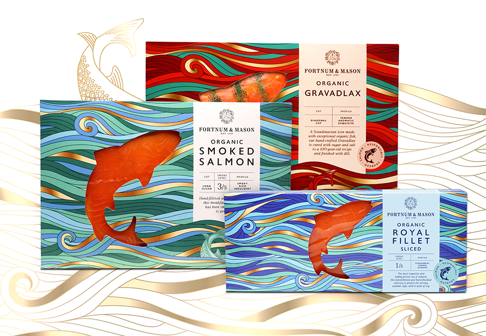
We opted for a design which would include a direct and rather sober reference to the very natural source of the product, a salmon fish. We chose the iconographical approach of a fish encyclopedia of the 18th or 19th c., simple, clear typography and the orange diagonal line to connect the packages when displayed.
2nd Place: Aromatologic
mousegraphics

We worked with our client to build the brand image and product story, starting from the given brand name (Aromatologic) and the high-value provenance of the products. Aromatologic project is conceived as one that studies the most primal of senses, Smell and traces the archetypal but personal “logic of the aromas” in ancient philosophy, the science of numbers and the field of personal memories.
3rd Place: SOC TOKYO
Keiko Akatsuka & Ass.

SOC is a Japanese brand of socks whose slogan in “An inspiration born from your foot.” The package has been designed so that it is able to contain socks of all sizes and display the different styles and was created according to the art of traditional Japanese folding, so that it may be opened without destroying the packaging.
PERSONAL CARE
1st Place: Tesco Kids Tissues
Pemberton& Whitefoord LLP

The challenge was to create a range of fun, family friendly, novelty tissue packs that would be suitable for children and teenagers alike – with a humorous, unique look. P&W created a collection of animals with the concept that the tissues, when dispensed, interacted with the box – the water blowing from the elephants trunk or the tuft growing from the penguins crown.
2nd Place: Lilia Hjartat
Bold

Apotek Hjärtat is one of Swedens largest pharmacy chains. Our brief was to create a concept for their child & baby products. The aim was to create a coherent and flexible design concept for packaging, retail environments and communication. We named it Lilla Hjärtat. (The Little Heart)
3rd Place: Luxe Soap
UWP Luxe

Luxury soaps enveloped in paper engineered boxes. These boxes are multi-layered, intricate die cuts that create an illusion of depth.
HOME, GARDEN, PET
1st Place: Method Air Refreshers
Method

Method’s range of Air Refreshers is designed with revolutionary pressurized air technology. Unlike many traditional aerosols which are powered by petroleum-based propellants, the continuous spray air refreshers are packed in an airtight chamber powered by compressed air.
2nd Place: Paint by Conran
Conran and Partners

Drawing on 50 years of experience in designing for the home Conran and Partners have created Paint by Conran, a range of interior paints primarily focused on the domestic market. The range launches with 96 colours inspired by British plants and landscapes.
3rd Place: STEPpack
Graypants

STEPpack is multi-functional. In addition to being a compact and protective shipping solution, STEPpack serves as a jig for assembling the light fixture that it houses.
GAMES, TOYS, SPORTS, RECREATIONAL
1st Place: Sling-Slang YOYO
TAIT Design Co.

In November 2014, TAIT Design Co. released the Sling-Slang YOYO, a handmade yoyo kit that comes in a unique screen-printed velcro-lock cardboard case. The vast majority of yo-yos come pre-assembled, but with this simple-to-build kit you get to put the pieces together yourself and learn how to tie a yo-yo string properly around the axle, resulting in either a beginner or intermediate level of play.
2nd Place: CLUG- The World’s Smallest Bike Rack
Hurdler Studio

CLUG is the world’s smallest bike rack. It is neat and discrete and packs a whole load of function into its tiny form. The elegantly simple yet incredibly useful packaging follows suit, cramming all the features you need to select and install your CLUG into a simple and responsibly sized pack.
3rd Place: Karl Lagerfield Barbie Doll
Mattel, Inc.

The Barbie® Karl Lagerfeld Doll exudes sophistication, from the tremendously chic, couture-inspired doll and fashions, to the exquisitely luxe packaging. Bold logo treatment and graphics, a break frame structure, and high-end materials set the tone for this limited edition doll, and culminate into packaging as cutting-edge as Karl Lagerfeld himself. This package is fit for a true icon.
TECHNOLOGY, MEDIA, OFFICE & SELF-PROMOTION
1st Place: Google Glass Packaging
Google Glass Design Team

With simplicity and innovation as part of our core values, we created a minimalist, original and cohesive packaging system for Google Glass and its accessories. Our goal was to create something that could be both beautiful and distinctly Glass. As the first touchpoint, the packaging is essential for setting the expectation with our customers and eases them into experiencing a completely new product category.
2nd Place: Lytro Illum
UNEKA

The Lytro Illum’s beautiful, minimalist design, smooth lines, and matte finish set it apart from the average DSLR camera. To showcase this standout product, we created a package that acts as a display case for a camera that is, itself, a piece of art.
3rd Place: Adobe Ink and Slide
Character SF

Since 1982, Adobe has built a reputation for developing world-class multimedia and creative software products. In July 2014, Adobe broke with tradition and launched its first ever hardware product–Ink & Slide. Ink is a pressure-sensitive stylus and Slide is a complementary digital ruler used to accurately draw geometric shapes and lines. Adobe reached out to Character with the enviable task of developing the Ink & Slide retail packaging system.
STUDENT
1st Place: Trident Gum, Packaging Concept
Hani Douaji

Trident Xtra Care is a chewing sugar-free gum that helps protect teeth and gums in between meals and gives a whiter brighter smile. I created an amusing fun, playful and interactive packaging which enhance the main feature of the product “Protecting Teeth”.
2nd Place: Backhouse
Yuya Yoshida

The assignment was to create a new packaging structure for protecting six breakable glassware, the brand image and packaging graphics.
3rd Place: Nutrilinx Dietary Supplements
Dulyawat Wongnawa

This project is a redesign of dietary supplements packaging for Whole Foods Market. I created the fictional sub-brand “Nutrilinx” in order to create a bigger impact and brand awareness among consumers. The physical bottle of the package is inspired by vintage potion and medicine bottles added with a modern humanistic touch to differentiate itself from the other brand on the shelves.


