Featured image for How Snask Designed the Best Pre-Gaming Beer You’ll Ever Drink

How Snask Designed the Best Pre-Gaming Beer You’ll Ever Drink

by Theresa Christine Johnson on 01/12/2017 | 5 Minute Read

Editorial photograph

Have you ever enjoyed a beer in the shower? Indulging in a shower beer is pretty common—after all, sudsing up for a night on the town goes hand in hand with a little pre-gaming. We spoke with Snask who designed a specific brew for just that on how Shower Beer came to be.

Who: Snask is not your typical design agency. This Swedish-based team of creative entrepreneurs dabbles in more than just branding or packaging, branching off into live action, stop-motion, and TV commercials. Not ones to follow traditional or conservative route, they aim to challenge the industry by doing things differently. They’ve got a book. They’ve got a band. And yup, now they’ve got a beer.

Editorial photographEditorial photographEditorial photograph

What: A Shower Beer that’s the absolute perfect size for your pre-game rinse-off.
Tell us a little bit more about why you knew PangPang Brewery would be the best place to partner with for this project.

Snask: Fredrik Tunedal who founded PangPang Brewery is a pure genius and an amazing person whom we love. He is also the guy who created Sweden's first micro brewery and he has one hell of a passion for beer and an extremely high level of the craft of brewing. Also, PangPang Brewery is the equivalent of Snask in the beer world. If beer was crystal meth PangPang would be Walter White and Snask would be Jesse Pinkman. So to us it was totally natural to turn to him and PangPang to make this beer.

Editorial photographEditorial photograph

Why did you go for a sort of retro, 70s vibe with the packaging?

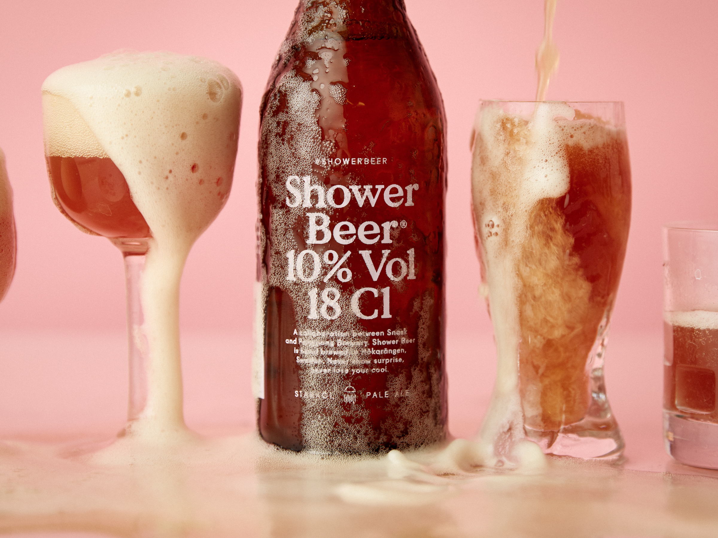
Snask: We wanted the shower beer to be an exclusive brew that tasted fantastic yet was strong enough to give you a kick in the butt and that warm feeling in the belly. This had to be translated into visual form, thus the direction for the packaging. We wanted it to feel almost like a perfume bottle but for the shower and filled with a strong pale ale. I think the retro 70's vibe is created much because of the shape of the bottle mixed with the colors brown and pink. The brown color is the preferred one for making beer out of light as much as possible, the pink is of course the color of Snask!

Why did you opt for the traditional typography for Shower Beer?

Snask: We wanted it to have that minimalistic feeling of a perfume. We experimented with bolder typography but it somehow became too much. With the idea/concept as well as the colors it suited the product much better to choose a more traditional typography.

Why did you choose to bottle the beer in a glass bottle rather than a can?

Snask: We were talking a lot about having a can and we still do. The thing is that there are some limits. The production has to be much bigger in order to be able to put it into small cans. Also we wanted the feel of a perfume so the bottle felt great. When it comes to dropping it on the floor we didn't think it mattered much since we've been drinking beer in the shower for years and a glass bottle never hindered us.

Editorial photographEditorial photographEditorial photograph

Why did you decide to incorporate a hashtag into the packaging?

Snask: The concept of shower beers has been around for a long time. So we really wanted to embrace that and add to it by producing the very first actual shower beer.

Why we love it / Why we picked it: Shower Beer is one of those things that makes you wonder, “Why didn’t someone think of this before?” There’s something delightful in its simplicity, not only in the packaging but also in the experience it gives. The brew steps away from a lot of the clichéd designs for beer—ones that rely heavily on masculinity or highlighting unusual craft flavors—and instead Shower Beer is a solid, reliable beverage. Designed to be enjoyed in three gulps, it is the obvious choice for someone who wants a quick drink before heading out for the night.

Editorial photograph