Featured image for Crit* Tony Ferguson

Crit* Tony Ferguson

by Richard Baird on 03/25/2013 | 5 Minute Read

Editorial photograph

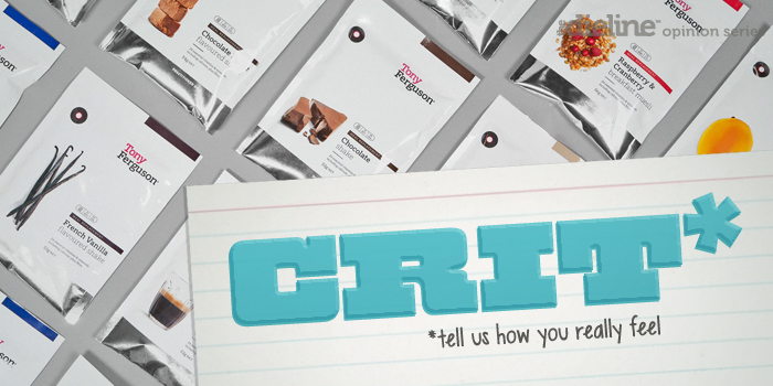
Launched over January and February this year, Tony Ferguson is - following a repositioning exercise conducted by strategic multidisciplinary design agency Maud - an ‘educational lifestyle / dietary program that helps people re-engineer their approach to food and health’ rather than a providing a ‘quick-fix meal replacement’. As part of this repositioning, Maud developed a new identity and packaging solution with a pharmaceutical subtlety, that would re-establish Tony Ferguson as a trusted, expert authority and convey the ‘lifestyle’ nature of the brand.

GS_googleAddAdSenseService("ca-pub-3860711577872988"); GS_googleEnableAllServices(); GA_googleAddSlot("ca-pub-3860711577872988", "incontent1"); GA_googleAddSlot("ca-pub-3860711577872988", "incontent2"); GA_googleFetchAds();

GA_googleFillSlot("incontent1");

GA_googleFillSlot("incontent2");

Editorial photographEditorial photograph

Predominately based around a ration pack structural choice, Maud’s design neatly resolves the themes of personalised convenience, modular practicality, a light military sense of command over cravings with a clear, consistent format that has a reassuring simplicity and an everyday accessibility. Its silver foil base-material and glossy white surface treatment marries professional kitchen, pharmaceutical laboratory with a space-age, technological undertone that works well to convey a researched effectiveness and high quality.

Editorial photographEditorial photograph

The fruit and nut photography builds on the above themes through a clinical isolation. An elemental presentation that suggests purity of ingredients but also the honest, trustworthiness of the brand. These are well shot with a good eye for fine organic detail, texture and colour which are drawn out by both the white space and bright, flat colour highlights. Alongside a nice mix of landscape and portrait pack orientation these differentiate varieties in a clear and cohesive manner with a sense of unlimited combinations set within a effective, structured system much like a periodic table.

Editorial photographEditorial photograph

The graphic design - a combination of plenty of space, a clear, legible typographic combination of light and regular slab serif, a broadly spaced sans-serif and simple top down information hierarchy, line detail and front of pack calorie guidance - has a clear and unwavering sense of format that resonates well with the structural choice. This also runs through a well spaced logo-type with subtle ligature detail across the GU, first name highlight, sentence case layout and slab serifs that give it a weight and authority, avoiding any unnecessary flourishes and accepting the name as proprietary enough. A silver circle top left is perhaps slightly superfluous with little communicative value but does provide compositional balance to the other elements.

Editorial photograph

A metallic spot colour and what looks like a low gloss coated white card substrate replaces the shine of the pouches across the boxes, while delivering far less impact these have a shelf-based practicality that also enhances the pharmaceutical subtleties of the brand.

Editorial photographEditorial photograph

While the white packs appear light and fresh, the dark introduce an evening warmth that perhaps divides meal times. The images are conventional vanity shots but hearty and comforting with good quality settings that add a sense of lifestyle where the lighter packs are clinical.

Editorial photograph

The result is straightforward and clear presentation of information, appropriately distributed between type, image, colour and structural choice. Mixing clinical effectiveness, what might be perceived as something close to professional kitchen flavours, with bright, honest ingredient photography that creates a strong sense of choice set within a controlled and reliable dietary system.

Editorial photograph

Richard Baird

Richard is a British freelance design consultant and writer who specialises in logos, branding and packaging. He has written for Brand New and Design Week, featured in Computer Arts magazine, Logology, Los Logos, Logolounge, The Big Book of Packaging and runs the blogs BP&O and Design Survival.

Twitter:@richbaird

Blog: BP&O

Portfolio:richardbaird.co.uk