Featured image for Boddingtons Draught Bitter

Boddingtons Draught Bitter

by Jessica Sanchez on 02/28/2013 | 2 Minute Read

Editorial photograph

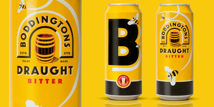
"After 14 years, Boddingtons has been given a fresh new look. The new packaging is designed to build on the existing equities and give Boddingtons a new level of standout. The challenge for us was to attract a new younger audience, whilst keeping the unique character that existing consumers remember with such affection. It was vital that the new design was not retrospective, but felt modern and relevant.” 


Georgina Leigh-Pemberton, Account Director, jkr. said: 

The Boddingtons brand has a history of confidence and irreverence, which has enabled it to defy the category norms and be a bit different.

Sean Harvey, Design Director, jkr. said: 

Boddingtons was a joy to work with, the bold timeless graphics were a gift for keeping the brand contemporary. The ‘Odd’ secondary packaging had done fantastically well but we needed to freshen it up. Humour has always been part of the Boddingtons brand and we came up with a more witty design using the Boddingtons bees (a symbol of Manchester’s hive of industry) to create the drop shadow of the B. The use of the big bold B really has great impact in store and using this as a shelf block for the secondaries will hopefully make the brand stand out even more. 

Jo Allan, Boddingtons Brand Team, AB InBev. said: 

We are delighted with the new Boddingtons design – it captures Boddingtons’ unique personality perfectly. We were keen to modernise the design, but in doing so it was important that we kept the distinctive colours and didn’t lose any of the brand’s rich heritage.

Designed By: jkr


Editorial photographEditorial photographEditorial photograph