Featured image for Crit* Birano Organic

Crit* Birano Organic

by Richard Baird on 02/25/2013 | 4 Minute Read

Editorial photograph

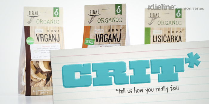
Birano is a speciality brand of packed mushrooms and fruit preserves 'inspired by the deli culture of the Big Apple' and created for the European market by international exporter Strela Funghi. The packaging for their new organic range - developed by Serbian design agency Coba&associates - draws on the mixed typographical elements of Birano’s original range - also developed by the agency - but replace its professional, 'kitchen white' and grid-based aesthetic with texture, earthy detail and a scrapbook-like layout of paper, stamps and stickers.
GS_googleAddAdSenseService("ca-pub-3860711577872988"); GS_googleEnableAllServices(); GA_googleAddSlot("ca-pub-3860711577872988", "incontent1"); GA_googleAddSlot("ca-pub-3860711577872988", "incontent2"); GA_googleFetchAds();

GA_googleFillSlot("incontent1");

GA_googleFillSlot("incontent2");

Editorial photograph

It is worth pointing out from the outset that this is by no means ground-breaking. It does, unapologetically, draw on every trick in the organic design book and really makes the most of established consumer perceptions but still manages to deliver impact without appearing dull or contrived.

The restraint and modular nature of the original range gives way to layers of visual texture. From the earthy, natural and sun-bleached qualities of the wood - a choice that conjures up a number of different countryside settings - to the craft qualities of a cream linen and torn paper. There is a nice sense of depth and detail in the the light, shade and finer features of the photography which really compliment the organic properties of the mushrooms and cuts through the rich, bright colour of the preserves.

Editorial photograph

A typographic mix of script, serif and broadly spaced sans-serif maintains the handwritten, individuality and the contrast of traditional and contemporary values of the other ranges, while the addition of a worn, woodblock print finish to the heavier, tall, sans-serif and loosely rendered, uppercase, slab-serif of the 'Organic' sub-brand, juxtaposes a sense of local industry with a child-like honesty. The illustrative hand and platter detail of the Birano identity, set to the left, introduces balance through the distinction associated with fine dining and the craft of a traditional etched print finishes that convey both high, hand selected quality and legthy culinary experience.

Editorial photograph

The overlaps of the stickers, tilt of the paper, subtle drop shadows, aged stamp effect and the annotated quality of the script contribute to a cookbook-like, cut and paste compositional quality. While perhaps little haphazard (this could perhaps be considered 'authentic') and with a slight hierarchical confusion builds on the craft and wholesomeness of cooking from good quality ingredients. There is a lot of information to contend with but the contrast of vertical linen and horizontal wood slats work well to split brand and product across the mushroom packaging while the multi-panel approach of the adhesive label and structural design of the jar is far clearer.

A wood-stained and natural colour palette - enhanced by the detail of the photography beneath - aids product division in a simple and effective way. They appear earthy and - with a DIY, back-garden sensibility that resonates well with the theme of basic ingredients and home cooking - feels familiar and comforting.

Editorial photographEditorial photographEditorial photograph

While the original range feels distinctive and more unique the organic variety is a solid balance of expected but warm and hearty design cues. It does tread a fine line between cluttered and layers of communication but through its subtle cut and paste, cook-book composition and the use of texture, manages to juggles these into an interesting and effective piece of packaging that competently leverages today’s consumer instinct.

Editorial photograph

Richard Baird

Richard is a British freelance design consultant and writer who specialises in logos, branding and packaging. He has written for Brand New and Design Week, featured in Computer Arts magazine, Logology, Los Logos, Logolounge, The Big Book of Packaging and runs the blogs BP&O and Design Survival.

Twitter:@richbaird

Blog: BP&O

Portfolio:richardbaird.co.uk