Search
Loading
Top Trending Posts
Newsletter
Featured Design Firm
FEATURED JOBS
« Kaveli | Main | Colour Spectra Pro »
Wednesday
Dec052012

Before & After: Watmuff & Beckett

11 29 12 20WatBeck 1

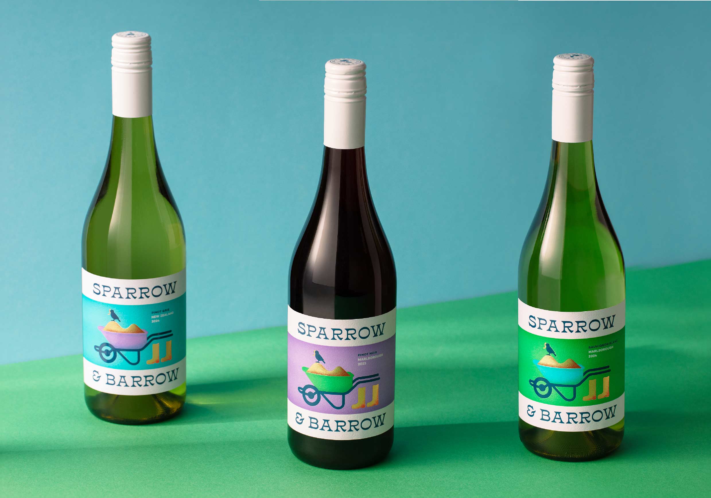
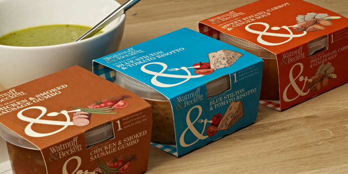
Watmuff & Beckett went to Pencil Studio to enhance their packaging even more, and redesign the packaging that they originally design, to give a bit more personality to the brand.


"With a new range to accommodate, 'Gumbo' we decided to look at this with a fresh set of eyes. The ampersand of Watmuff & Beckett was a great tool to use as a character to identify the three ranges; Soup spoon for Soups, Fork for Risotto and Table spoon for Gumbo.

With delicate illustrations, reminiscent of those in old cookery books to identify the flavours skus. The new packaging create a more modern feel to the brand and the use of bold colours also give the packs great shelf presence!"

Designed By: Pencil Studio


11 29 12 20WatBeck 211 29 12 20WatBeck 311 29 12 20WatBeck 4


Before:

08 19 11 walmuffsoup 408 19 11 walmuffsoup 808 19 11 waspuffsoup 5

Reader Comments

There are no comments for this journal entry. To create a new comment, use the form below.

PostPost a New Comment

Enter your information below to add a new comment.
Author Email (optional):
Author URL (optional):
Post:
 
All HTML will be escaped. Hyperlinks will be created for URLs automatically.
Related Posts Plugin for WordPress, Blogger...