

Health drinks are becoming all the rage, but with a saturation in the market it’s more important than ever to make your product stand out. Hired Guns Creative designed this bright and friendly packaging for Tofino Kombucha, a new brand of health drinks that definitely stands out on the shelves.

“For Tofino Kombucha we developed an eye-catching new brand that speaks the clean, minimal language of health drinks, while evoking the famous seaside town of Tofino, BC.
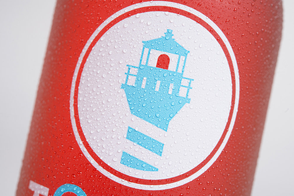
We decided to make the lighthouse our central theme, illustrating its iconic silhouette in a bold, simple geometric style. To complement the brandmark, we designed custom typography with sharp, modern sans-serif letterforms, its first ‘O’ playfully echoing and abstracting the lighthouse and its stripes, and standing tall above the other letters.”

“On the bottles, we used clearspace labels to our advantage, leaving negative space for the colourful kombucha to act as the light – even shining when backlit. We chose simple, minimal colour palettes in white-plus-one-colour to emphasize the drink’s delicious appearance, favouring combinations that feel bright and happy.
The angular cuts on the capstrap and the white ‘flavour’ bar on the front label make subtle allusion to the lighthouse stripe motif, providing the bottle’s clean and open design with an elegant finishing touch.”


Designed By: Hired Guns Creative
Printing: Westkey
Photography: Sean Fenzl
Location: Canada


