
I just love simple Scandinavian design like this. Larun IPA beer was designed by Joonas Jansson, with specific attention to the place where the beer is sold.


“Branding and label design made for Larun IPA craft beer. Laru (abbreviation of Lauttasaari) is a district of Helsinki, situated on an island known for its landmark water tower standing on a hill full of trees. Larun IPA beer is only sold in Lauttasaari and it’s visual identity is influenced by the calm and uncramped nature of this district.”


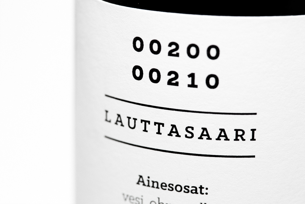
Against the amber bottles, the stark white of the label is immediately noticeable. Black text and images appear neatly on the front, keeping the appearance minimal. Instead of a traditional cardboard six-pack, Larun IPA appears in a small wooden crate with a carrying handle. It’s clearly beer, but these special elements and its simple design communicate that this is a unique craft beer unlike any other.


