The Palm Rosé Is The Epitome Of Summer

Published


1.jpg

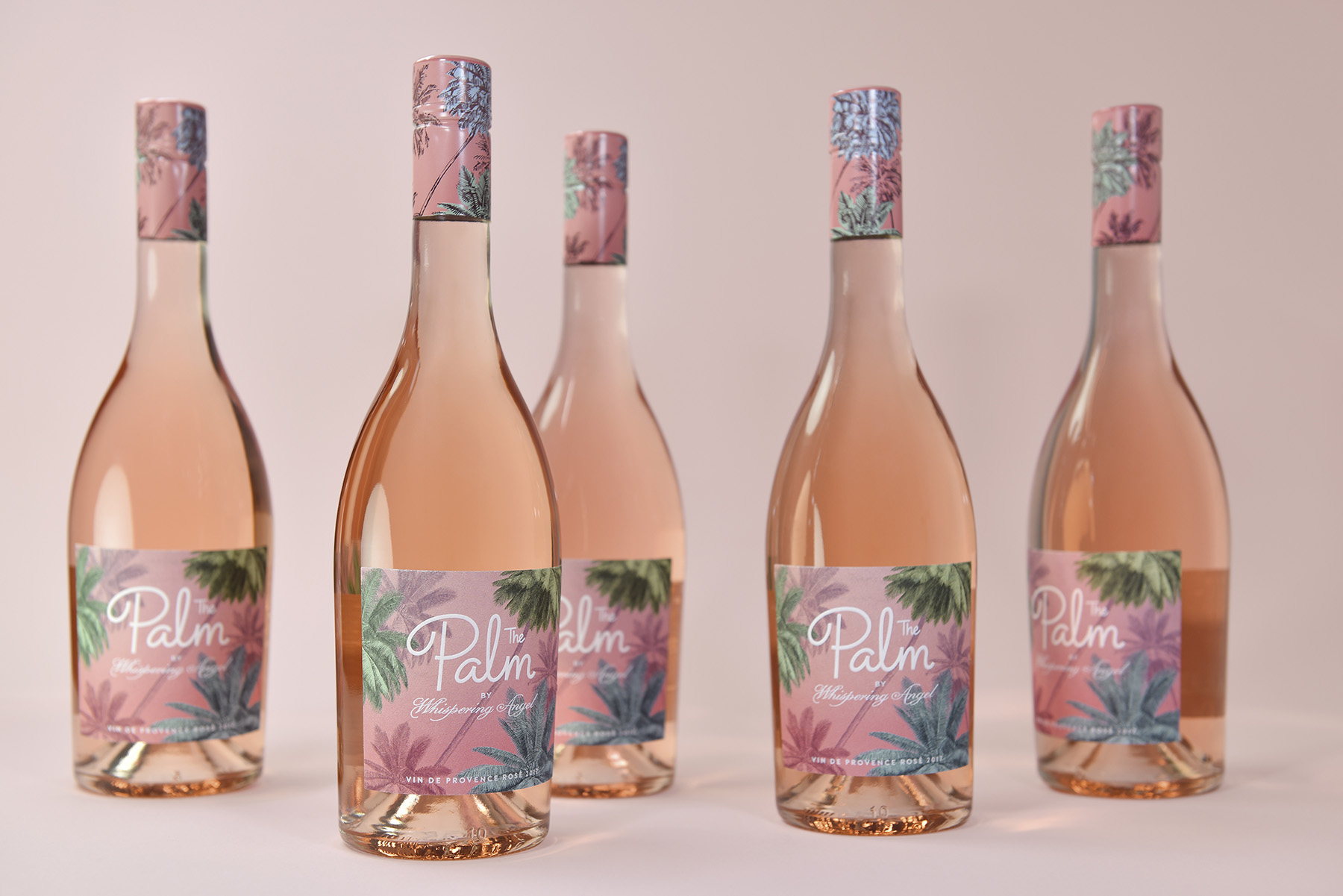
Produced by Design Bridge, The Palm rosé is truly the epitome of Los Angeles vibes in the summer as the label looks like it belongs at every cabana of The Beverly Hills Hotel. 

“Whispering Angel is leveraging on the success of their premium portfolio to introduce The Palm, an entry-level rosé to appeal to a younger, fashionable, female audience. Design Bridge’s challenge was to create a brand that epitomized a fun, aspirational ‘rosé lifestyle’ for the US market while reflecting the refined, high-quality of the French wine.”

2.jpg

Pati Zywert, Design Director from Design Bridge commented,“When developing the design, we began thinking of The Palm as the younger sister within the Whispering Angel family, taking a fun road trip with friends from the French Riviera, where the wine is produced, to the palm tree-lined beaches of the Californian coast. We imagined all the sights and places experienced along the way – from Cannes to Coachella – and used them as creative inspiration and reference points for the design.” 

Design Bridge researched vintage travel posters depicting the Côte d’Azur, typography from French brasserie and wine bar signage, design and iconography of mid-century Californian hotels, and imagery associated with the legendary Coachella festival of music and arts. Sunsets and palm trees were recurring themes in the research, and Design Bridge have illustrated an evocative palm tree scene for the bottle that brings together the essence of the French Riviera and Californian coast.

3.jpg

Pati Zywert, Design Director from Design Bridge continued, “We wanted people to imagine themselves sitting under the palm trees on a balmy evening sharing a bottle of The Palm with friends, watching the shifts of colours in the sky, before going out to party. Our illustration was inspired by a vintage botanical etching of a palm tree, which adds refinement and depth to the design, and reflects the French provenance of the wine. For the sky, we’ve tempered the vibrant pinks of a Californian sunset with the subtler hues of sundown in the Côte d’Azur.”

The hand-drawn typography is printed in white foiling onto a label of uncoated stock, bringing a tactility and a contrast of finishes that consumers expect from a high-quality wine. Special versions of the palm illustration have been created allowing it to be tiled and easily adapted for use on off-pack assets, such as social media, digital platforms, point of sale and at events, demonstrating the power of a brand idea to be translated for use across multiple platforms.

4.jpg

Agency: Design Bridge
Design Director: Pati Zywert
Location: London

This placeholder is removed when the ad slot is configured.

This placeholder is removed when the ad slot is configured.

This placeholder is removed when the ad slot is configured.

This placeholder is removed when the ad slot is configured.

This placeholder is removed when the ad slot is configured.

This placeholder is removed when the ad slot is configured.