Thirst Craft Illustrates The Perfect Cider

Published

Filed under

ThirstCraft_PottersCraftCider_09.jpg

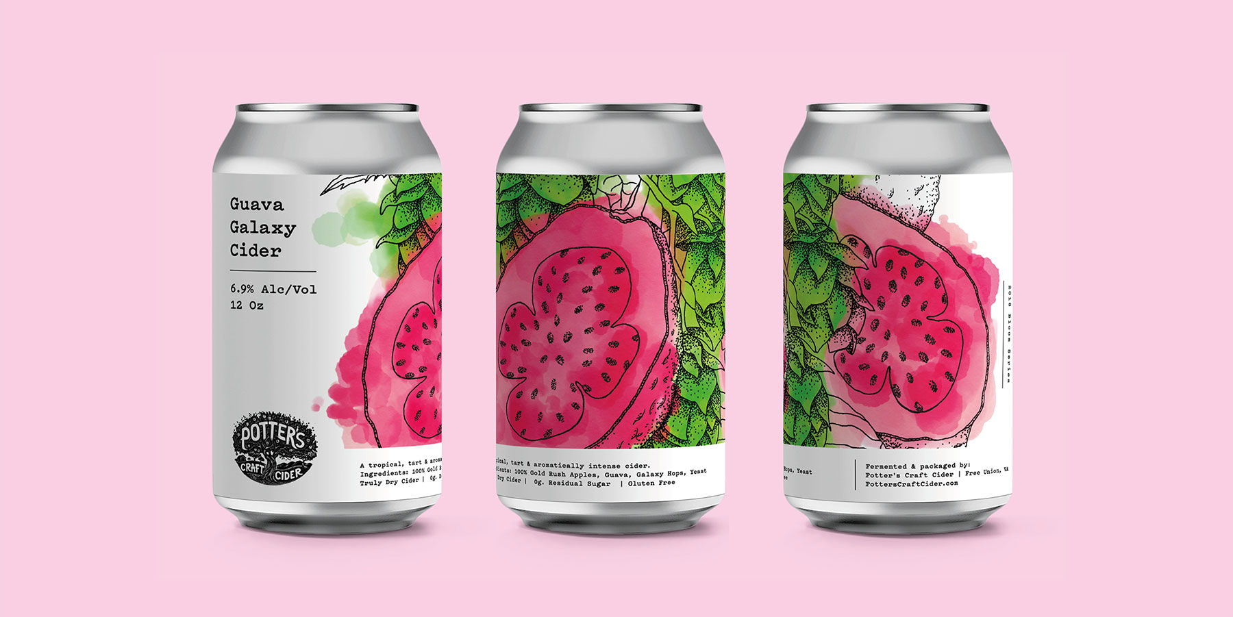
Illustrations with a vintage flair featuring botanicals and food products are becoming a popular trend for all-natural and craft beverages, food and beauty products as the demand for more organic and clean products rise.

Chobani, the world’s most prominent yogurt company, redesigned their branding and packaging with 19th-century inspired folk art to reshape the way people experience their products. Absolut released Absolut Juice with illustrations and patterns that designer Mariana Rodrigues referenced from House of Hackney, Liberty and Timorous Beasties. Teagrance launched their herbal toothpaste with floral-inspired designs that highlighted the principal ingredient, jasmine, to convey a clean but contemporary feel.

ThirstCraft_PottersCraftCider_05.jpg

These companies executed this growing trend with style and grace, and now Potter’s Craft Cider is ready to join the ranks.

“Naturally, these compelling product attributes need to be visually communicated through design, and there are some typical design cues such as white backgrounds and hand-drawn illustrations that reflect these qualities,” says Matt Burns, Creative Director at Thirst Craft.

Saying that, it’s important to know that every design stands out in the context in which it’s being consumed,” adds Matt.

Founded by Tim Edmond and Dan Porter and headquartered in Virginia, Potter’s Craft Cider started as a hobby that grew into a distraction and then a full-blown business venture, with both moving from their retrospective towns to run a cidery in Charlottesville in 2011. A short year later, they took it a step further and began planting the first few trees for their orchard and have slowly added new ones as the years pass to explore new and unique flavors.

ThirstCraft_PottersCraftCider_10.jpg

“Having built up a loyal following, Potter’s wanted to expand their portfolio with a more experimental range, the Bloom Series,” begins Burns. “This series is all about interesting flavor combinations.”

However, the brand felt that the woodcut, monochromatic designs Potter’s is known for did not do justice to these new flavors, which is where Thirst Craft, a specialist drink design agency, comes in.

“Our ambition was to let the Bloom Series truly blossom by creating a new, cohesive range style that was a vibrant celebration of taste,” begins Burns. “As their competitors were opting for quite traditional cider labels complete with muted, apple-centric color palettes, this modern flavorful family really stood out on the shelf.”

ThirstCraft_PottersCraftCider_04.jpg

The inspiration for the illustrations arose from the flavors as Thirst Craft aspired to create a mouth-watering design.

Each style of brew features a hand-drawn outline of the main ingredient – passion fruit, guava or watermelon – before scanning it in. This provided the designers with the flexibility to play around with color digitally, ensuring that the best were chosen, with vibrant shades of red, magenta and yellow served as the focal point for the designs against the white can.

This style of design is increasingly popular for a few reasons. First, consumers in recent years have started to lean towards a more healthier, natural and cleaner lifestyle and are attracted to packaging that matches those values. It’s the reason consumers love going to a farmer’s market for their produce. Illustration and folk art by extension, not only serves as a visual feast, but they emphasize the wholesomeness of the ingredients and sometimes give the product itself a rustic feel.  If a designer can connect an idea back to the land, much like the popularity of a farm to table dining experience, it only reinforces those ideas.

Secondly, the packaging is a treat for the eyes. In some ways, the decision to purchase is based purely on aesthetic because a brand wants to build an emotional, evocative connection with the packaging. If they can connect that aesthetic with their brand’s values, like Chobani, all the better.

“With each project, we think about what’s right for our client and where they’ll be seen. Potter’s is a very local product with an established ‘hand-crafted’ look. We wanted to respect that throughout designs by staying true to their roots and creating something that felt consistent with their brand and product,” concludes Burns.

Thirst Craft achieved the natural, vibrant, and almost contemporary botanical illustrative look they strived for with black-outlined, watercolored designs against the white can.

Not only does it fall into the growing trend of contemporary, folk-inspired designs that grace all-natural, organic and clean products, but it does you one better by taking it a step further to incorporate the ethos of the Potter’s Craft Cider, making it one with the brand.

ThirstCraft_PottersCraftCider_08.jpg

This placeholder is removed when the ad slot is configured.

This placeholder is removed when the ad slot is configured.

This placeholder is removed when the ad slot is configured.

This placeholder is removed when the ad slot is configured.

This placeholder is removed when the ad slot is configured.

This placeholder is removed when the ad slot is configured.