This Ouzo Wants To Pay Tribute To a Greek Hero – The Fisherman

Published


heros_2.jpg

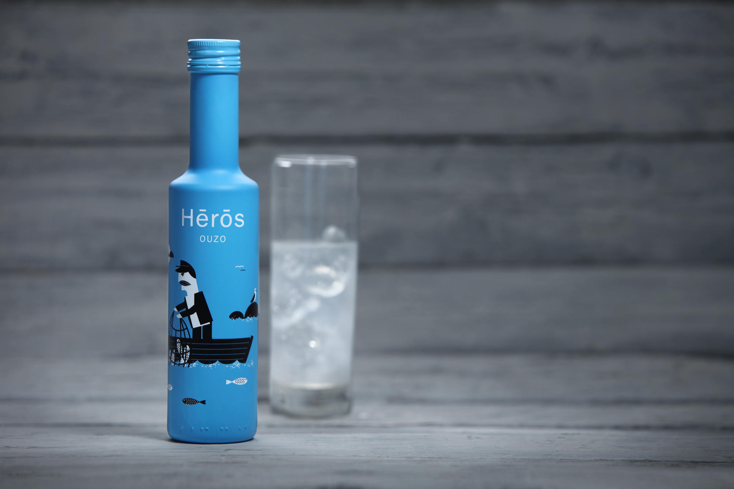
This spirit stands out with its use of a nice summery blue and playful illustration style. S & Team designed the packaging for Hērōs, a new ouzo brand that aims to capture the spirit of Greece and also pay tribute to the fisherman of Greece who are seen as everyday heroes.

“Our client, Nikolaou, owner of Nikolaou Winery, came to us to discuss his plans to launch a new ouzo brand. As our discussion progressed it became clear to us that the issue was to target tourists with a taste for design by communicating Greek values through naming and packaging.”

heros_gif.gif

“The naming research was focused around English words of Greek origin. The idea was to find a name that would be understandable by foreigners and express values which are intrinsic in Greek culture. The word ‘hērōs’ was chosen for all the reasons mentioned above. It is a word with significance to Greeks that also makes sense to tourists, while its spelling with its accent marks gives a hint of its Greek roots (Greek word ἥρως).The name also pays tribute to Greek fisherman, the personification of everyday hero, who struggles above the waves and weather conditions to pull up his daily catch. Summer and ouzo just wouldn’t taste the same without him and his catch.”

heros_3.jpg

heros_1.jpg

“We were clear in our mind that the packaging was not geared towards tourists interested in Greek folklore culture. So a realistic portrayal of Greek fisherman was definitely not an option. Our customer’s persona, as we have defined it together with Nikolaou Winery, is the sophisticated traveler, who apparently wouldn’t get a Greek column ouzo bottle. So we created an illustrated fisherman in a flat geometric style. The light-blue coating of the bottle represents the color of the sea that engulfs Greece. At the back of the bottle is the story behind the name ‘hērōs’ and further information regarding production and alcohol percentage as well as the product’s barcode, which was designed to look like waves to match the entire concept.”

illustration_detail.jpg


Designed By: S & Team 
Creative Direction: Evaggelos Spiliopoulos
Art Direction: Leonidas Iatridis
Copywriting: Alexia Kommata
Photography: Math Studio
Client: Nikolaou Winery
Location: Athens, Greece

This placeholder is removed when the ad slot is configured.

This placeholder is removed when the ad slot is configured.

This placeholder is removed when the ad slot is configured.

This placeholder is removed when the ad slot is configured.

This placeholder is removed when the ad slot is configured.

This placeholder is removed when the ad slot is configured.