Featured image for Latin American and Scandinavian Elements Come Together In This Coffee Packaging

Latin American and Scandinavian Elements Come Together In This Coffee Packaging

by Natalie Mouradian on 05/30/2018 | 3 Minute Read

Editorial photograph

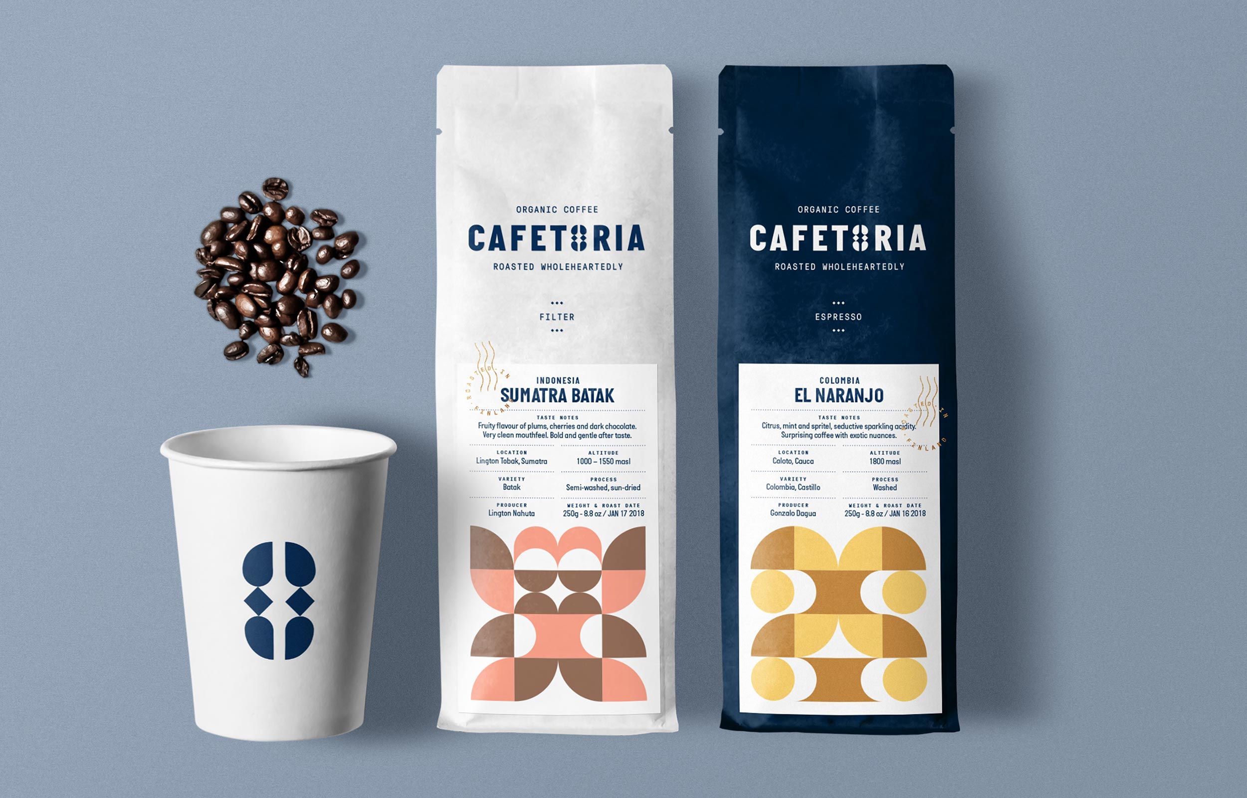
Diferente designed this striking minimal coffee packaging design that aims to unite the Latin roots of the product with its Finnish production.

“Cafetoria is a coffee roaster in Helsinki with a goal: to offer their customers high-quality organic coffee with a certified origin while promoting fair trade, social development and environmental protection of small coffee farms in Latin America.

The problem found in the analysis is that Cafetoria offers a great coffee but their brand image is not coherent with the business idea and also doesn’t communicate the image of a Nordic company with Latin roots.”

Editorial photographEditorial photographEditorial photographEditorial photographEditorial photograph

“As a solution, Diferente proposed a totally new visual language for the brand based on a symbol: a coffee bean that integrates the simplicity and Nordic perfection with the allure and modular repetition of Latin ethnic crafts.

The modules taken from the symbol are used to generate different icons that illustrate brand messages as well coffee origins in the labels of the packaging —where a roast certification seal is used to stamp white and blue bags that distinguish filter and espresso roasts.

The result is a minimalist brand image with a Latin touch that stands out as a premium handmade product roasted wholeheartedly in Finland.”

Editorial photographEditorial photographEditorial photographEditorial photograph

Designed By: DiferenteCliente: Cafetoria RoasteryLocation: Barcelona, Spain