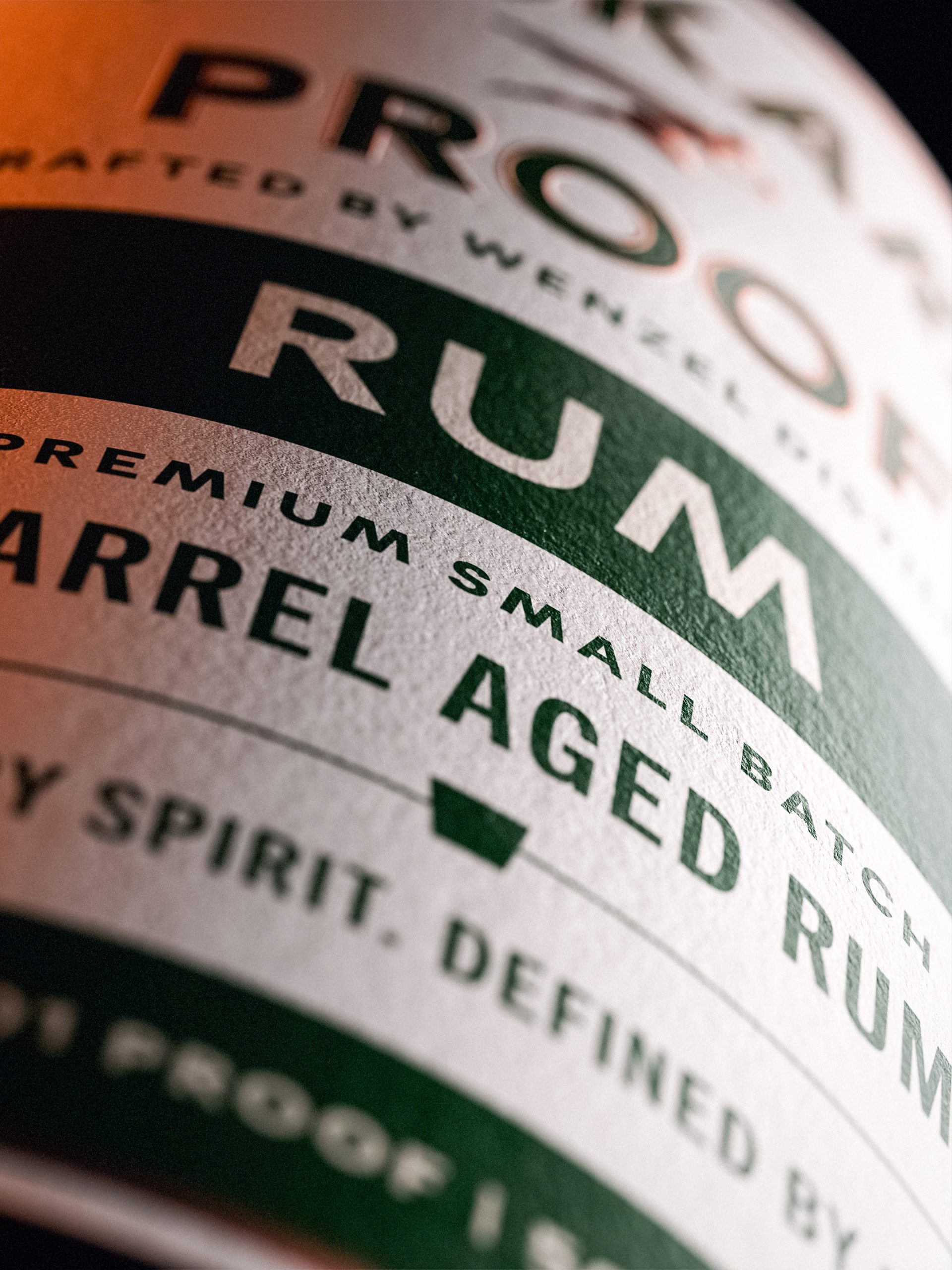
Jason Carne designed this conceptual packaging for Tempest, a Whiskey brand with roots in Kentucky. The design features beautiful lettering and metallic foiling in order to create an eye-catching spirit label.
“Tempest is a fictional ‘bluegrass strength bourbon whiskey’ brand I created as an art piece for the Outlaws gallery show put on by the Lexington Art League here in Lexington, Kentucky. In keeping with the theme of the show, Tempest is a homage to the mobsters, bootleggers, and anti-prohibitionists of the 1920’s that fought back against the puritanical legislature of both the American government and the Temperance Movement that guided it. The labels are diecut, letterpressed, gold-foiled, and have a blind deboss – all printed up by the talented folks at Valhalla Studios. All photography was shot and edited by Steve Squall at Justins’ House of Bourbon in Lexington, Kentucky.”


