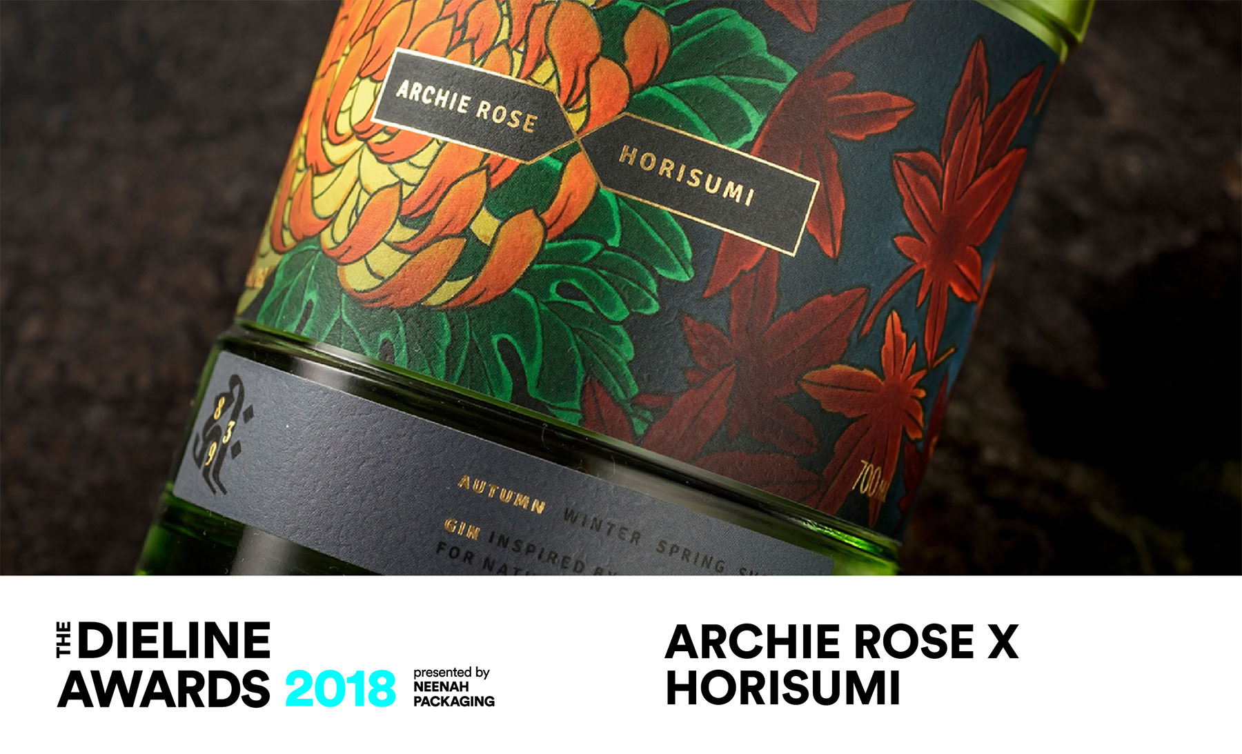


The Archie Rose X Horisumi is a limited release gin series – a collaboration between Sydney-based Archie Rose Distilling Co. and acclaimed tattoo artist Horisumi, which pays homage to the Japanese seasons.
Unlike most processes, where packaging is designed post liquid development, we worked in reverse; Horisumi first interpreted the Japanese seasons and we collaborated with him to develop a design fitting of this vision. Archie Rose then carefully crafted each gin, building a botanical profile that is inspired by the distinctive tones of each season and the artwork by Horisumi. Our role was to bring both worlds together to create a timeless collectable spirit series that everyone could be proud of.


The first in the series – Autumn, tells the story of the Kiku flower and the autumn gift of the fallen maple leaf. Meanwhile, the strong Koi fish makes its way upstream to evolve into the form of a mystical dragon, all captured in Horisumi’s Irezumi tattoo style. Here, Archie Rose accentuates spice-driven notes of red miso, sesame seed and sansho pepper to create a nutty and nuanced spirit that reflects the transitional tones of autumn.


Each season tells it’s own unique story incorporating an animal drawn from traditional Chinese folklore – The Koi for Autumn, the Falcon for Winter, the Hare for Spring and the Snake for Summer. We purposely positioned these characters out of plain sight and to the side of pack so that they are slowly discovered when the bottle is turned.


The main feature is a 360-degree recessed label across the body, which gave us maximum area to show off Horisumi’s incredible artwork. It’s also a useful hand grip area for bar tenders. In Japan, it’s disrespectful to reveal your tattoos in public, which is why people never tattoo their faces or hands. We honour this tradition with a custom Furoshiki wrap, which tastefully conceals Horisumi’s art. In Japan, Furoshiki is commonly used to wrap parcels of food or gifts, which is quite fitting for this very sharable and collectible gin series.


Agency: Squad Ink
Art Director: Matthew Squadrito
Designer: Robbie North
Illustrator: Kian Forreal (Horisumi)
Photographers: Lucas Peng, Nikki To
Printer: Multi Colour Australia
Client: Archie Rose
Location: Australia