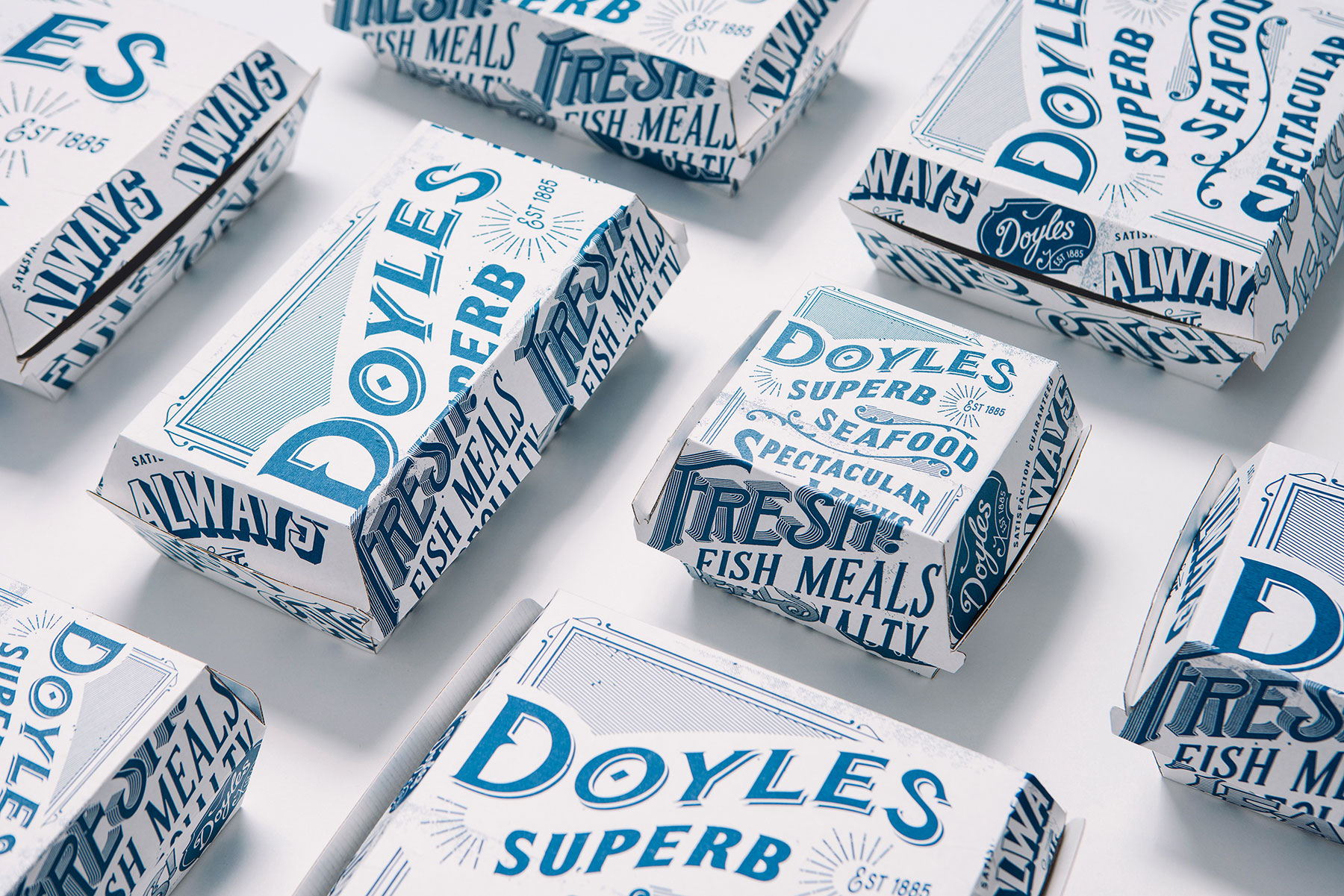
Doyles Seafood Comes With Packaging Inspired By Newspaper Headlines
By
Published
Filed under
By
Published
Filed under
We love this elegant duotone packaging for Doyles, an Australian seafood restaurant. The Creative Method was responsible for the design, drawing from the newspapers of yesteryear for their inspiration.
“Back in 1885, Doyles on the Beach first opened its doors in Sydney Australia, serving seafood freshly caught by hand line. The Creative Method was approached with the task of refreshing the iconic Doyles Seafood packaging whilst retaining its history and heritage of quality, authentic seaside dining. We created a suite of packaging and collateral including food cartons, cups, signage, a poster series and newspaper menus. Working with basic printing methods, we looked at a way to maintain authenticity. We achieved a textured look emulating newsprint to adorn the menus and packaging. The use of vintage graphics and language also gives a nostalgic nod to times gone by. We used the iconic Doyles brand blue solely on these items to drive the idea of a fresh, quality seaside dining experience.”
“We gave Doyles a brand extension that focuses on history and heritage, not just aesthetics. Vintage graphics work with the production method (flexography) to make the brand feel more authentic. Typography and copy reinforces quality and what the brand stands for – ‘Always the finest catch.’”
Get unlimited access to latest industry news, 27,000+ articles and case studies.
Have an account? Sign in