These Bottled Cocktails Come With Fun Graphic Illustrations

Published


entry-kdPypxRJ-607188.jpg

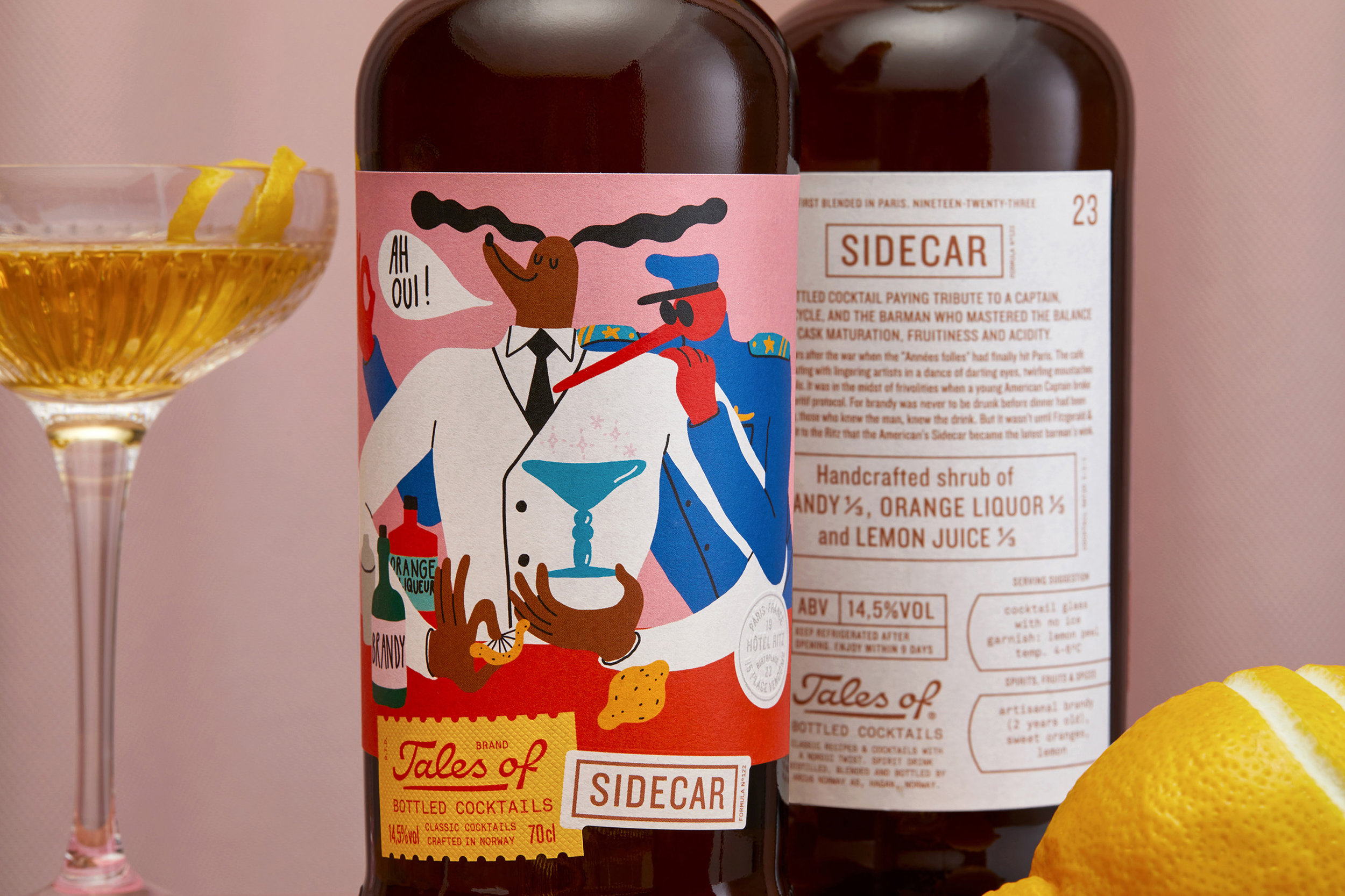
Tales Of… is a Norwegian bottled cocktail brand that comes with an intriguing look. OlssønBarbieri were responsible for the design and created labels complete with fun and funky flat graphic style illustrations that aim to capture the spirit of the cocktails inside.

“Alcoholic Ready to Drink brands (RTD) have a reputation for being sweet, childish and artificial.

The project was initiated by the department of innovation and tactical brands at Arcus Norway, who identified an opportunity to change the perception of the category by creating a series of crafted cocktails with natural ingredients for a more adult and quality focused consumer.”

entry-kdPypxRJ-607187.jpg

entry-kdPypxRJ-607189.jpg

“A growing trend show that consumers prefer alcoholic beverages with lower ABV in connection with an increased focus on health and a renewed interest for process, origin and ingredients. Male consumers in particular are the drivers for this growth focusing on convenience, freshness and taste-complexity.

We were asked to create a brand platform for this new range that would transmit craft and natural ingredients and connect with the target group of 25+. The naming “Tales of” was decided and tested by the client together with the first two cocktails: Sidecar and Oslo Mule (a Moscow Mule with Aquavit instead of vodka).”

entry-kdPypxRJ-607190.jpg

“The secret to a good premixed cocktail is really not a secret at all: ingredients. Naming and story though have proven to be as important to the success of a cocktail. Most of the cocktails we are drinking today where born between the 1880 and 1930 and the concepts is to celebrates these stories (or legends, distortions, half-truths) to reinstate the ‘soul’ of every cocktail and lift the ingredients they are made of.”

entry-kdPypxRJ-607195.jpg

entry-kdPypxRJ-607194.jpg

“We took advantage of the fact that we didn’t have any heritage, spirit brand or a bartender name to relate to, and were free to define a new look for this product category. The illustrations and storytelling offer a more crafted and contemporary take on the RTD category suggesting a committed approach to real taste and quality ingredients. The overall playful look is paired with a factual and detailed back label true to the production as well as a recount of who, where and how the drinks came to be.

An overall independent attitude is instilled in the products, triggering curiosity to try the entire range. The brown bottle contributes to communicate craft and helps to preserve the natural juice and ingredients.”

entry-kdPypxRJ-607196.jpg

entry-kdPypxRJ-607193.jpg


Agency: OlssønBarbieri
Art Directors: Henrik Olssøn, Erika Barbieri
Designers: Henrik Olssøn, Erika Barbieri, Lachlan Bullock
Illustrators: Egle Zverblyte
Custom Typography: Stefan Ellmer
Photographer: Sigve Aspelund (Tinagent)
Printer: Eurostampa
Location: Norway

This placeholder is removed when the ad slot is configured.

This placeholder is removed when the ad slot is configured.

This placeholder is removed when the ad slot is configured.

This placeholder is removed when the ad slot is configured.

This placeholder is removed when the ad slot is configured.

This placeholder is removed when the ad slot is configured.