Featured image for The Dieline's 2018 Trend Report: The Package Becomes The Canvas

The Dieline's 2018 Trend Report: The Package Becomes The Canvas

by Natalie Mouradian on 02/27/2018 | 3 Minute Read

Editorial photograph

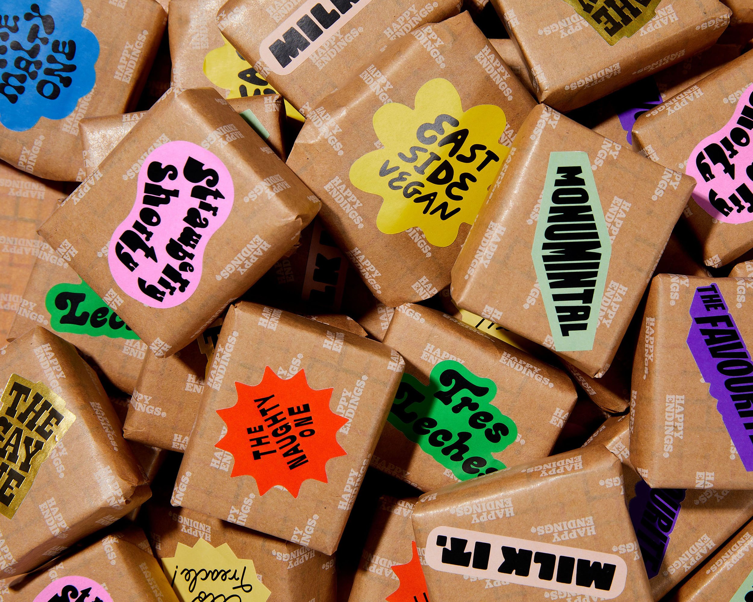
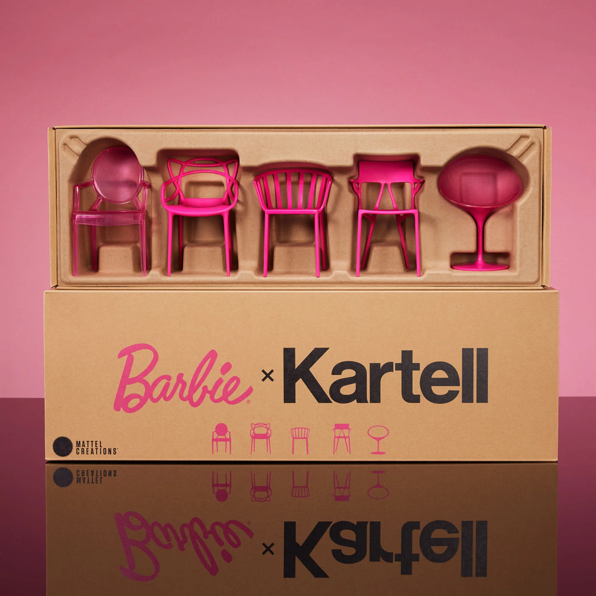
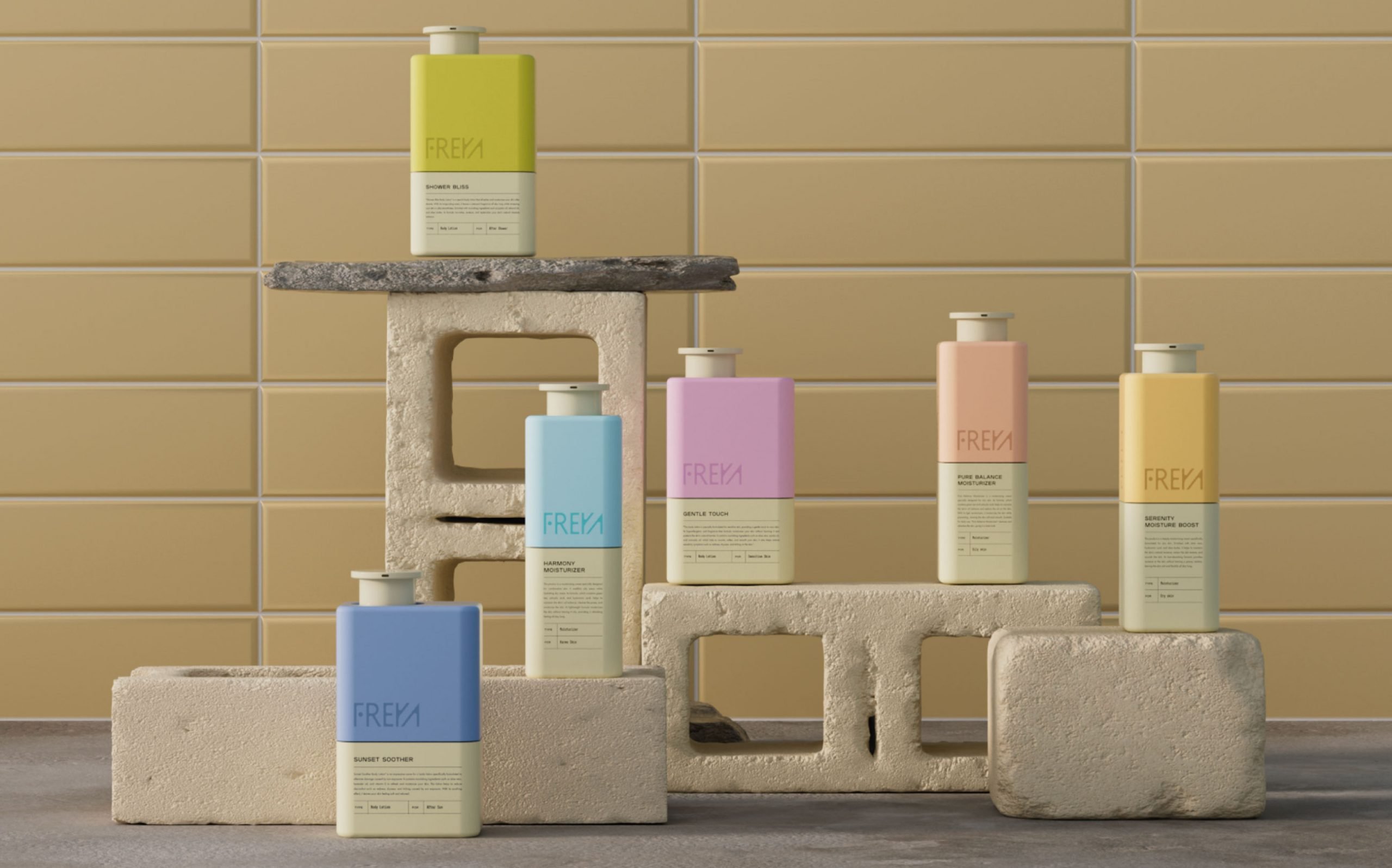
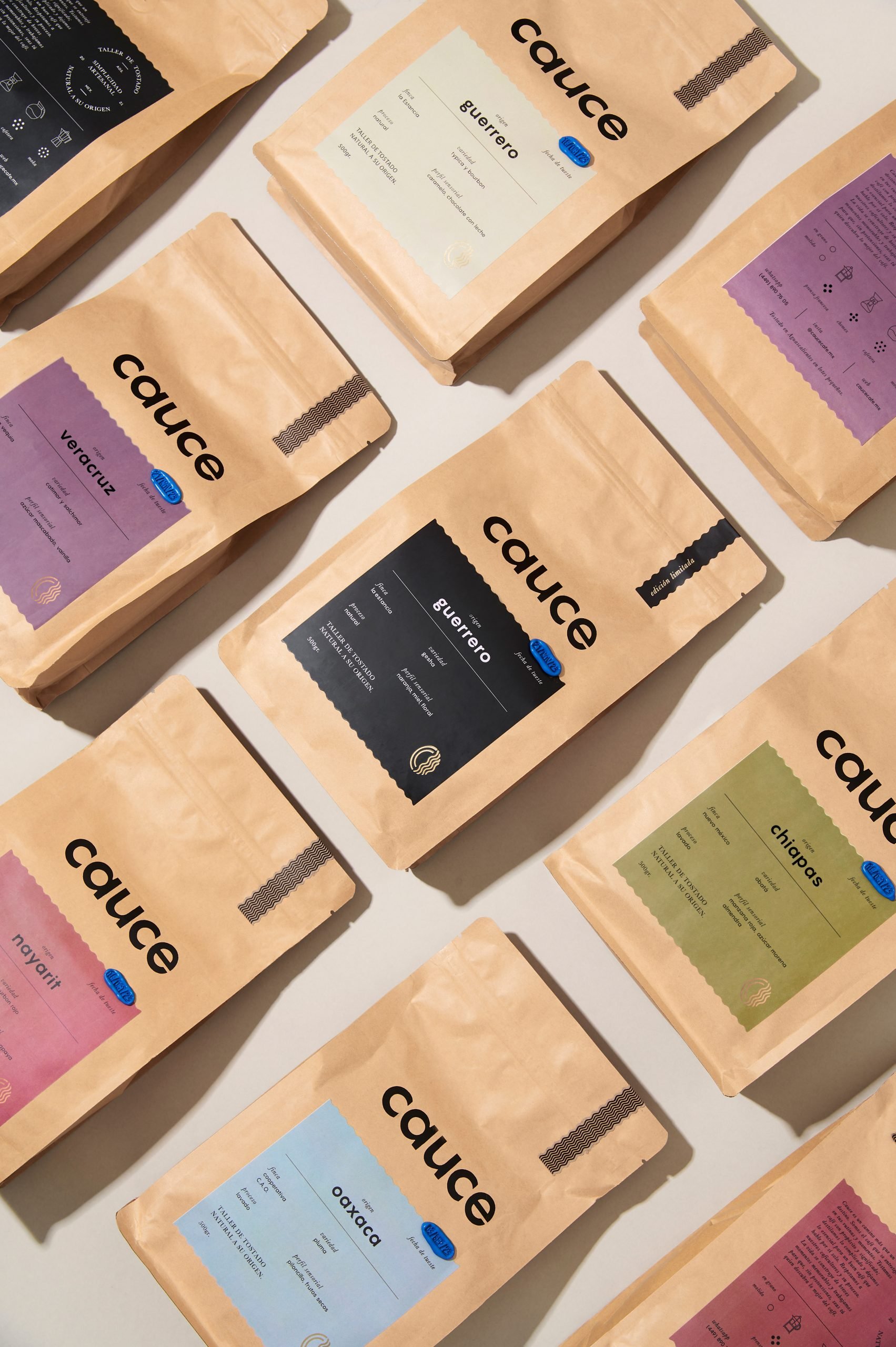
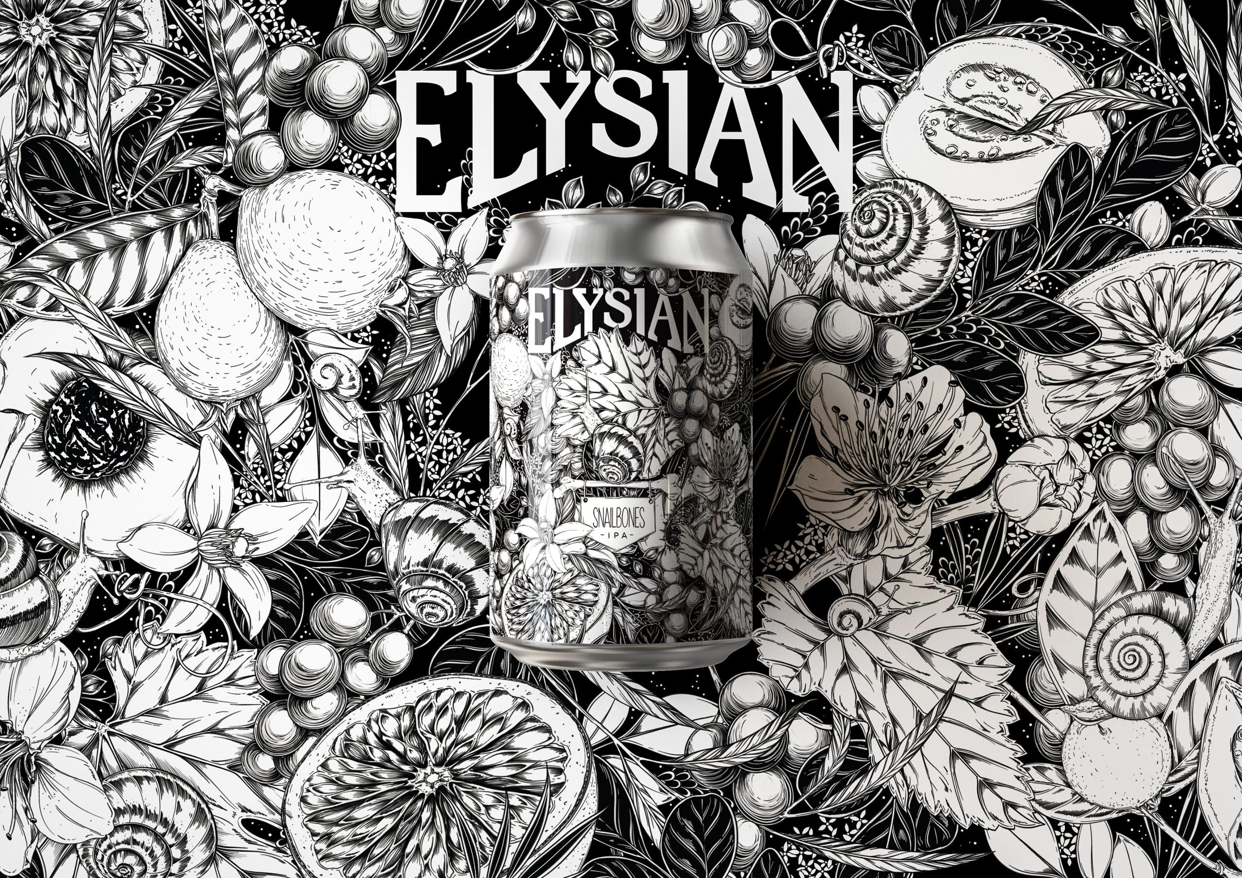
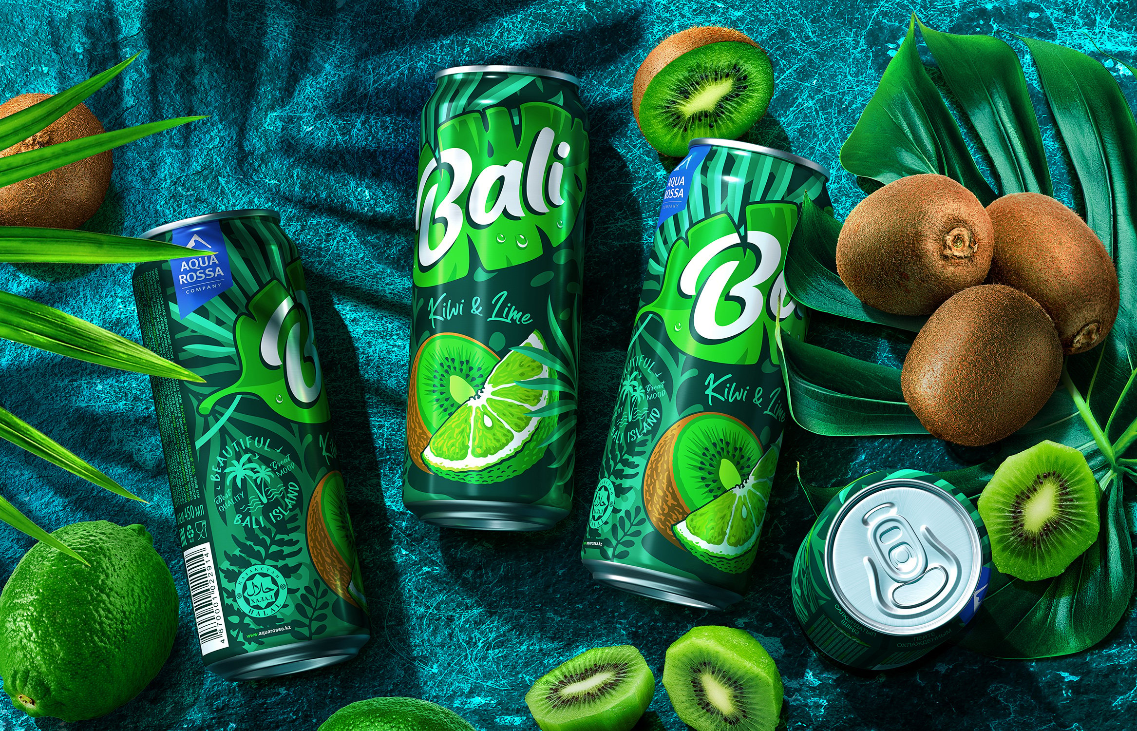
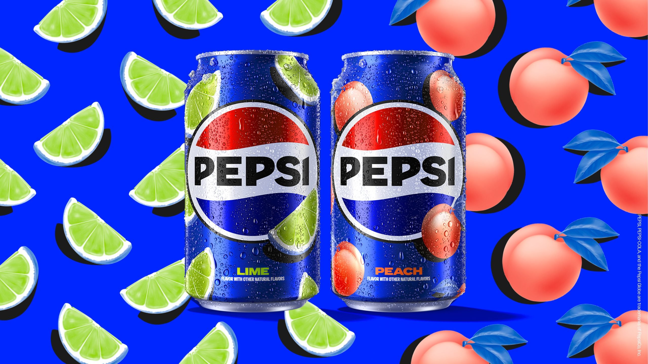
We’ve noticed a big shift in branding on packaging, to the point that it has become secondary. The package is seen as a canvas for art and design itself, and the product and the brand become the second player. Logos and typography fade into the background and the negative space is filled with colorful gradients and dynamic patterns.


Editorial photograph

Natural Science Beauty

Organic skin care line Natural Science Beauty inverts traditional design hierarchy by keeping the logo and primary information in a minimalist typeface on a plain white belly band while injecting the design with vibrancy through an abstract, hand-painted pattern on the box.

Editorial photograph

Parko

Another brand to follow the abstract color collage aesthetic is Parko, an LA-based organic and paraben-free toiletry range. Their concept of 'Back to Basics' is exemplified in the simple, geometric shapes that adorn the paired down packaging design, accompanied by a versatile but modern logotype.
Editorial photograph

Niche Tea

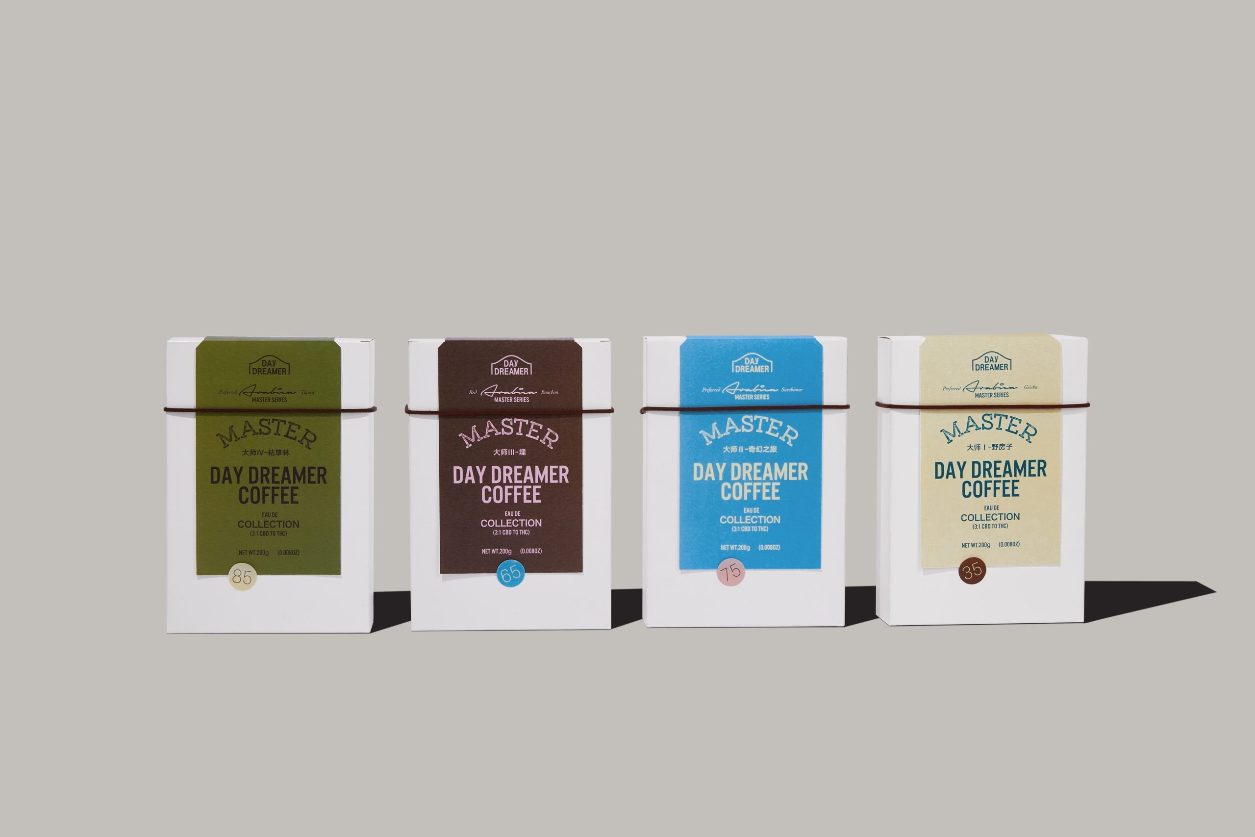
According to design studio IWANT, the minds behind Niche tea’s branding, agreed from the outset that they wanted to “create a lifestyle brand, a tea range that kicked against the glut of high street tea brands.” They developed a series of seamless patterns that were unique to each flavor of medicinal herbal teas, and created an individual graphic identity for each item, while still maintaining cohesion under the overall brand.

Editorial photograph

Commonwealth Brewing Co.

Jeramy Biggie, founder of Commonwealth Brewing Co. told branding agency Thirst, “I want to be able to visually see the flavors that I taste in the can.” With four beers in the core series, each of them has a unique flavor that was assigned its own trippy and organic abstract pattern. It’s like a 1960s liquid light show in every can.

Editorial photograph

LIFEWTR

LIFEWTR is using their bottles as a canvas and social platform to showcase the work of female artists. With only 3–5 percent of major permanent collections in the U.S. and Europe featuring art made by women, this was a great opportunity for LIFEWTR’s parent company PepsiCo to create beautiful packaging while also executing a robust digital marketing and PR campaign that further drove exposure for the message #ArtByAWoman.

Editorial photograph

ALDI

Though discount grocer ALDI’s business model might be all about the basics, they recently announced a partnership with artist, designer and illustrator Timothy Goodman for the release of their limited-edition reserve wine private brand collection. Goodman’s work lifts inspiration from the origin stories and flavor notes of each wine to bring striking color and playful iconography to the bottles with his bold, text-based illustration style.