Featured image for The Dieline's 2018 Trend Report: Neutral Is the New Luxury

The Dieline's 2018 Trend Report: Neutral Is the New Luxury

by Natalie Mouradian on 02/27/2018 | 4 Minute Read

Editorial photograph

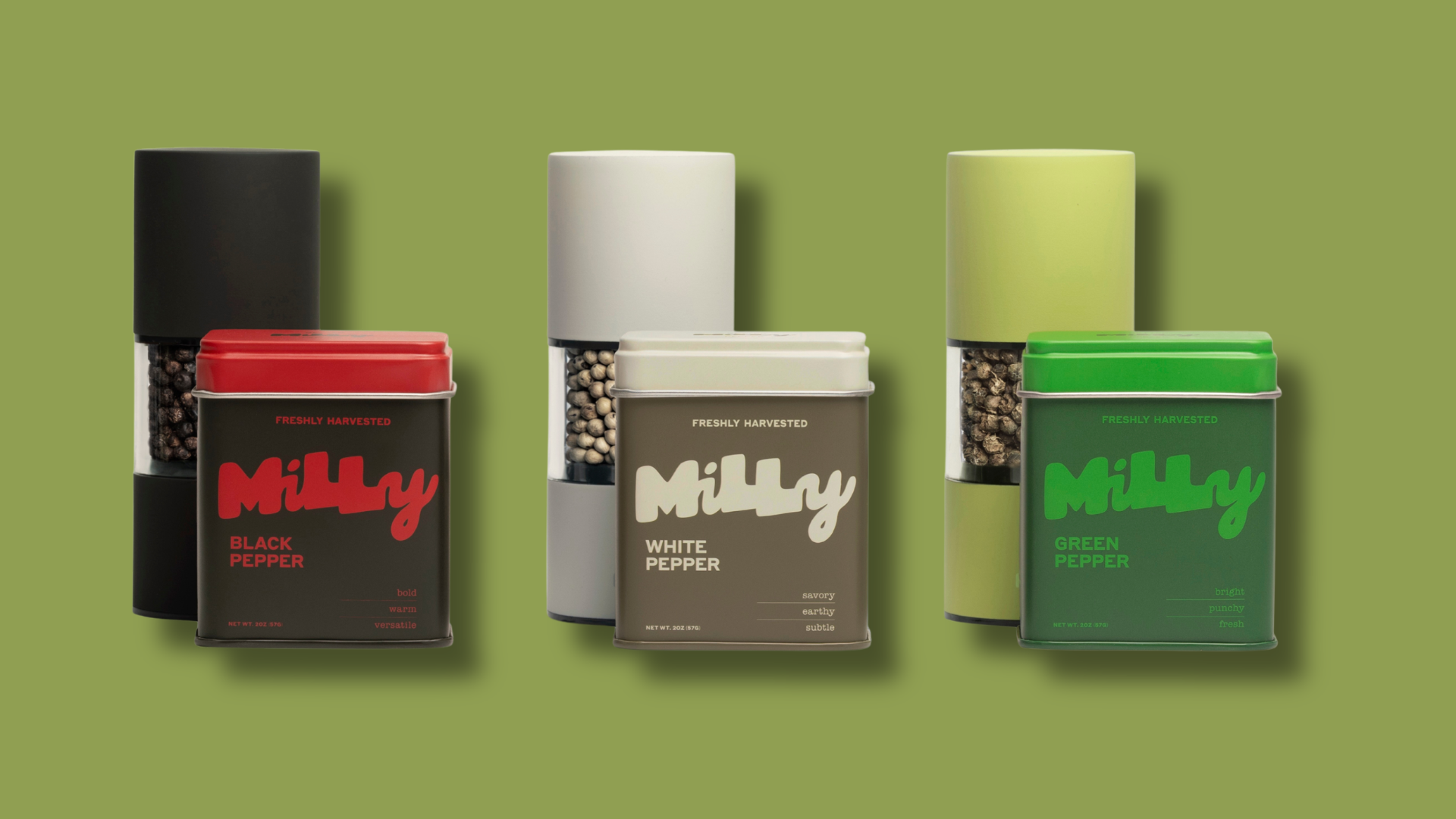
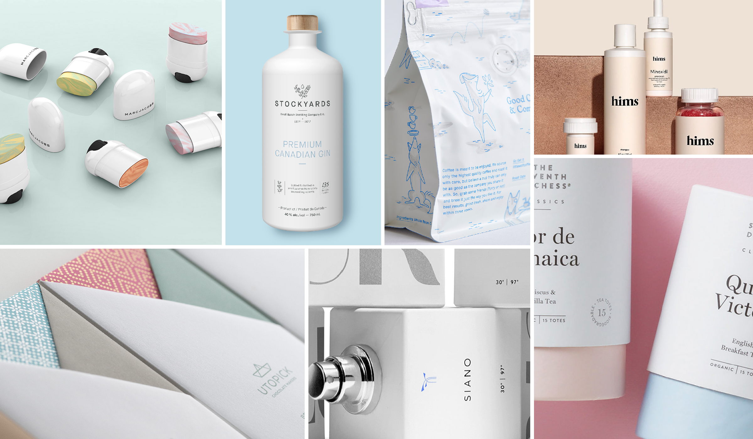
Luxury is no longer defined by excess and exclusivity, but by openness and neutrality. There’s a sophisticated restraint to the brands in this category, with plenty of negative space surrounding delicate serif and sans-serif logotypes, offset by uninterrupted color palettes of warm earth tones and soft pastels. There’s also a little ornament appearing on these minimalist designs, and the gender-neutral identities for many fragrance and skincare lines lets brands avoid being defined as “made for men” or “made for women” and are rather unisex in their function and appeal.

According to Fusion's Massive Millennial Poll, 50% of young adults between the ages of 18-34 believe gender exists on a spectrum, so for brands who are responding to the changing attitudes of their customers, that means the way products are packaged and marketed is also shifting away from the binary categories of male or female. The packaging material still looks expensive and that it comes at a premium, but the branding language feels approachable, designed exclusively for everyone.

Neutral is the new luxury.


Editorial photograph

The Seventh Duchess

The Seventh Duchess is an organic tea brand with a luxurious visual identity to match its name. The Duchess came to design firm Boxer and Co. for a slight makeover of two lines in their collection—their classic and apothecary teas. Boxer and Co. did away with the previous tin packaging system and replaced it with an elegant tube structure.

Editorial photograph

Marc Jacobs

Marc Jacobs designed a beautifully minimalist cover-up that blends away imperfections with marbleized dual hues to brighten, neutralize, and conceal hyperpigmentation for an even complexion.   

Editorial photograph

Hims

Hims is a modern-thinking brand seeking to remove the stigma of things like erectile dysfunction through design. Hims offers direct-to-consumer shampoos, serums, vitamins, and pills delivered right to your door for those concerned about hair loss or ED. The packaging for Hims is also subtle and sophisticated—it’s something that consumers won’t feel the need to stash away in the deepest, darkest corners of their medicine cabinet.

Editorial photograph

Utopick Chocolates

Utopick Chocolates takes you on a journey through its packaging. Inspired by Spanish explorers, the origami paper resembles that of the sails of a ship. Lavernia & Cienfuegos developed the packaging which easily unfolds (and refolds) seamlessly, allowing consumers to marvel at its beauty even after they’ve indulged.

Editorial photograph

Little Wolf

Perky Bros designed the whimsical illustrations that help define the brand identity for small-batch coffee roastery and café Little Wolf. Each package tells a story inspired by owner Chris Gatti’s Siberian Husky, River, in an effort to make specialty coffee more accessible and a little friendlier. “The design’s inspiration is one part science and two parts storybook. The system showcases a methodical, yet quirky typographic system and a restrained icy blue color palette reminiscent of the eyes of a newborn wolf pup. Our protagonist River can be found playfully illustrated throughout the identity as the loyal shopkeep—reminding everyone that specialty coffee shouldn’t be taken too seriously.”

Editorial photograph

Stockyards  

Stockyards minimalist branding was directly inspired by the small batch distillery’s organic ingredients. ''We wanted to explore a direction that would clearly stand out in a cluttered, highly competitive, sea of clear glass.' says Albert Strano, Creative Director at S+PDA. 'We chose a white, matte overall coating for the bottle and a fairly minimalist approach to the bottle decoration. The brandmark is a testament to the ingredients with space for the distiller to mark each bottle with its unique batch number. Craft spirits the way they were meant to be."