Striking the Balance Between a Little Bit Street Style & a Little Bit Luxe

Published

Filed under

Who would have guessed the big 5-0 could look so good? Even after fifty years, the Adidas Superstar remains a best-seller, coming in at number four in sales in 2017. Duy Dao, a designer in Los Angeles, decided to give Adidas some special treatment with a concept design for its iconic shoe’s 50th anniversary.

“Respecting the product and doing good research was the key,” explained Duy. He wanted the design to have a perfect mix of luxury while also maintaining a bit of edginess—style, but also grit. So for inspiration, Duy turned to not only the brand but the shoe itself.
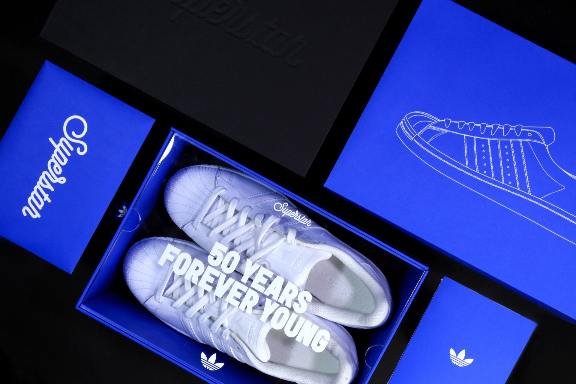
“My design approach was to focus on the shape and the blueprint of the shoe,” he said. “The Superstar is an iconic silhouette. Tributing its heritage was a big challenge.”

The Superstar came out in 1969, offering consumers a low-top version of the Adidas Pro Model. Originally produced for playing basketball, the shoe became particularly well-known when Run DMC wrote a song called My Adidas, and the footwear became a must-have in the hip-hop scene. Fame plus a versatile design has made these “Shell Shoes” (called so because of the rubber on the toe box) a favorite of sneakerheads. And while the shoes were released in basic colors—black, white, navy, and red—Adidas now offers an array of colors, and you can even customize your own.

So how exactly do you go about creating a design for such a well-loved, recognizable product? Don’t complicate things. A shoe like the Superstar has gained fame for a reason, and a design needs to work with it rather than against it. “I think the shoe has gained a reputation, and it deserves to be recognized just by looking at simple gestures.”

What’s not so simple, though, is the color—a rich, vibrant blue which pairs perfectly with the straightforward design. This part proved to be the most challenging part of the whole project. “I ran through a stack of different shades of blue in the Pantone books,” Duy admitted, “and ordered so many blue samples papers during my research. It’s always frustrating when you are a perfectionist but the reward is worth it.”

Indeed, the hue is spot-on. Energetic and fresh, it exudes the same kind of “quintessential Adidas.” Plus, blue has been part of the Adidas brand, and Duy felt it was appropriate to incorporate it into his own design. “Who doesn’t love a hint of Yves Klein’s blue, am I right?” Duy asked.

While developing the packaging, Duy also wanted to go beyond the design and incorporate an experience into the project. “I felt like, for a special edition shoe like this, it would be such a great opportunity to link it to a bigger campaign,” he explained. “And that was when the idea of making the ‘Forever Young’ campaign comes in, and then it extended to the posters and invitations.”

The complete concept comes together beautifully—from the colors and the fonts to the box and invitation you hold in your hand. What Duy loves most about it, though, is something you can’t quite put your finger on. “It’s the overall vibe, the feel of the project,” he said. “I think that’s a really important aspect of any design project.”

This placeholder is removed when the ad slot is configured.

This placeholder is removed when the ad slot is configured.

This placeholder is removed when the ad slot is configured.

This placeholder is removed when the ad slot is configured.

This placeholder is removed when the ad slot is configured.

This placeholder is removed when the ad slot is configured.