How Simple Shapes and a Unique Mascot make Cocoro Rooster Stand Out

Published

Filed under


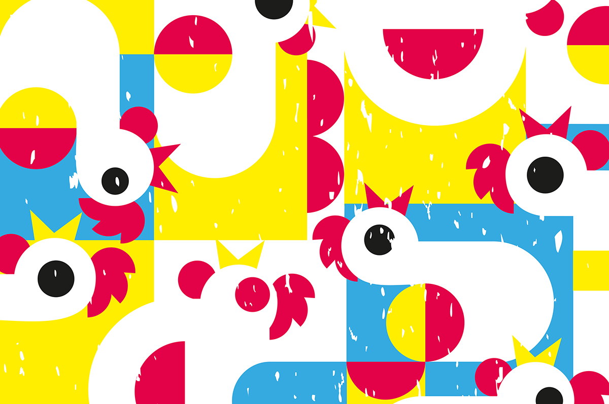
Cocoro Rooster is a chicken fast food restaurant that is guaranteed to make you smile. The mascot, an adorable, bug-eyed chicken, is fun and instantly recognizable, giving the brand a jolt of energy. Galilea Torres, the designer at Tropical Branding Lab behind the project, told us a bit more about creating Cocoro Rooster’s mascot, developing the bold design, creating something that would appeal to both kids and adults, and more.

Walk us through the design process that you went through for this project.

Galilea Torres: Every project I work on starts with a briefing, where I ask  my clients about their target audience (to whom the product is directed to), basic aspects of their product or service (mission, vision, values, etc.), then we assign adjectives to the brand as if it were a person (appearance, personality, preferences, behavior).

Once the information we have on the brand is studied, I create a moodboard for inspiration with all the qualities and aspects that we have to highlight in it, then we initiate the sketching process, and then we move on to the digital side of things.

For this project we started by creating one of the chickens that make up the pattern used in the COCORO Rooster packaging, we geometrized it and started to carefully put it together; this is the stage that took more time to complete, since getting to the final result took long and busy hours.

For the creation of the logo, we decided to go for something that was hand-made to balance out the rigidity of the geometrical forms in the pattern and thus be a more friendly brand that was apt for public of all ages.

For the creation of the main chicken character, several proposals were made on sketch that would comply with the requirements for kids toys, then the selected character was modeled in Cinema 4d and printed for testing, giving us the result we used in the branding package.

What was one of the biggest goals you set out to achieve with Cocoro Rooster packaging and how did you accomplish it?

Galilea Torres: The biggest goal I had while creating the branding for Cocoro Rooster was to develop a brand that was dynamic, fun and that projected such an energy that it would likely put a smile on people’s faces.

In order to achieve that, I made the decision of creating a pattern that:

  • would catch the attention of both kids and adults alike
  • had an interesting and functional composition
  • adapted to our packaging design
  • would be entertaining for the consumer
  • would ultimately generate a pleasant experience at the restaurant, creating a lovemark

What was the most challenging part of this project? What about the most enjoyable part of it?

Galilea Torres: The most complicated part of this project was to properly integrate the different illustrations that make the pattern, and later translating them onto a kid’s toy from which we intend to make collectible versions of.

The most pleasant experience of the project was to give life to the restaurant’s character, assigning a personality and appearance to it and figuring out how to bring all of the different parts of the design together until the project is completed.

How did you balance making the brand appeal to both kids and adults?

Galilea Torres: In order to make Cocoro Rooster an appealing brand for children and adults alike, we played with certain elements like the different size and color of the eyes of the chicken, along with creating a handmade logo that had more organic and natural-looking lines.

If you could pick one aspect of the finished design that you like the most or feel especially proud of, what would it be and why?

Galilea Torres: The aspect of this design that I liked the most was creating the packaging of the cup and paper bag by using the pattern I designed. It turned out to have a bold appearance and is quite fun to have in your hands, making it hard to want to get rid of.

Share one lesson that you learned while developing the finished product.

Galilea Torres: The biggest lesson I learned from ideating, developing and designing Cocoro Rooster is that the brands that captivate people start with simple shapes (circles, squares, rectangles), and the compilation of these forms can create great designs.

This placeholder is removed when the ad slot is configured.

This placeholder is removed when the ad slot is configured.

This placeholder is removed when the ad slot is configured.

This placeholder is removed when the ad slot is configured.

This placeholder is removed when the ad slot is configured.

This placeholder is removed when the ad slot is configured.