Featured image for Typography is The Star of This Wine Packaging

Typography is The Star of This Wine Packaging

by Natalie Mouradian on 09/21/2017 | 2 Minute Read

Editorial photograph

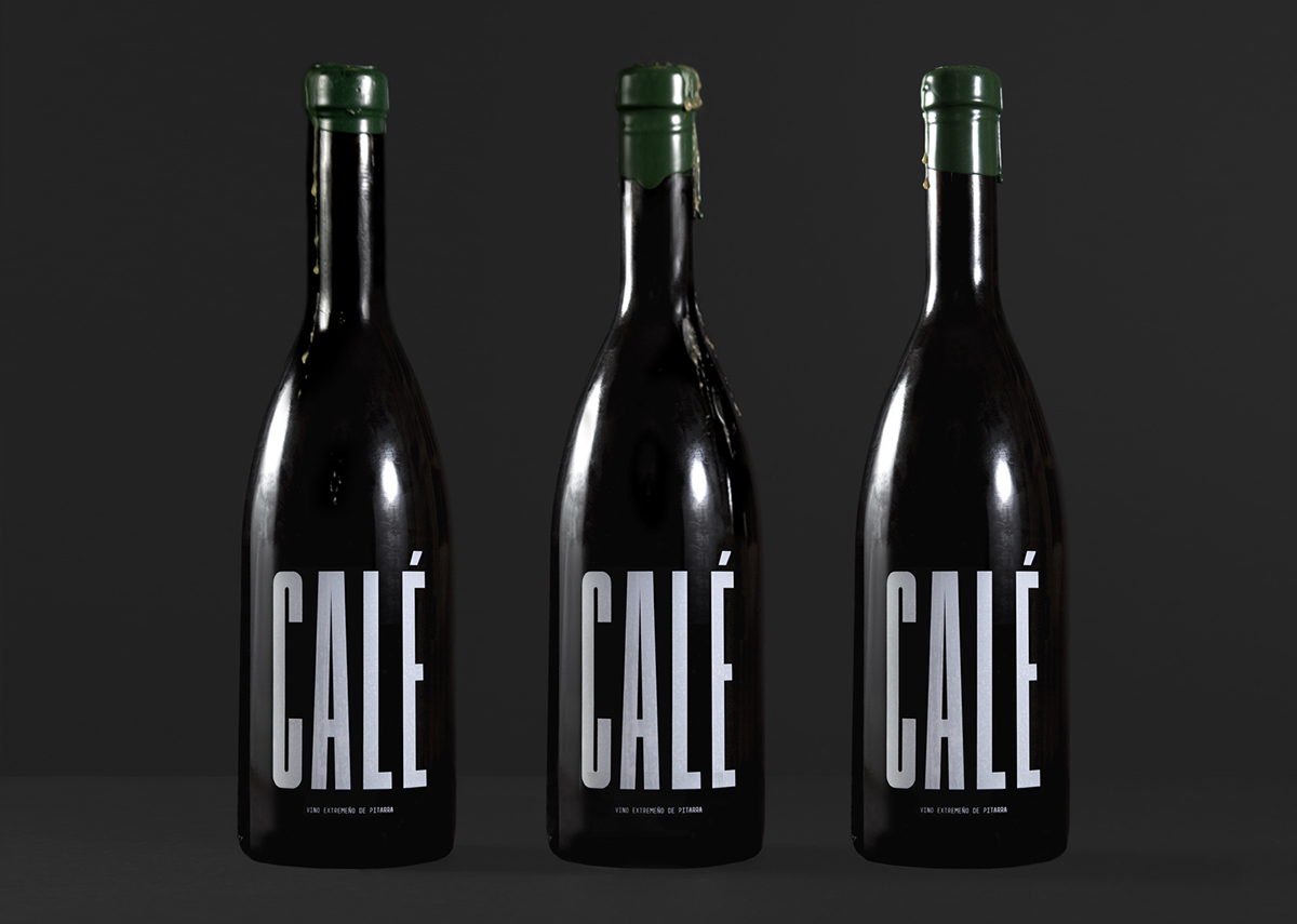
Stupendous Studio designed the packaging for CALÉ Wine, taking a simple yet bold approach. The main element of the packaging is the typography, which is comprised of a striking condensed typeface that takes on the life of the package.

Editorial photograph

“CALÉ is a small production of a ‘pitarra’ style wine from Coria, province of Cáceres region of Extremadura, Spain.

Calé is produced using traditional winemaking methods which includes fermentation in clay pots dating back to the Roman Empire.”

Editorial photographEditorial photographEditorial photographEditorial photograph

“The design concept incorporates each colour of the Extremenian flag (green, white and black). The production of the artisanal wine using traditional techniques extends through to the packaging with the use of green wax as a seal and a manual brass stamp. Each seal is manually created and therefore unique. The number 17 on the top references the year of production. CALÉ is silk screen printed on the bottle in a bespoke condensed typeface, FM CALÉ.”

Editorial photograph

Designed By: Stupendous StudioLocation: London, UK