Tyku Sake Is Bringing Chic Modernity To A Traditional Japanese Spirit
By
Published
Filed under

By
Published
Filed under
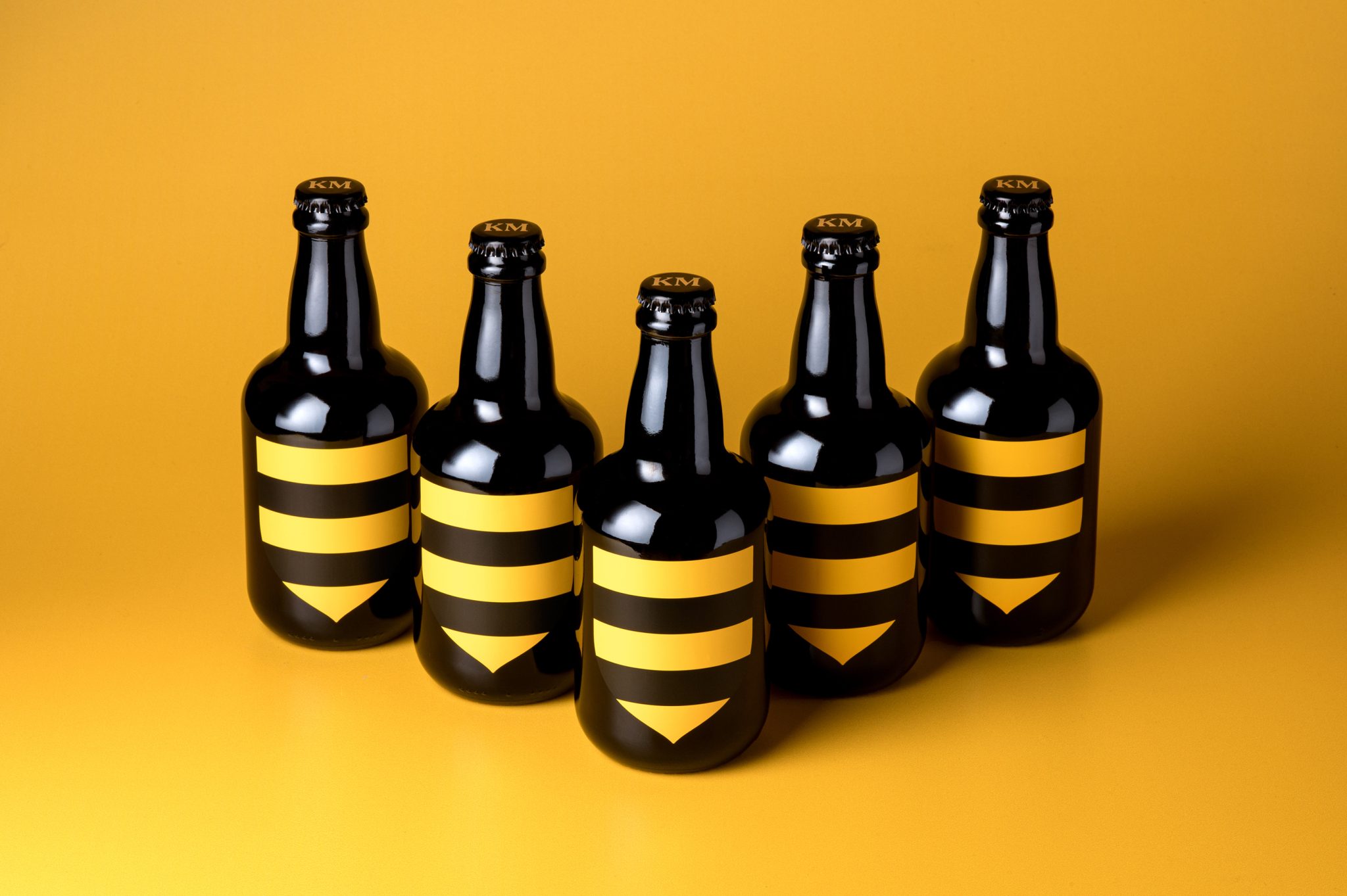
Established has come out with this sophisticated and chic packaging for Tyku Sake. The design features a Japanese look but embodies a classy modernity through and through.
“Established was asked to redesign the existing sake packaging, structure and graphics for this sake to reflect a new brand positioning targeting a clean living, urban consumer who values wellness and pursues a balanced lifestyle while still drinking. The product was for a US based consumer but needed to maintain a genuine Japanese look. Balanced river stones were introduced as a witty representation of both the crafted/ balanced blend of the wine and also the ‘zen’ positioning and yoga enthusiast target demographic. The typography was set in a Japanese format and the bottle shape was redesigned to keep the iconic triangle shape but softening the feel in the hand. We added a subtle reference to the shape of porcelain sake jars in the neck and cap.”
Designed By: Established
Get unlimited access to latest industry news, 27,000+ articles and case studies.
Have an account? Sign in