Featured image for How Extraordinary Wolffer Estate Pink Gin got its Extraordinary Packaging

How Extraordinary Wolffer Estate Pink Gin got its Extraordinary Packaging

by Theresa Christine Johnson on 07/19/2017 | 4 Minute Read

Editorial photograph

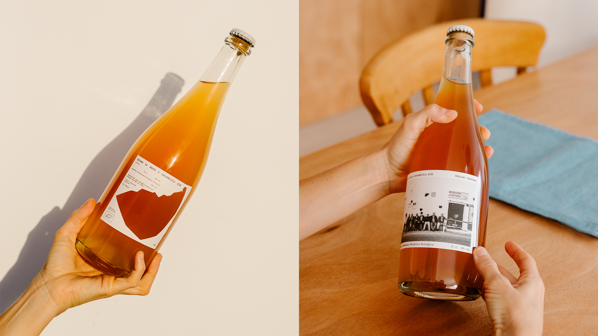
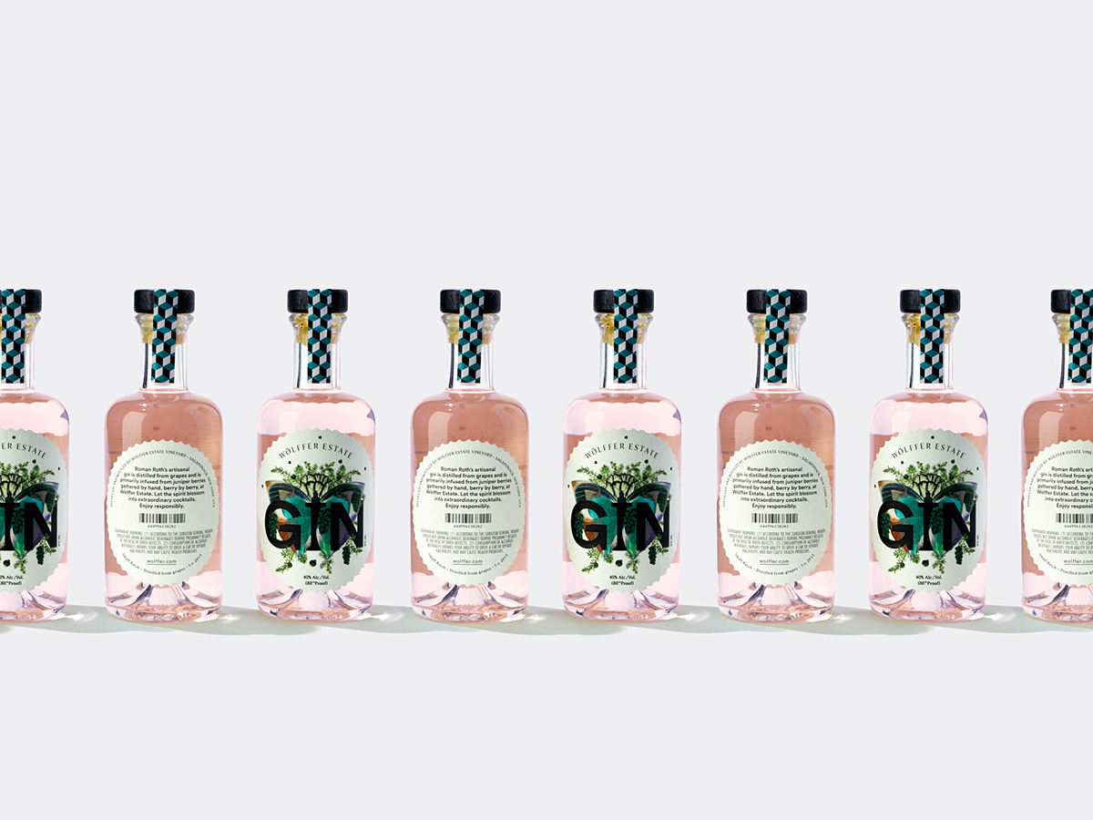
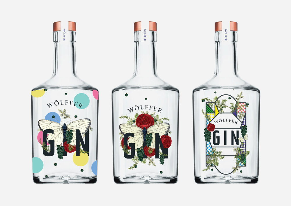
The botanical designs on Wolffer Estate Gin are simply mesmerizing, aren’t they? Since IWANT had designed some of Wolffer’s other products, they naturally turned to the agency for something fresh, fun, and botanical-inspired. We spoke with IWANT to learn a little bit more about clarifying the direction for their design, keeping things low budget, and much more.

Walk us through the design process that you went through for this project.

IWANT: We have a close ongoing working relationship with the team at Wolffer—Gin (and brandy) were mooted some time ago, but it was a side project for winemaker Roman Roth, something he was playing with slowly on the side, experimenting, perfecting. It had been in the air a while before Wolffer said it’s time to get going. We wanted something fresh and different—initially I wanted it be quite minimal using type and screen printing the bottle. But the more we messed around we all agreed it should be more playful and in keeping with some of the botanical influenced designs we were using on other Wolffer products.

Editorial photographEditorial photograph

Early iterations of Wolffer Estate Gin.

What was one of the biggest goals you set out to achieve with Wolffer Estate Gin packaging and how did you accomplish it?

IWANT: One of the biggest goals for us was to make something befitting all of Roman’s work. This is a small batch Gin, so budgets weren’t huge because of the low volume—it was a toe in the water and we needed to make a label that would say high end without loads of money thrown at it. We accomplished this with thoughtful, considered design, the little branded banjo strip across the black wooden stopper really changes the overall appearance and the whole thing has been really well received. Next batch will much bigger and Wöllfer will be producing a larger bottle too.

Editorial photograph

This gin is certainly different from other gins on the market! How did you balance a standout design that is equally elegant?

IWANT: I’d like to think this is what we do well across a lot of our design—we tend to look at what else is out there and then look the other way as much as we can. Of course we have clients, and they sometimes tend to reign you in but here I think we managed to create something that is different enough and both classically beautiful and elegantly contemporary. 

What was the most challenging part of this project?

IWANT: As I mentioned previously, we were originally looking for something more minimal but it felt too removed from other aspects of the brand. After several rounds we settled on the butterfly design. Native Americans see the butterfly as a symbol of change, joy and colour which is the perfect analogy for Wolffer Gin in both execution and finished product. We also made bunches of grapes from Juniper berries as reference to the Rosé wine base of the Gin.

Editorial photographEditorial photographEditorial photograph

If you could pick one aspect of the finished design that you like the most or feel especially proud of, what would it be and why?

IWANT: I love how the brand pattern in the banjo brings the design together—we use the pattern on wine capsules which has become a strong identifier for the brand and here it works equally as well.

Editorial photograph