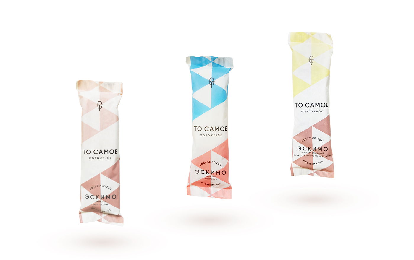
This ice cream is a total throwback. A Soviet classic treat reborn, DN Group obviously pulled from posters and patterns of the past to create something hip for To Camoe sweet treats.
“The packaging design has continuity with the style of Soviet advertising posters and classic patterns of the past. Why exactly Soviet classics? Because we wanted to emphasize the naturalness of the product, this ice cream—it’s a classic 15% cream made by Russian state quality standard from natural milk, the same as was thirty years ago.”


