
Sullivan Higdon & Sink is illustrating SONIC® Drive-In variety with its most recent packaging design. The 24 unique illustrations use core brand colors, Ben-Day dots and bold line work yielding simplified graphical representations that evoke a sense of crave-ability. The look is clean and simple, with iconic brand elements — SONIC’s red button, core menu products and SONIC’s playful voice — interspersed throughout.

“Working on a new family of packaging was an exciting opportunity. One of the primary challenges was coming up with an engaging concept that would carry SONIC’s story and could adapt to the vast production variables in a project with so many elements of different sizes, shapes and materials,” said Creative Director Jon Kowing. “Our creative team designed a smart solution that worked across all elements. Bold, yet simple illustrations of iconic SONIC offerings are paired with brief, witty anecdotes to reinforce the unique experience of grabbing something to eat or drink at SONIC. All of this is done in a way we hope brings a smile or a chuckle.”
Each illustration is paired with a story to help immerse the customer in the SONIC brand. In tandem, the illustrations and product stories invite customers to explore SONIC’s variety and customizability. Customers who engage with the packaging are rewarded with tidbits of the brand story hidden under flaps on bags, on the bottom of tot cartons and sprinkled in with the legal copy.

![CornDogMockup_v2_LR[5].jpg](https://static1.squarespace.com/static/52536652e4b007332ef4ecf4/5941c6f629687fe9d2553e63/5941c6f62e69cf730d17a097/1497483003818/CornDogMockup_v2_LR%5B5%5D.jpg)
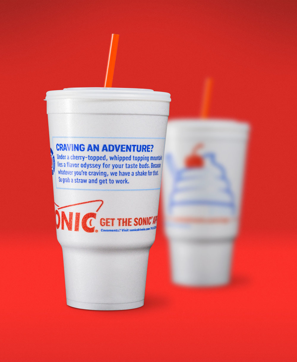
“Because of its unique drive-in experience, many people enjoy their SONIC drinks, ice cream and food while sitting in their car, which means they spend a little more time with the packaging. By wrapping the message around cups and bags, we’re encouraging customers to view the entire message,” Kowing said. “And for those who are hooked, we’ve included small ‘Bite-Sized Wisdoms’ we hope they enjoy discovering along the edges and undersides of elements. Lastly, we may have added a few extra comments in the legal copy that SONIC’s legal department didn’t actually require us to include. It’s our way of thanking anyone who spends time with us.”
This invitation for customers to dive deeper into the packaging doubles as an invitation to explore the wide range of customizable menu products. The concept puts the customizability of SONIC’s menu front and center — from Chili Cheese Tots to adding vanilla to a classic Cherry Limeade — and inspires fans to discover a new favorite each time they SONIC.


Agency: Sullivan Higdon & Sink
Client: SONIC® Drive-In
Creative Director(s): Jon Kowing & Parc Masterson
Art Director & Illustrator: Jerad Nun
Copywriter: Matt Stacks
Photographer: Brian Yates
Launched: Spring 2017


