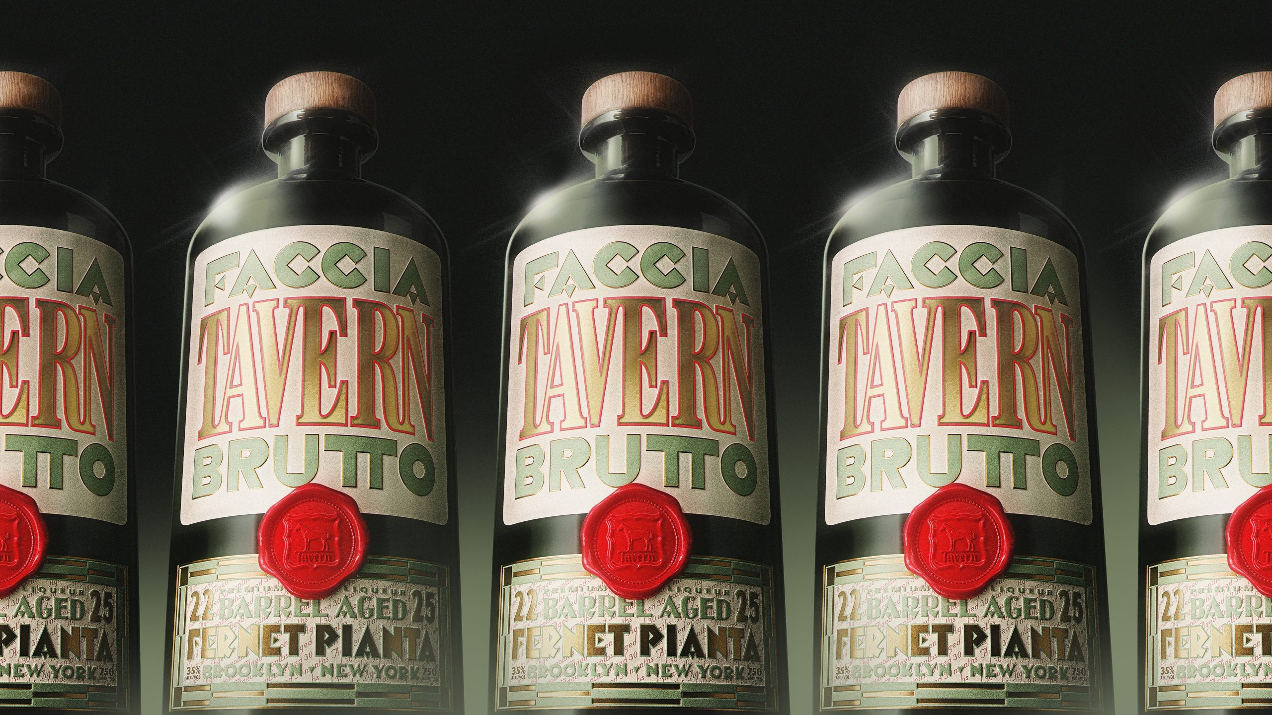

As trend leaders and enthusiasts, designers have a natural inclination to move with the times, and their ‘of-the-moment’ design aesthetic wants to reflect that. To them, the inverse can feel like “bad design.” This approach in packaged goods is often visually aspirational, and can be an effective way for a brand to spark new consumer love. Yet, it often hinges on the designer’s perception of beautiful, rather than beauty being in the eye of the beholder. It begs the question, if, in using this approach, are designers designing above consumers instead of to them? The 2016 election revealed a chasm between aspiration and pragmatism, and asks those of us in the marketing, advertising and design world: do we really know who we are talking to? Get it right and you’ll create emotional resonance and brand relevance. Get it wrong and you could miss your target entirely.
A quick glance at the state of current package design shows a trending upscale, premium aesthetic that is increasingly aspirational and very much tied to the narrative around authenticity. Over the last five years, small new challenger brands have leveraged aspirational design as a way to disrupt established brands at shelf and create an immediate, more intimate connection with consumers. In telling their story – the process, the people, their purpose – they have answered a growing consumer desire for more information about the products they consume. As successful as this approach has been though, not every brand has a consumer on the other side that cares for this level of information. What the election seems to have exposed is a stronger desire for transparency and a better understanding of what they are getting versus a narrative of authenticity. For brands, rather than serving up a story that helps consumers get to know them better, there seems to be an opportunity to tell consumers simply what they are getting and provide clarity.
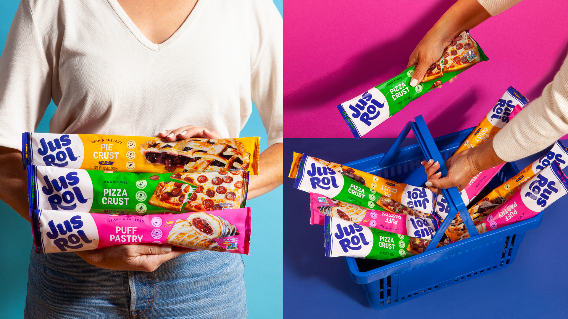
Pragmatic design, as an alternative design approach, is a visual reaction to the saturated use of authenticity and its design language of premium. It directly speaks to the need for a different design aesthetic that values honesty over storytelling. It is rooted in functionality and accessibility, and values what the consumer thinks is beautiful versus the designer. It conveys that “what you see is what you get” but creates small moments of relevance using fonts, surface textures, language, layout and propping materials that feel essential and familiar. Its core traits are function, style, and clarity and is designed, but not overpromising. At shelf, it feels accessible and not off-putting.
