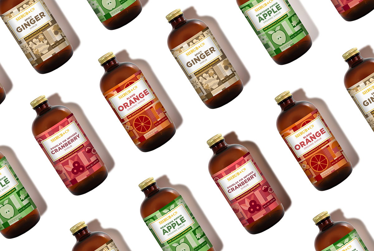
Nørvik Design created the fun packaging for Shrub & Co., a line of syrups that help add flavor to cocktails or sodas. The designs feature flat geometric-styled illustrations that reflect each individual flavor.
“The following product shots showcase label designs for a boutique company in Berkeley, CA. When approached by Shrub & Co to redesign their existing set of labels, we decided to start fresh and move away from their current look and feel. The concept was to create a flexible graphic system for all eight flavors. The systems has four sets of geometric illustrations that reflect that flavor. Each label has a color palette that uses three Pantone swatches, mixed ink add additional colors to the palette, and the final touch is gold foil stamping. The label system is versatile and can adapt to the addition of new flavors.”
Studio: Nørvik Design
Client: Shrub & Co.
Designer: Gretchen Natvig
Printer: Cellotape
Location: San Francisco, CA


