Featured image for Jeanneret Wines Take Inspiration From the Swiss Movement

Jeanneret Wines Take Inspiration From the Swiss Movement

by Natalie Mouradian on 06/07/2017 | 4 Minute Read

Editorial photograph

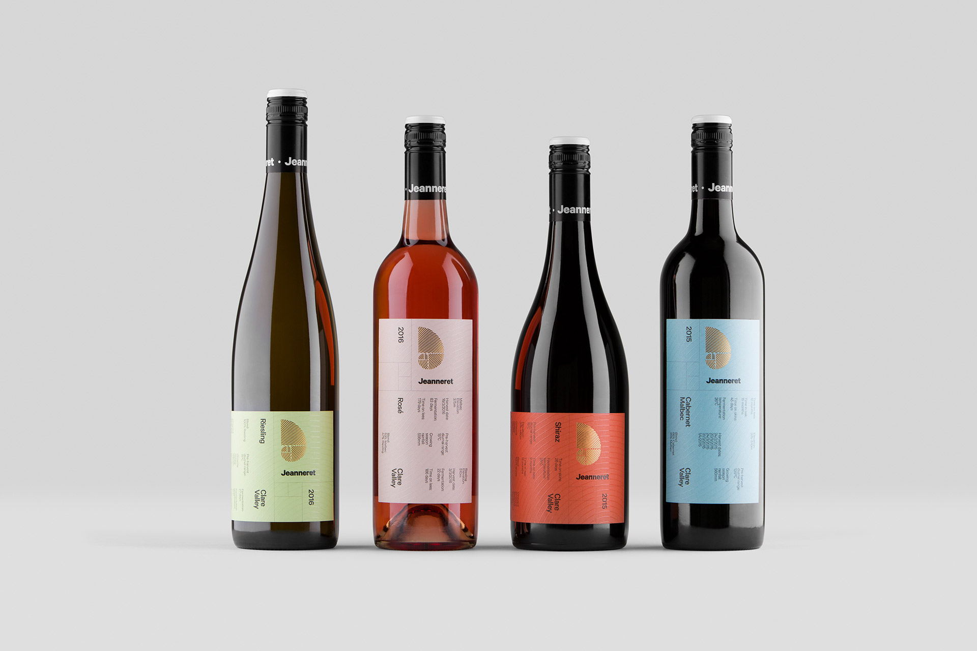
Studio Band designed the packaging for Jeanneret Wines. The packaging takes inspiration from the Swiss Design movement by incorporating a very streamlined and organized approach to the layout within its label.

Editorial photographEditorial photographEditorial photographEditorial photograph

“Every bottle of Jeanneret wine is truly a product of its environment. The unique characteristics of each vintage reflect the growing conditions of the year. Nature’s divine influence is apparent in every sip.  The brand’s former logo, a nautilus shell representing the Golden Ratio, referenced family ties to Le Corbusier, the Swiss-French pioneer of modern architecture. Le Corbusier’s designs were based on proportions found in the natural world – a practice that echoes the winemaking process and inspired our approach.” 

Editorial photographEditorial photographEditorial photographEditorial photograph

"We evolved the nautilus shell into a stylised ‘J’, and incorporated undulating vines. The label designs were built on proportions seen in Le Corbusier’s work, and the palette was based on his system of harmonious colours. The structure and typography took inspiration from Swiss-Modernist design, more broadly."

Editorial photographEditorial photographEditorial photographEditorial photograph

"Growing conditions and the year’s winemaking process now take pride of place on each bottle’s label. Variances in vintage can be read, as well as tasted. The immutable influence of nature is now impossible to ignore."

Editorial photographEditorial photographEditorial photograph

Agency: Studio BandCreative Director: Chris Cooper Designer: Shane Keane Location: Australia