

Pond Design revitalized the Classic Jameson Whiskey Reserve Range.
“The work to revitalize three world-renowned Irish Whiskeys, Jameson Black Barrel, Jameson Crested and Jameson Signature started in the Jameson archives at the Midleton Distillery in Cork. Each whiskey in the Heritage series tells a unique story embedded in the brand’s rich history.”


“The design celebrates the brand’s history through preserving the heritage of John Jameson on one hand and through injecting each design with humour, modernity and attitude on the other. The main design element on the bottle labels are inspired by old Jameson labels, original details such as handwritten journals, beautifully bound old books, diaries and ledgers with their rich old-world detailing.
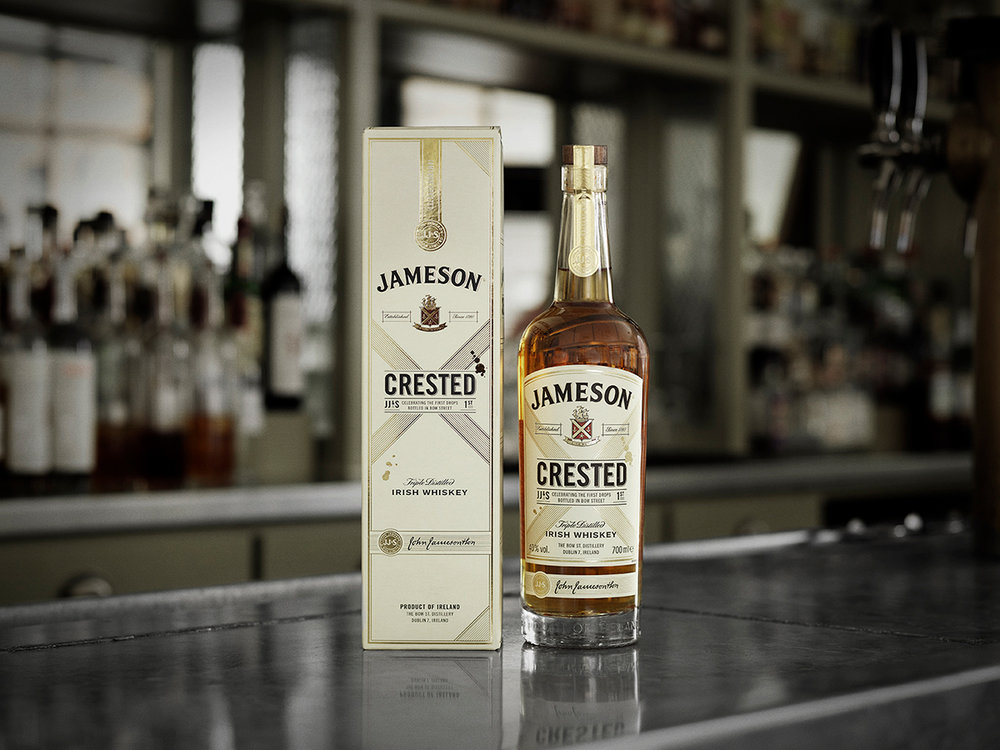
Crested is a tribute to the first whiskey that was bottled by Jameson in Bow St. The Cross, or ‘X’, is taken from the Jameson Crest, and is also a nod to the Crested Ten, the original blend that was produced and bottled by Jameson. The Gold Drops are a way of expressing Crested’s unpretentiousness and signify the ‘first drops bottled in Bow Street’.”

“The World for Black Barrel is inspired by the world of the charred barrels. A series of lines placed under the product name inspired by the centre-piece of the Black Barrel story – the barrels themselves. The lines represent the hoops that hold our barrel staves together.
The Charcoal Smudge is inspired by the charred wood created when toasting barrels. The smudge creates a contrast to the gold foil super premium details. The smudge aims to recreate the feeling of being touched, as if someone has handled the charred planks and left fingerprints.”


“Signature is a tribute to John Jameson’s dedication to quality and details. In the old days, barrels would not leave the distillery without John Jameson’s signature – a guarantee of their quality. That historical fact has built into the design. The label’s primary element is the angled band featuring the product name. The inspiration for this is drawn from the forward-leaning movement of John Jameson’s signature. The running ink from Jameson’s own pen is therefore an important part of the design.”


Designed By: Pond Design
Client: Jameson Whiskey, Irish Distillers, Pernod Ricard
Location: Stockholm, Sweden


