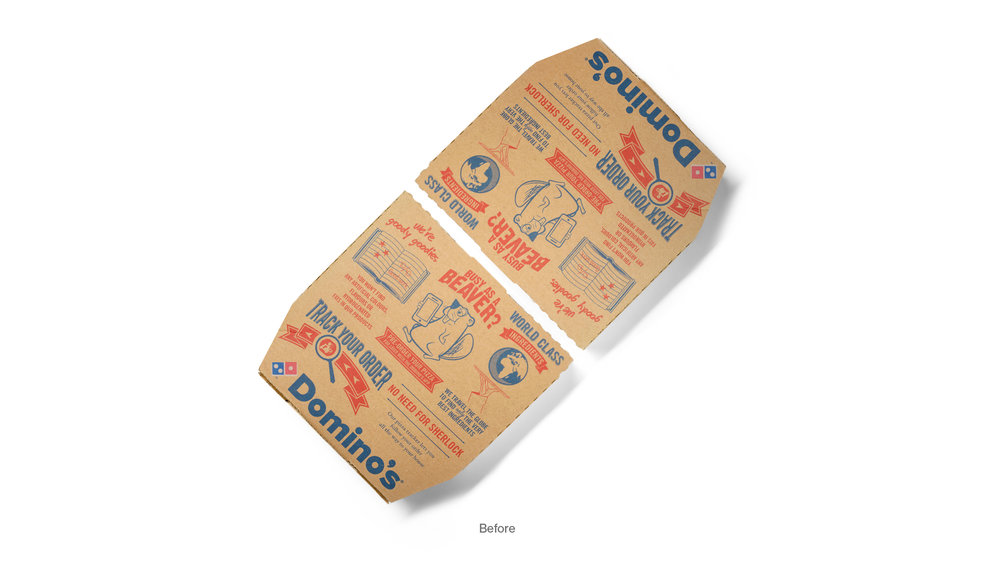
Over the years, Domino’s packaging had become overloaded with generic messaging that had little impact with consumers. Our task was to make Domino’s the definitive article once more by redesigning its delivery boxes in the UK. Knowing that 96% of all Domino’s pizzas are sold in pairs, we made the brand’s iconic red and blue domino logo pivotal to the design, and used the brand’s pizza combo deal as a canvas to bring it to life – one red box, one blue box. The result was bold, brave and simple packaging design. An open invitation for sharing and play.

Sean Thomas, Creative Director at jkr, adds: “Our creative goal was to reinforce the brand’s distinctiveness and make people feel proud about choosing Domino’s over a competitor pizza. The Domino’s logo is both charismatic and memorable, and we saw the perfect opportunity to translate this directly to the pack and make it a tangible expression of people coming together over pizza. The design makes an instant impact on the doorstep and means that consumers aren’t just ordering a pizza, they are ordering a Domino’s.”
All generic category information has been removed from the boxes, and the packs now only feature limited product information on the side of each box, detailing the quality of the pizza ingredients, such as 100% fresh mozzarella. High quality ink was also used on the boxes to ensure heat from the pizzas didn’t affect the design or the box, and the boxes are all 100% recyclable.”


Designed By: jones knowles ritchie
Client: Domino’s Pizza Group Ltd
Creative Director: Sean Thomas
Design Director: Brett Stabler
Designer: Luke Thompson
Strategy Director: Lee Rolston
Account Director: Leonie Payne
Global Marketing Director: Matt Parkes
Marketing Manager: Amy Maw
Location: London, UK

