The Dieline Awards 2017: Moo Yogurt
By
Published
Filed under
By
Published
Filed under


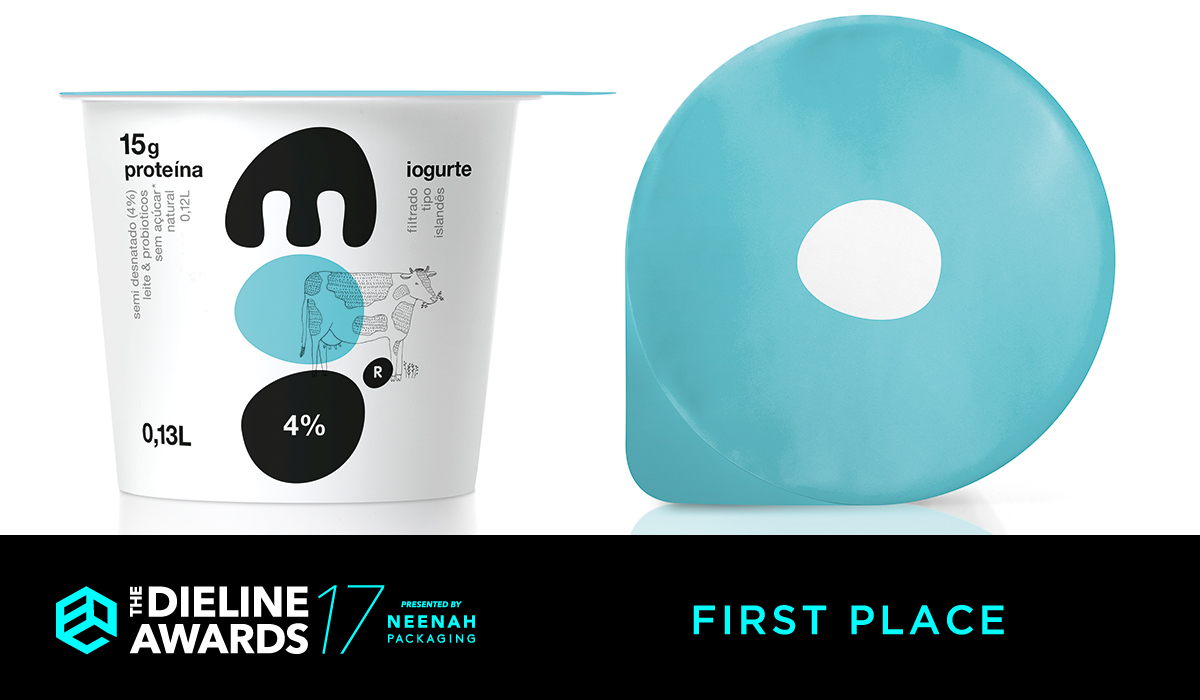
The “MOO” logo was designed after a biomorphic principle, making it memorable as it playfully recalls a plump, productive cow form or the soft, creamy yogurt body. The three letters comprising the logo-typed name serve as a generous surface-base of creative alternatives so that flavors and mixes are easily marked and distinguished in blue, green, orange, ochre and pink spots. The fine lines of the additional illustration (fat and thin cows, honey jars, plants and fruits) cooperate in creative antithesis. The lid of the containers are color-coded with just one defining spot in the middle as a reminder of the key letter “o”.


Designed By: mousegraphics
Illustration: Ryn Frank
Location: Greece