

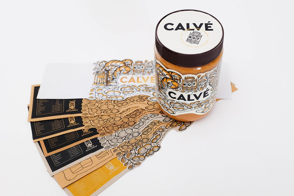
Gideon Evenhouse designed this whimsical concept for Calvé Peanut Butter. The design features an illustration of the original factory that the peanut butter was produced in, while also referencing the actual peanut plant.


“Calvé has been around for more than 100 years and has made peanut butter for over 65 years. With this project we got the task to create a new label for the Calvé peanut butter.
The label is designed with the idea to show off the proud heritage of Calvé. There is a hand drawn illustration that starts as a peanut plant but has small hints of the original factory and the company’s origin. The NOF (Nederlandse Olie Fabriek) is shown in its large and original scale and there is also text that says ‘Delft’ on the side, in order to reference the factory location.”


“The style of the illustration is a nod to the sla-olie stijl (jugendstil) from Jan Toorop. As an end result the label creates a more luxurious design that shows the proud heritage of Calvé, a pot of peanut butter that no one would mind to have on their table during lunch!”


Designed by: Gideon Evenhouse
School: Willem de Kooning Academy Rotterdam
Teacher: Niels Alkema
Location: Netherlands


