
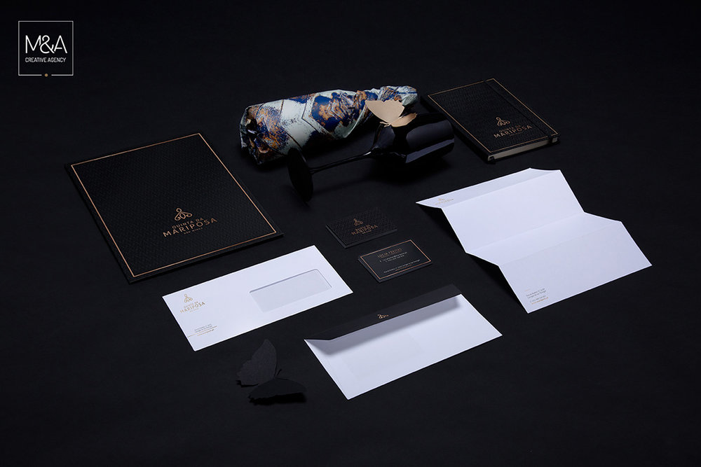
M&A Creative Agency designed the packaging for Quinta da Mariposa, a wine that takes its name and inspiration from the beautiful butterfly. The labels are decorated with illustrations of butterfly wings. The details on the wings reveal metallic foiling and an exquisite texture, which definitely bring this bottle of wine to life.


“Quinta da Mariposa, owned by winemaker Lúcia Freitas, is based in Dão, a region of Portugal that is increasing production in the wine sector. M&A Creative Agency developed the branding, stationary, and the packaging design for Mariposa wines. The color palette used was influenced by nature and aimed to reflect the splendor and uniqueness of these species of butterflies. This includes creating rising patterns with different shades and textures that characterize each wine of the brand. The finishing touch was adding a high technical rigor effect to reflect the graphic concept that was developed.”


Design and Photography: M&A Creative Agency
Location: Portugal


