Featured image for How Bornean Culture Influenced this Stunning Chocolate Bar Packaging

How Bornean Culture Influenced this Stunning Chocolate Bar Packaging

by Theresa Christine Johnson on 03/08/2017 | 5 Minute Read

Editorial photograph

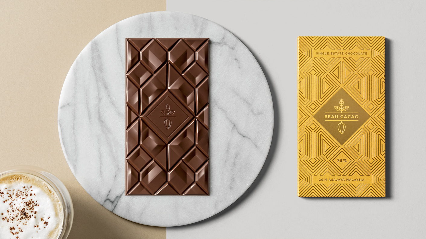
We’re big fans of chocolate here at The Dieline. So naturally we were intrigued by the simply beautiful packaging for the (equally beautiful) chocolate bars, Beau Cacao. We asked Socio Design a few questions about the process for designing such an eye-catching chocolate bar, what inspiration they turned to, and how the chocolate bar design affected the packaging.

Editorial photographEditorial photograph

Walk us through the design process that you went through for this project.

Socio Design: Our design process began with a discovery phase, which in this case was a combination of information gathering, workshops, and desk based research. This gave us an insight into founders Bo and Thomas’ philosophy as well as highlighting the pertinent features of the project, growing regions, and processes involved in making chocolate.  

During one of our workshops Bo and Thomas shared a number of books on Bornean arts, crafts, and culture. We were instantly captivated by the beautiful patterns found in traditional Bornean textiles and earthenware and wanted to make them a key part of the packaging design. During the concept phase we experimented with a number of Bornean influenced patterns that ranged from the literal to more abstract interpretations. In the end we settled on a simplified geometric pattern that acted as a metaphor for the tradition of Borneo and modernity of London.

The rest of the process centred around the refinement of the patterns, colour, and paper stocks. Paper colours were based on the flavour profiles of the chocolate, red to match smoky tobacco and paprika and yellow for caramel and brioche. This was then matched to a single foil colour to unify the range and create a flexible system of pattern and colour that would allow for future iterations. Paul at Identity Print in Kent, UK was instrumental in this process, helping Bo and Thomas to test colour combinations and paper stocks with different foils and packaging dielines.

Editorial photographEditorial photographEditorial photographEditorial photographEditorial photograph

Development sketches of Beau Cacao

What was one of the biggest goals you set out to achieve with Beau Cacao packaging and how did you accomplish it?

Socio Design: Our main goal was to produce a packaging design that faithfully communicated the origins of the cacao as well as reflecting Bo and Thomas’s bean-to-bar chocolate philosophy. We wanted the packaging to do justice to the hard work of the farmers, but still positioning the chocolate as a premium, artisan product. It’s a real treat eating the chocolate and the packaging experience had to reflect that.

How did the chocolate bar design influence the packaging?

Socio Design: Our initial designs took inspiration from traditional Malaysian textile designs. In the beginning these patterns were quite literal and illustrative but after seeing the great work by Adam Gill, the bar designer, we made some adjustments to reflect the distinctive moulded shape of the bar within. We wanted the packaging design to follow the basic shapes set out in the chocolate mould but added in extra detail to align it more closely with the original Bornean textile designs. This approach helped us to harmonise the experience, improving the transition from packaging to chocolate bar whilst maintaining the spirit of the traditional designs.

Editorial photographEditorial photograph

What was the most challenging part of this project?

Socio Design: Drawing the pattern was quite a challenge as we wanted to pay homage to the original inspiration whilst still creating something ownable that represented the brand in a contemporary way. We knew from an early stage in the project that the pattern should be foiled so took this into consideration whilst rendering the pattern design. It was a constant juggling act in order to achieve the right level of detail ensuring it would be possible from a printing perspective. 

If you could pick one aspect of the finished design that you like the most or feel especially proud of, what would it be and why?

Socio Design: The foil pattern was a huge part of the overall design. Not only does it impart a feeling of Malaysia and Borneo it also worked with the existing framing mechanism used by the logo. The foil acted as a bridge between the two worlds, the traditional life in Borneo and, modern life in London.

Share one lesson that you learned while developing the finished product.

Socio Design: I think research was key to the success of this project, both from understanding the marketplace and also ensuring that the packaging was true to the heritage of Malaysian cacao. It was a real challenge to create a design that felt premium but also true to Borneo.

Editorial photograph