
Though there would probably be a great number of medicinal marijuana advocates that would disagree with their slogan, Lofoten Seaweed aims to sell “the weed that’s good for you.” When it came time for Lofoten to design the packaging and branding for their wild-harvested seaweed, they turned to Norway’s by north.
“Norwegian consumers are not used to seaweed,” by north partner and designer Morten Iveland says, “so establishing this as a product for the average consumer was a challenge. We also had to think of foreign consumers, who are used to seaweed, as well as the professional market.”
Lofoten Seaweed features three different products—the Lofoten Umami, Ocean Truffle Salt, and Fresh Ocean Truffle—all of which are perfect for both serious, professional chefs and the amateur cook at home who aspires to create amazing food and an endless pile of dishes for their spouse to wash.
“The biggest challenge, Morten says, “was to communicate the brand to the everyday consumer. We think the key here is the balance between the visuals and materials that communicate high-end, while the personality and humorous tone of voice makes it accessible to most people.
Lofoten Seaweed also focuses on getting consumers started with seaweed in the kitchen, sharing recipes and ideas for use. That is a big part of making it accessible to the average consumer.”


“We also had to make sure,” Morten adds, “that Lofoten Seaweed came across as a serious company with a certain amount of self-confidence. The founders, Angelita and Tamara have a great sense of humor so we wanted that to let that show through the tone of voice of the brand. The trick is to balance it so it doesn’t come across as tacky. Last but not least, we had to find the perfect balance between communicating exclusive and high-end as well as environmentally friendly.”
Being an environmentally-conscious brand was significant for Lofoten, as they believe that the future of food and sustainability lies within the deeps of the ocean. “We spent a lot of time finding the right packaging for the products and sustainable materials and solutions for this project,” Morten says. “After all, most of the harvesting of the seaweed is done by hand, so Lofoten Seaweeds connection to the environment is quite direct and hands on.”


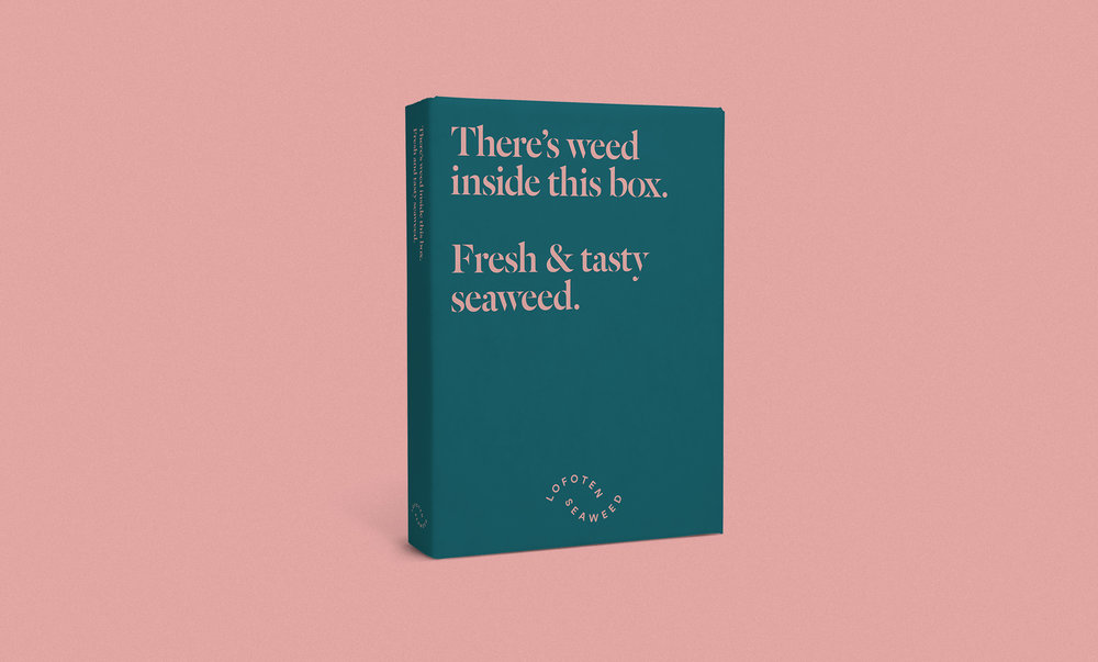
It was also a challenge for by north to find the right packaging that also managed to satisfy the aesthetic, practical, and environmental interests of the brand. “Establishing a visual identity,” Morten says, “and logotype that says seaweed from the Arctic without using clichés like northern lights and icebergs proved to be a bit challenging, as well as balancing exclusive and high-end with accessibility for everyone.”
Overall, Morten and by north are pleased with the finished product. Its playful logo and sleek, modern furnishings strike the perfect balance of high-end and approachable, while also communicating just who Lofoten is as a brand.
Now to find some of that seaweed for an extreme seasoning sesh’.


