

The packaging for Pip & Nut all-natural nut butter aims to capture the creator’s positive energy, and the result is a fun design that’s lively and a product packed with personality. B&B Studio’s design team wanted to create something that was new and unexpected but equally charming and personable.
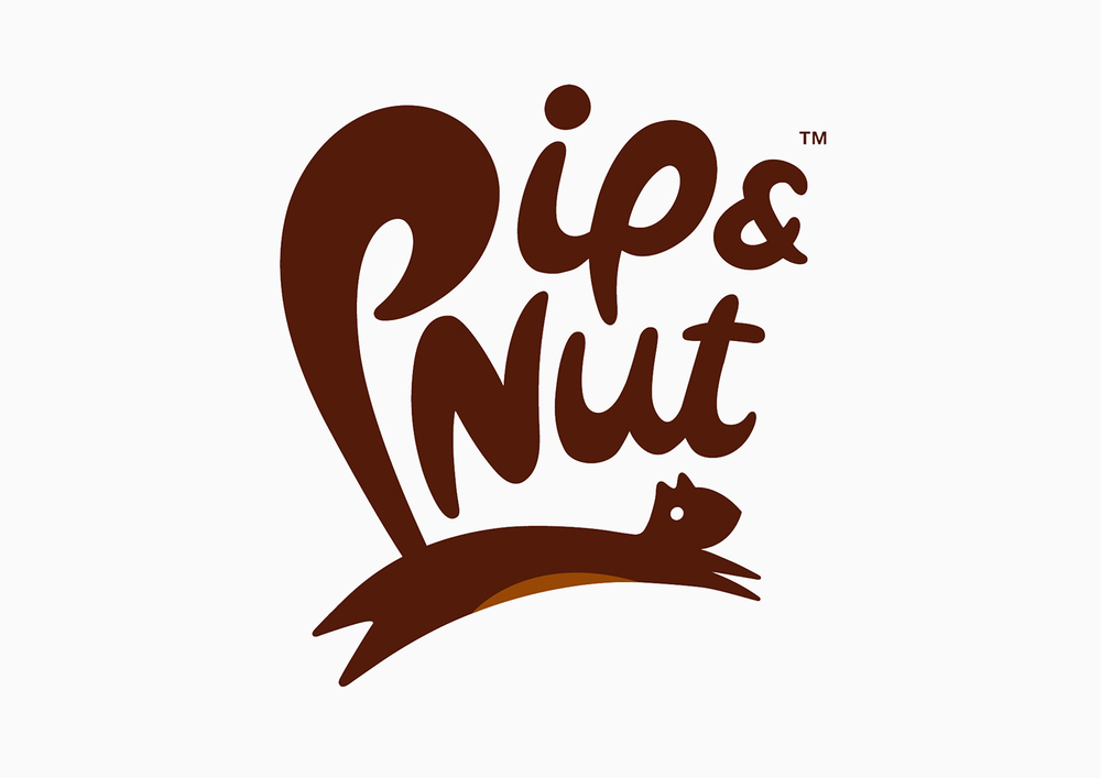
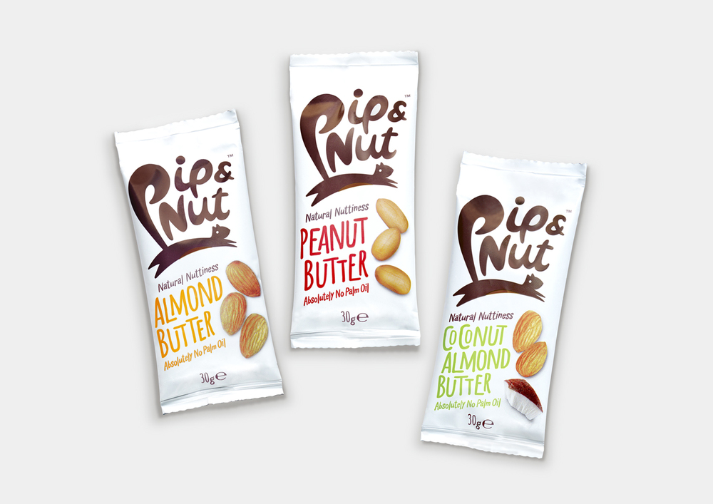
“The successful concept – a leaping squirrel whose tail forms the P of Pip & Nut – was chosen for its characterful spirit, broad appeal and subtle suggestion of spreadability. A fresh look and feel, with unfussy hand-drawn type, and straightforward product imagery communicate the simplicity of the product, which is made without artificial ingredients or palm oil. A brand line of Natural Nuttiness completes the design, communicating both the product’s values and the brand’s personality.”
Pip & Nut walks the fine line between a product that is minimal and simplistic and something that is widely appealing. The leaping squirrel breathes life into a design that may otherwise be less intriguing, with a clean white background and casual font.


