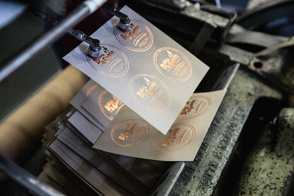
As an advocate for female entrepreneurship, Refinery 43 (a boutique brand and design studio in Massachusetts) collaborated with Bell & Goose Cheese Company — a woman owned & operated business proudly located in the great state of New Hampshire.
With a love for savoring life’s moments and nurture relationships through skillfully crafted cheese, the name Bell & Goose Cheese Company was inspired by the head cheese makers children (Belle & Gus, nicknamed goose) who are playfully represented in the logo design.


Packaging for the exquisitely crafted farmhouse cheese was designed with hand lettered vintage typography because of the handcrafted nature of the small-batch cheese. Refinery 43 also elevated the design by adding a lovely feminine touch of copper foil and brought out the raw authenticity of the farm with a textured kraft paper stock to adorn the simple white cheese wrap.
The final look is the perfect representation of Bell & Goose — an honest, women-run business with a focus on family values and enjoying the simple things in life.


Creative Direction & Design By: Refinery 43
Client: Bell & Goose Cheese Company
Photography: Jenn Bakos & Mama Sauce
Location: Massachusetts, USA


