

Spanish agency Brandsummit designed the elegant and minimalistic Pago Cativo, a wine that references incarceration in a subtle and unexpected way.

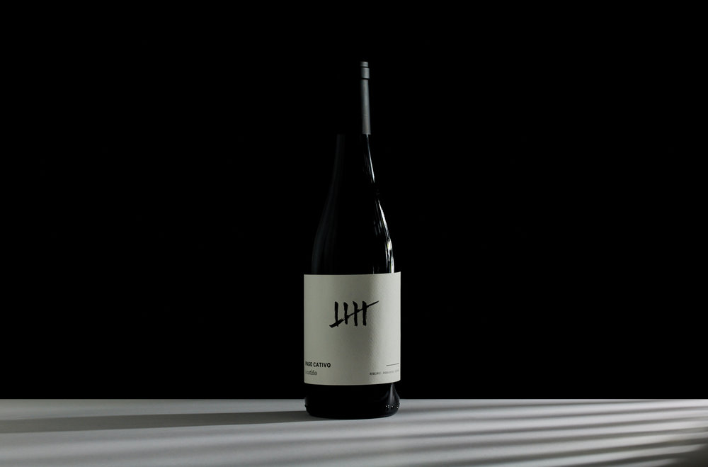
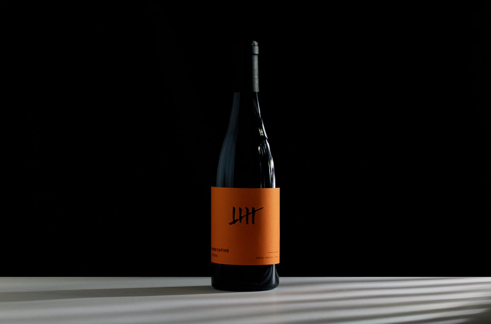

“Simplicity and meaning define the image of Pago Cativo, a Spanish wine with two presentations: White O Forte and Red O Cotiño. Its iconic design plays with the product’s name. ‘Cativo’ means ‘small’ in Galician, which is the region of the wine, but also ‘captive’, so that’s why one of the most emblematic elements of the prison was taken as the central image of this wine. Finally, the design was stamped on white and orange labels to differentiate each type of wine and highlight the glass’ color of each bottle. The paper used was Cotone Bianco Ultra WS de Manter. A simple, but memorable design, with the main feature of an inverted blind embossing.”


Agency: Brandsummit
Designer: Alex Monzó
Project Director: David Baldoví
Account Planner: Natalia Perea
Client: Vinos de Terruños
Location: Spain


