
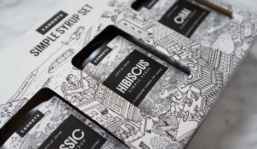
An outstanding simple syrup has the power to transform any drink, as Cahoots Cocktail Co will prove. Enticing flavors alone (like lavender and hibiscus) are an instant draw, but the packaging definitely seals the deal. We spoke with Ross Milne at Cahoots about the process for designing these lively, modern bottles, the story behind the illustration on the label, and the challenges of a double-sided bottle.
Walk us through the design process that you went through for this project.
Ross Milne: Both myself and the other founder come from design backgrounds. Early on, we discussed outsourcing the brand and packaging work to avoid being consumed by one aspect of the product development. John was interested in working on the brand, and its been led by him ever since. It helped to treat the project as if it were a normal client/design partnership. John assembled references and mood-boards in order to discuss possible directions. Rounds of feedback and design pushed the project forward. We focused on building brand assets that could be utilized across a lot of applications. When we encountered a decision where a leap of faith was necessary, we tried to say yes more than no; a luxury in graphic design.
What was one of the biggest goals you set out to achieve with Cahoots Cocktail Co packaging and how did you accomplish it?
Ross Milne: The legacy, pre-prohibition emphasis in bar products was already well explored by the time we started on Cahoots. We felt there was room for a brand that took a different approach, something that was light-hearted without compromising sophistication. Cocktails should be fun, and Cahoots is intent on making it accessible for anyone to create great looking, delicious cocktails from home. The combination of illustration with a black and white palette struck the right balance.


Why did you choose to go with detailed, beautiful illustrations for the packaging?
Ross Milne: The illustration commissioned from Lucy Engleman is loosely based on Vancouver, Canada, where Cahoots is based. The scene distorts scale by turning buildings into bar tops and making fruit larger than life. The brief imaged a metropolitan environment with everyone hopped up on Cahoots.
We knew that a strong brand would build credibility quickly, so we invested a disproportionate amount of our total budget in one illustration. It was the kind of decision that would probably have been denied in a typical client/design partnership, but we felt it was important. The illustration—together with lettering also provided by Lucy—became the backbone of the brand.

What was the most challenging part of this project?
Ross Milne: Most of our competitors use a boston round bottle, so we wanted to be distinct by choosing a bottle that contrasted well. We settled on an option that references Canada’s maple syrup tradition and the classic booze flask simultaneously. It worked to distinguish ourselves, but going against the grain created a number of design and production challenges. It turned out that a double-sided bottle is hard to mass-produce. There’s a reason why so many products are in round bottles.


If you could pick one aspect of the finished design that you like the most or feel especially proud of, what would it be and why?
Ross Milne: Having spent our careers working for clients, being in total control was a rarity. It allowed us to make decisions quickly, and put our mark on every aspect of the brand and packaging. As one of the founders, I am also a type designer. My Charlie and Echo typefaces worked really well for the support type and it’s been gratifying to incorporate details from our design practice.
Share one lesson that you learned while developing the finished product.
Ross Milne: A few brand assets, used consistently, can go a long way.


