New Zealand agency makebardo designed the playful packaging and branding for Lillevik Alpine, a cider with strong European influences. Without artificial additives this refreshing cider has a perfect balance of sweet with a powerful flavor, all the while serving up great design.

“We’ve created a logo based around an attractive illustration shield. The design of the shield was inspired by the name ‘Lillevik Alpine’ that refers to a family holiday home in Norway belonging to the maker of the Cider.”
“Regarding the morphology of the shield we decided to work with lines, responding to the connection between Europe and Oceania. This is one of the main values that the brand has.”


“We wanted to reflect the origins of the maker, since the taste of the cider blends between a traditional European flavour and the freshness and modernity of Oceania. Our goal is to communicate an honest identity of a product with a simplicity that makes it great. It is important to clarify that the decision to create a shield was not based on defense or heraldry. The family’s memories and special moments in their Alpine house are reflected and commemorated in this small postcard.”


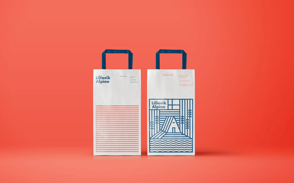
“There is a relevance and intention that underpins every choice. The typography, colour palette, label material and print finish, all give to Lillevik Alpine Cider an impactful and appropriate visual identity. We believe that the blue shield over the red background creates a personal and different approach in this product category that generates an impact on the street.”

Agency: makebardo
Location: New Zealand


