Hair care brand Toni&Guy today unveils a new brand identity and packaging design across its full range of hair care and styling products. The new design and identity has been developed by branding and packaging consultancy PB Creative.
The agency was briefed to create a new design that would showcase the brand’s strong fashion roots, conveying its eclectic and bold personality, and also to emphasize its London heritage.

Staying competitive
The primary objective of the redesign was to ensure that Toni&Guy stayed relevant and competitive in a crowded market filled with premium brands focusing on salon quality and strong heritage.
Ben Lambert, Co-Founder and Creative Director at PB Creative, explains: “Against a backdrop of fierce competition, it was time for Toni&Guy to create a new design that captured its own vibrant personality and translated it in a way that would make a striking impact on an audience driven by bold statements and fashion-led design.”

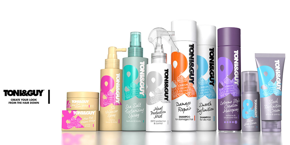
Bringing the ampersand to life
The key to unlocking this challenge and at the heart of the new design is the enlarged ampersand. PB Creative then honed in further on Toni&Guy’s rich heritage, using the brand crest as a watermark to reinforce its credibility and boost recognition.
Lambert continues: “the ampersand is a means of bringing out the brand’s bold personality, so by making it the main focus of the design, we are reinforcing this fact whilst creating a system that allows us to clearly differentiate across the extended range.”

Enabling easy navigation
The new wash and care range utilizes the ampersand equity to inject color and life into the packaging, creating a bold and vibrant fixture in store, as opposed to the previous design, which was predominantly white.
Another key objective for the redesign was to improve navigation across Toni&Guy’s extensive product range. The new design adds further color and vibrancy to the existing canvas colors used across the range.
Kate Cholmondeley-Smith, Global Brand Director for Toni&Guy, adds: “Fashion and individuality are at the heart of TONI&GUY. The new design is a perfect combination of these two elements. The striking use of color through the ampersand and crest, particularly for the wash and care range, is a significant shift for us.”
The new packs will be rolled out from September 2016, following an initial limited edition launch featuring designs by guest designer Roksanda in May which adopted this new aesthetic.

Designed by PB Creative
Country: United Kingdom


