SHS Drinks today unveils a complete reinvention of its ready to drink (RTD) brand WKD, in time for its 20th anniversary later this year. The visual identity, branding and packaging design has been created by global brand design agency jones knowles ritchie (jkr) and will roll out in October.
Designing for a modern audience
jkr began work on the WKD brand in April 2016, following a competitive process. WKD owner, SHS Drinks, wanted to reinvent the brand in order to cater to the needs and attitudes of their target market of 18-24-year-olds. Research revealed a big gap in consumer interests and demands since the brand launched in 1996, so a revitalised brand design and visual identity was required in order to engage this audience.
Brushstrokes of bold colour
jkr created a central design concept of an exclamation mark, taking inspiration from the existing rectangular WKD mark and setting it above a flexible dot. The new symbol represents the brand’s sense of fun and excitement, using the dot as a versatile icon that flexes to tell a story whatever the format.
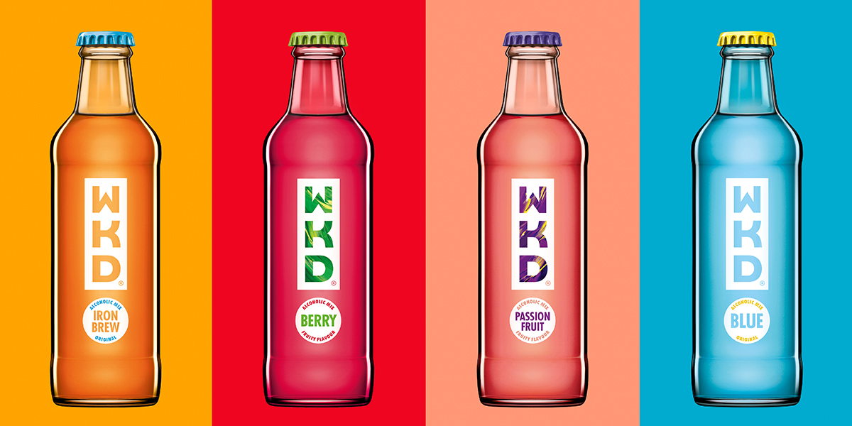
The agency chose to hero the bold colours associated with the WKD brand. These colours are used in the secondary packaging for the bottles, and also framed through the logo itself as part of the lettering on the brand mark for the WKD Blue and WKD Iron Brew bottles.
The designs for WKD Berry and WKD Passion Fruit feature bold, oil-painting inspired brushstrokes to highlight the flavours, resulting in striking, simple visuals that stand out on shelf and highlight the exclamation mark concept.
The bottle caps are also brightly coloured in contrasting shades and feature symbols and designs which further emphasise the element of fun.
Adam Swan, design director at jkr, explains: “Vibrancy and bright colours have always been part of the WKD story but this reinvented design unlocks that vibrancy and takes it one step further, bringing the passion, fun and excitement of the brand to life. The exclamation mark symbol provides a canvas for multiple brand expressions and is a flexible, versatile icon that can be rolled out across a variety of channels.”
Jo Sykes from SHS Drinks, who spearheaded the project, says: “This isn’t a re-launch, it’s a reinvention of the WKD brand. WKD has a strong track record, and its core qualities – the right taste, the right level of alcohol, and an energising lift – all have strong appeal for today’s 18 to 24-year-old audience, but as a brand proposition it needs to be made more relevant to this new generation of consumers. jkr has understood this challenge from the start, and the reinvented design perfectly captures both the spirit of the brand and the need to create a memorable icon that allows WKD to remain relevant and engaging for years to come.”


