Pack of the Month: Magnificent Beard

Published

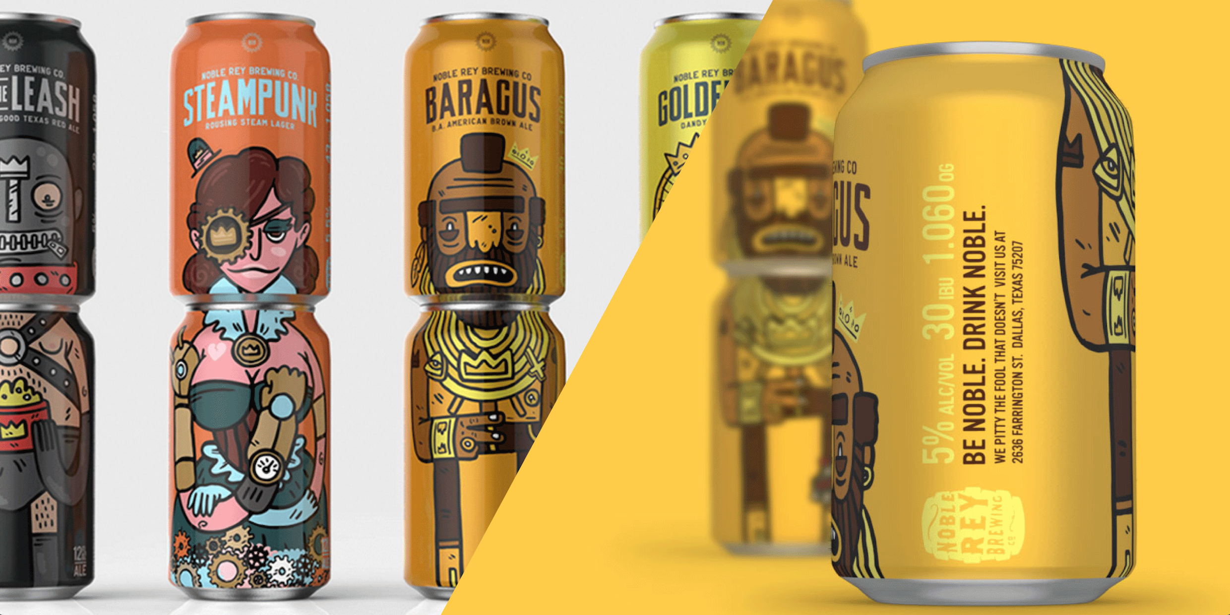
Forget “employee of the month” or high school superlatives—we’re pleased to present The Dieline’s Packaging of the Month. This monthly feature offers an in-depth, behind-the-scenes look at one of the most popular designs that’s appeared on the site. It will give you the opportunity to learn more about the designer or agency behind the product, why they designed it the way they did, and why we here at The Dieline love it. For August 2016, we spoke with the duo behind Magnificent Beard about their design for Noble Rey Brewing.


Why did you choose to go with individual characters on each can, and how did you  develop them for each brew?

  • Noble Rey was a brand new brewery, so aside from a logo, they hadn’t focused on any other branding. Before we began any design work, we sat down with the owners Chris Rigoulot and Justin Krey and conducted a discovery session to really unpack what their brand means to them and how they want to represent themselves today and in the future. In these sessions, you often find that stakeholders aren’t on the same page, and you can force a conversation between them that wouldn’t normally occur until you’re well into the design process – definitely the most painful time for tough conversations to happen. We wanted to make sure they were going to be able to stay consistent with their brand messaging and target over time, and we wanted to set them up with a framework for anyone else they might work with in the future. 
  • In these sessions we also identified their ideal craft beer drinker: Late 20’s, decent job, down to try “weird beer flavors”, stranger sense of humor, probably still has Star Wars toys. Digging into the specific people they’re after really helps set the tone of where to start illustration-wise and what the tolerance for weird stuff will be. We like to get weird, but we reign it in sometimes.
  • After narrowing our focus on the specific drinkers we were looking to attract, we thought it would be best to approach each can as a collectible character. The names the beers were pretty straightforward, so it was easy as far as deciding what kind of character to develop with the exception of Off the Leash. Both Chris and Justin of Noble Rey are dog dudes, so this was named after their pups. Without any of that backstory, we immediately thought escaped gimp. Now it’s their best selling beer. People are weird. 

Moodboard

Why did you opt for the same font choice for each can, and how did you decide on  that particular font?

We rely on the characters and color floods to be the main differentiator between the beers, so type became a consistent, grounding element for each can.  

  • Bridgeport by FOUNDFONTMatt had been REALLY wanting to use Bridgeport for some time, and it just hadn’t fit any of the projects we’d been working on lately. Sometimes you go the reverse route – you find a font and think “shiiiiiiiiiiiiiiiiiiiit! This is the FUCKING BEST!” and it won’t suit anything you’re working on for a year or more. The design lords are probably punishing you for skipping ahead, but they smiled upon us this day. Bridgeport lent itself well to the overall design for a few reasons:
  • We were big fans of how the big ‘ol blockiness reflected the line quality of the illustrations. The goal of the cans are to be stacked, but we knew we couldn’t count on them always being displayed that way. The front of the can has to live on its own, so we needed something that would give the masthead weight and presence.
  • MC GOTHIC by FOUNDFONT
  • MC GOTHIC is used for the brewery name and descriptor copy in the masthead. We wanted something shorter and fatter than Bridgeport, but it still needed to look like it lived in the same universe, so welcome MC GOTHIC to the fam. 
  • Vinyl by T-26
  • Used for the ABV and info about the brewery. Again, we needed something that looked like it lived in the same university but had to be a bit more legible.

We’re probably breaking some ancient typography laws by mixing these 3 up, but we feel like they play an important part in visual hierarchy and declaring what is consistent across the packaging family.

Sketches

You went through many iterations of illustrations for the cans, so why did you decide  on this exact style for them all?

  • Cans are a little tricky to design. The viewable area that needs to contain all of the valuable info – brewery name, beer name, illustration, beer style, ABV, all of the reasons that will convince you to buy this beer, is slightly larger than a business card. When you put 6 cans overflowing with info next to each other, the 6 pack as a unit can become visually overwhelming. Now think back back to the last time you were walking down the beer aisle and your eyes started to glaze over – overstimulation!
  • You can see by some of our earlier designs that we were finding our way to the right balance. Some of the full body characters would look great on a flat layout but would completely fall apart once we wrapped them around a can. Early on, we sketched a layout of the lower half of a Mr. T head that we liked for its simplicity, but realized other characters wouldn’t be very recognizable in the same layout, so we sat it aside in the “probably trash” pile. Weeks later we were going back through the “probably trash” pile and after seeing that lower half of a head design, it just kind of clicked that we needed a stacked can design to make the other half. It was one of those moments where you simultaneously feel like it had been there all along and that you’re the worst designer of all time for having overlooked it.

  • The hand-drawn style seemed to best match the interests of the persona we created early on: down for the weird, still has star wars toys, etc. We think this low brow style equally communicates the humor and personality of the brewery as well.
  • To focus the attention on the characters and counter balance what you typically see on the beer aisle, we decided to embrace simplicity: A flat color field for the background that puts full focus on the character. We’ve been very lucky that distributors and grocery stores are excited about the stacking concept and go out of their way to display them two tall.
  • Lots of credit to Chris and Justin at Noble Rey for trusting us enough to get weird.   

This placeholder is removed when the ad slot is configured.

This placeholder is removed when the ad slot is configured.

This placeholder is removed when the ad slot is configured.

This placeholder is removed when the ad slot is configured.

This placeholder is removed when the ad slot is configured.

This placeholder is removed when the ad slot is configured.