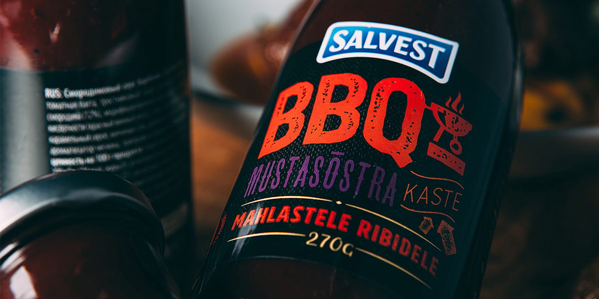
Division created the brand identity and packaging for Salvest, a range of four tasty sauces. With different taste and characteristics, the key objective for Salvest was to communicate the unique personality of the four condiments.
“We’re displaying the name of the sauce and hints about the personality of the flavours using different typography. In addition to the texts, there are also illustrations indicating their characteristics. To give our work a bit of elegance and to create a contrast we decided to use black background”
The standout is undoubtedly strong and the bold use of colours and fonts links the products themselves with their branding. What a ‘saucy’ packaging!


