Featured image for RUNA

RUNA

by Elizabeth Freeman on 08/23/2016 | 6 Minute Read

Editorial photograph

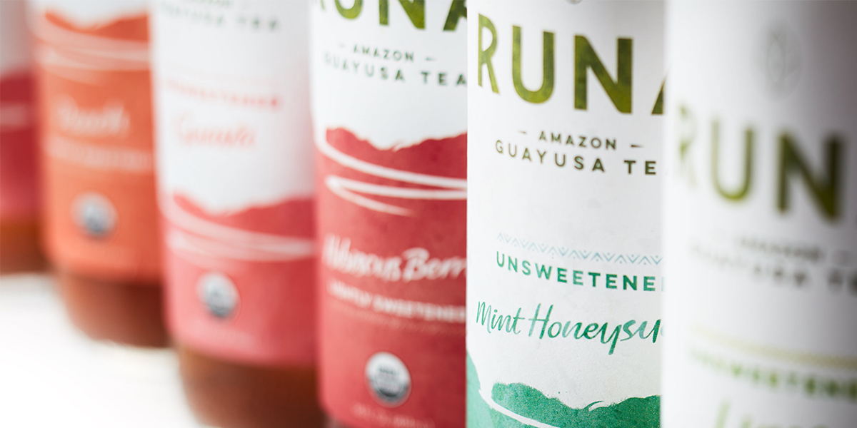
RUNA tasked internationally award-winning design studio Vault49 to conceptualize, design, and produce RUNA’s rebrand of their ready-to-drink teas and energy drinks brewed from the Amazonian guayusa leaf.

Guayusa has a rich cultural heritage. The leaf has been brewed and consumed in the Amazon for centuries by indigenous people and is revered for its health benefits and energy-giving powers. Families will gather at dawn around a communal fire and drink guayusa together. They come together to share stories, dreams and myths. Indigenous people say that this tradition and guayusa are essential to making them feel RUNA – meaning fully alive. Guayusa has a lot of caffeine—more than most bottled teas—making it a popular choice for consumers looking for a natural and sustained energy boost. Many consumers enjoy guayusa because it allows for more focus, alertness and sustained energy without the crash as compared to coffee or traditional energy drinks.

Editorial photograph

Guayusa is one of the only teas in the world that is grown exclusively by farming families. Guayusa is grown in bio-diverse forest gardens and is a tool for creating economic incentives for rainforest conservation. The look and feel of the new packaging reflects the pure, spirited and clean energy of the brand, with clean white space and light watercolor design, while respectfully translating indigenous identity and heritage. 

The story behind RUNA is rich with inspiration, from Tyler’s first trip to the Amazon when he discovered guayusa, to the daily morning rituals when Kichwa tribes go on personal journeys interpreting their dreams. But the product is also central to the brand, as guayusa is unique in its origin as well as its benefits. So we were tasked with a lot of messaging to convey.  The biggest watch-out was that not one consumer touchpoint could carry the weight of the comprehensive story, so we captured the essence of RUNA through a creative underpinning titled Journey and Discovery to ensure all of the design was anchored in the same brand truth. 

Editorial photograph

The word mark was inspired by Kichwa, where we designed the "A" with a downward “V" to hint at the tribal origins.  RUNA is very much a part of our urban lives, so the mark has a modern and minimalist silhouette with space for the letters to breathe, enhancing the open and spacious energy.  The guayusa leaf is a key ingredient of RUNA and to the brand story, so it was heroed while having an understated treatment, adding to the natural and organic feel.

For the packaging, an early decision in our exploration was to avoid anything overly literal in the design.  We penned consumer portraits, but recognized that RUNA had to have a wide appeal and our design needed to resonate with everyone from yoga buffs to overworked office execs.  Each of these individuals have their own aspirations, their own dreams and will ultimately have unique discoveries and an original journey. This insight led us to create a landscape featuring an Amazonian river, which can be seen as an abstract pathway, leading to somewhere unknown. Everyone is invited to interpret it in their own way, and discover their own story.

Editorial photograph

A watercolor treatment was selected to for its esoteric feel as well as provide juicy flavor cues. We chose colors that felt as though the landscape was painted using the juice of the ingredients themselves, feeling nothing but organic.

The energy cans take the design into a more stripped back aesthetic relevant for the category, focusing on the word mark and contained texture to communicate the aspect of discovery, and enhancing Kichwa cues through the use of a unique graphic pattern. The aim of the can design was to balance the feeling of an energy product with organic cues. Energy from a leaf, not a lab.

Editorial photographEditorial photographEditorial photographEditorial photographEditorial photograph

“We share a kindred spirit with RUNA management and were honored to have been on the journey to translate the brand premise of being 'fully alive' into art.  The new packaging captures the storied and authentic roots of the brand, while staying relevant to an urban consumer with a vibrant and clean palette.  RUNA drinkers are the brand’s biggest advocates, so we’ve left room for them to identify their own journey in the design; where some have described the illustration as a ‘path of inspiration’ others see the Amazon river.  RUNA offers an enlightened product and business model, and we are happy to bring the brand essence to life through design.”

Editorial photograph

-Jonathan Kenyon, Executive Creative Director, Vault49 Founder

“We couldn’t have been happier in our experience working with the Vault49 creative team to brainstorm, conceptualize, and develop the new packaging design for RUNA’s ready-to-drink teas and energy drinks. RUNA was born from the pure, clean energy source in the Amazon known as the guayusa leaf, and we finally feel like the brand’s packaging fully conveys this spirit. We are excited to share the new packaging design with consumers and hope that the clean and vibrant illustration will elicit inspiration and provide the energy needed to spark everyday endeavors.”

-Tyler Gage, Co-founder and CEO RUNA

Editorial photographEditorial photograph

Designed by Vault49

Country: USA

City: New York City