Featured image for Bensons - The Juicers

Bensons - The Juicers

by Theresa Christine Johnson on 07/07/2016 | 2 Minute Read

Editorial photograph

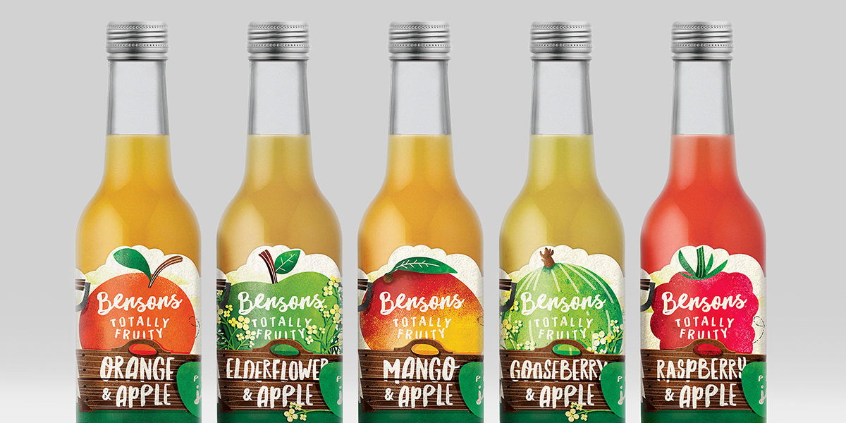
Bensons is a farm in the UK that produces several ranges of fruit juices and a family of pure fruit popsicles. They turned to Great Depths to launch a new visual identity and label redesign that would emphasize their wholesome ingredients and mouthwatering flavors.

“As the only Red Tractor accredited juice manufacturer in the UK, Bensons tasked the Great Depths team with refreshing and re-aligning their brand to reflect the quality and honesty of their ingredients as well as their expertise and family values.”

Editorial photograph

Creative Director, Neil Pinkawa, says, "Through the use of much looser, hand-drawn typography, we were able to give the Bensons brand mark an honest and naturally crafted look—reflective of their values and offering. The addition of the intentionally simple secondary line of ‘The Juicers’ makes a further statement of confidence and expertise.”

Editorial photograph

Bensons’ redesign allows the freshly picked and squeezed hues of the fruit to shine while emphasizing the local, farm-to-bottle aspect of their production. The brand name looks handwritten, further indicating the individual care that goes into each bottle of juice they make. On the front of the label, a large wooden box contains an oversized fruit, letting consumers know that the beverage is packed full of flavor.

Editorial photograph

“Following the rebrand, the Great Depths team tackled the refresh of the Totally Fruity range, taking visual cues from the British orchards and farmland that play such a pivotal role in the Benson’s family story. The team created flavour specific illustrations for each of the eight labels, referencing countryside scenery and farming paraphernalia with playfully oversized fruit at the fore of each product.”

Editorial photograph

Designed by Great Depths

Client: Bensons - The Juicers

Country: United Kingdom