

Sometimes there’s just nothing better than a bag of perfectly salted, crispy and crunchy potato chips. Chip Off The Old Block really ups the game for potato chips out there, offering their thick sliced, flat cut, and batch cooked kettle chips for generations. New Zealand agency phd3 redesigned their packaging to recognize the history of the brand and set the bags apart from others on the shelf.


“Chip Off The Old Block offers an alternative grower brand of chips in an otherwise over-processed category. The brand name, overalls, shirts, flat colours, pocket device and language in the brand packaging celebrates ‘three generations and growing’ of potato grower.”

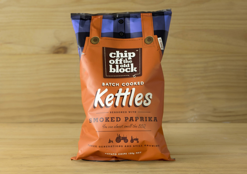
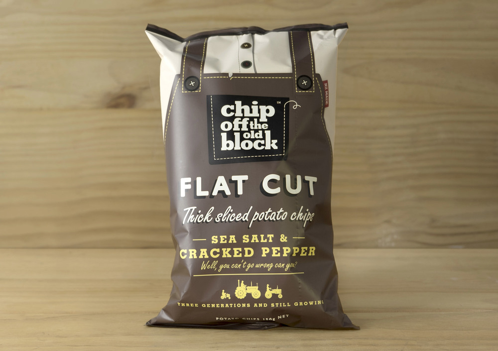
The bags take the way we envision farmers and turn those elements into packaging. We envision farmers as wholesome, kind people clad in overalls and riding tractors. Each chip variety is packaged in an overalls bag, with different flavors having colors that indicate the ingredients. The font choice feels friendly and welcoming, with a slight shadow that gives the impression you’re out in the sun. On the back, we get a little bit more about the company’s story and real-life images, allowing consumers to feel closer to the brand and more emotionally invested in the product.


