

Raw Fairies is one of London’s leading juice cleanse companies, providing healthy juices that are made with love. Their high quality products are organic, non-GMO, made from pure ingredients, and delivered daily. Konrad Sybilski was tasked with refreshing the logotype and creating new labels for their selection of raw foods and juices.

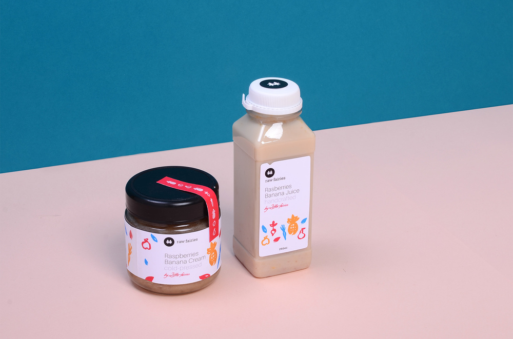
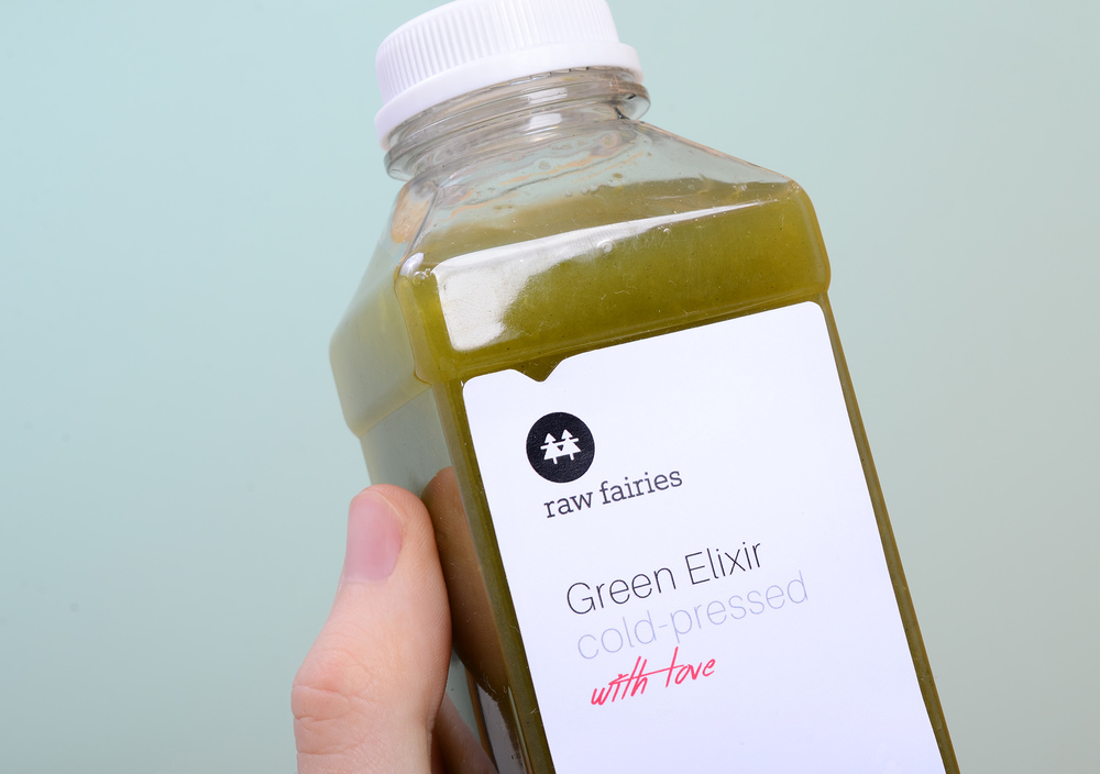
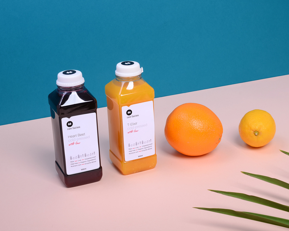
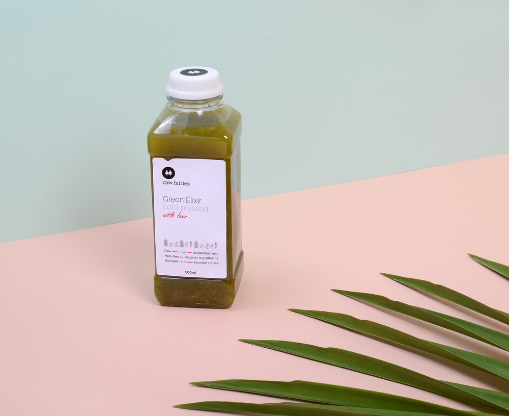


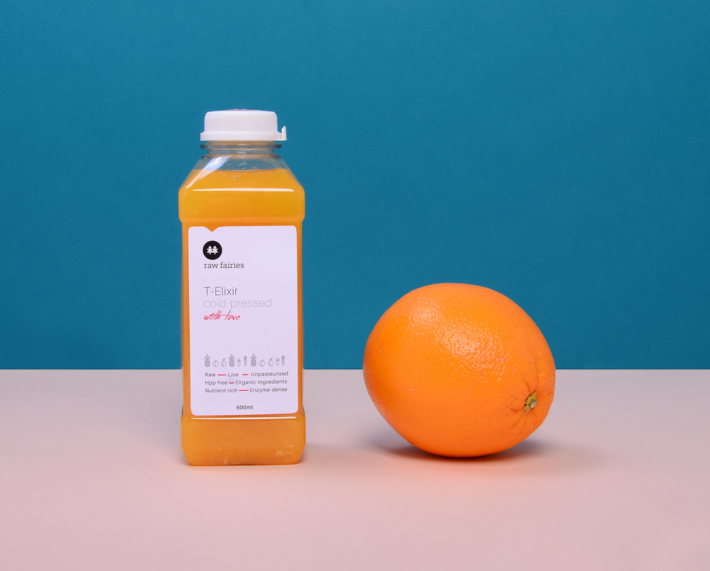
Raw Fairies juices come in clear plastic bottles, allowing the rich hues from the fruits and veggies to show. Each flavor is written on the front in an elegant, thin sans serif font which adds to the premium quality of the brand. Delicate illustrations of produce appear at the bottom, right above the values of each juice (like raw, organic, and nutrient-rich). Instead of a cluttered label, Sybilski opted for something simpler and cleaner, making it a high-quality juice choice without nasty added ingredients.

Designed by: Konrad Sybilski
Country: Poland
City: Warsaw


