Lamb’s: A Family of Fine Smooth and Refined Rums
By
Published
Filed under
By
Published
Filed under
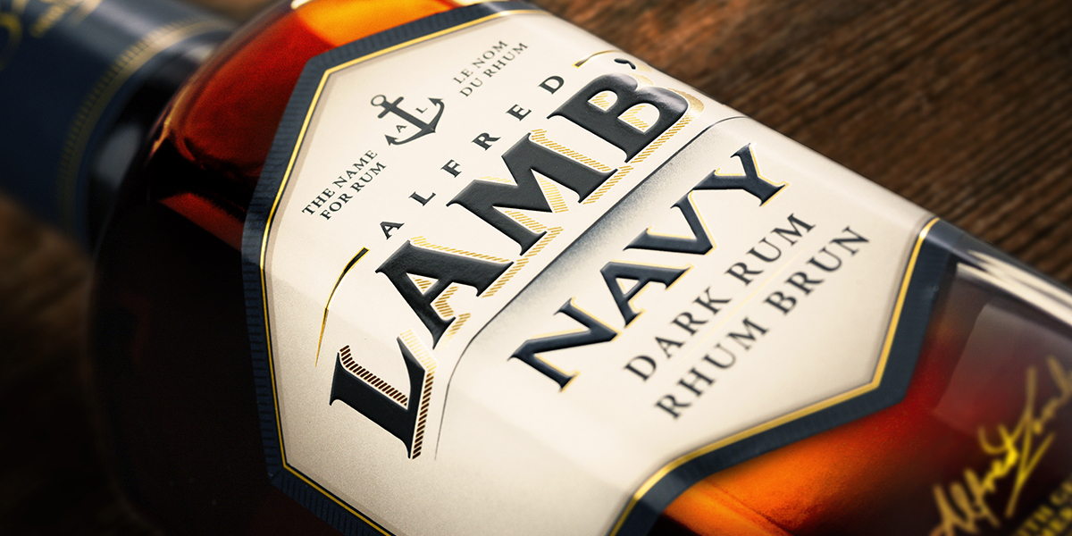
If you’re looking for a good time, make sure there’s a bottle Lamb’s at the next party you go to. Designed by Davis, exquisite dark, amber and white rum are displayed in hexagon-shaped glass bottles. The redesign sticks to the brands traditional roots but modernizes it with a clean label design and nautical illustrations. Hints of gold found on the signature, bottle’s neck and logo add a luxurious element to the rum.
At the very edge of the country, on an island at the doorstep of the North
Atlantic, where the weather can change at a moment’s notice is where this humble Lamb’s Nation is rooted.
Introducing a fully revitalized Lamb’s Rum…
Get unlimited access to latest industry news, 27,000+ articles and case studies.
Have an account? Sign in


