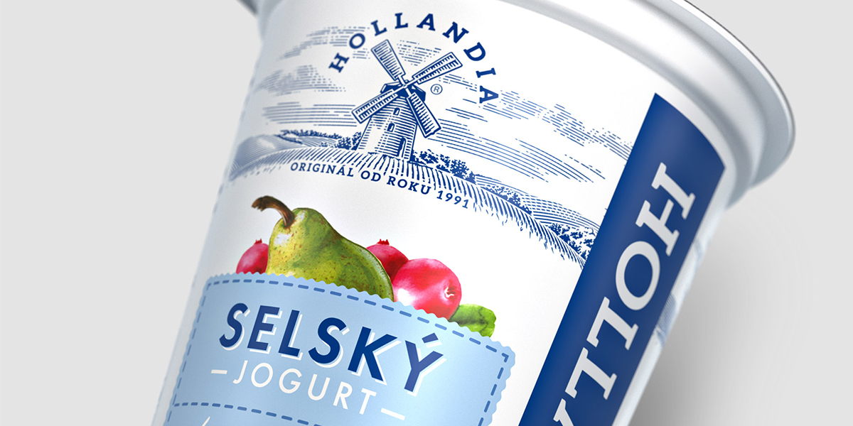
Hollandia is the yogurt love brand adored by consumers across the Czech Republic. This redesign marks a dramatically, refreshed look of Hollandia’s product ranges and corporate identity, which had undergone minimal change since the company originated 25 years ago.
Over a mere three months, Prague-based branding and design agency Cocoon refreshed everything from Hollandia’s company’s logo and corporate identity to the packaging of every single flavour and range.
Before/After
Aligning the ranges of Hollandia’s portfolio (which includes ‘Selsky’ range, meaning ‘rustic’, and ‘Bio’ range) was one of the big tasks of the redesign. The new visual identity of the brand is now much more consistent overall, which makes it easy for consumers to navigate among all of its varieties.
While Hollandia has been well-known as ‘the best yogurt’ producer in the region, for the past two decades the comparatively outdated packaging was failing to communicate just how great the product is.